Imports, chunks, config, webpack
Contents
Lesson overview
This final example is going to be more real-life-like. We’ll focus on these features:
-
Using an entry from a myEntries folder outside of the site/ structure
-
Letting the entry itself import and nest its own react components. Imports like this are just regular frontend ES6, and happen at compile time, done by webpack.
-
Importing those secondary assets from a shared non-entry folder, and marking that folder so everything in it is turned into a separate bundle - a dependency chunk. These chunks are repeatedly-used, effectively-cached and rarely-downloaded "library assets" of shared secondary components. They’re meant to take care of bigger stuff while keeping the footprint of the entry small (while still automatically compiled and tracked by react4xp).
-
Our react components will need some compilation that react4xp doesn’t handle: styling our react components (but it could be anything on the webpack step: asset handling, loaders etc). So we’ll see how to add custom webpack config to the react4xp setup.
site/parts/
    multi-color/
        multi-color.es6
        multi-color.xml

react4xp/
    myEntries/
        MultiColor.jsx
        MultiColor.scss
    shared/
        ActiveColorOval.jsx
        ActiveColorOval.scss
        Button.jsx
        Button.scss
        ColorButtons.jsx
        ColorButtons.scss
        shared-styles.scss

react4xp.config.js
webpack.config.react4xp.js
As you can see, there are more moving parts than before to coordinate here, so we’ll divide the code into three sections:
-
an XP part at the core of things, fetching editorial data from XP and inserting it into a react4xp entry - as before,
-
the entries and imported assets under react4xp/,
-
and adaptations to the react4xp config, which will enable webpack handling of styles and enable the Part controller to find and use the entry and its imports the way we want.
The multi-color Part
Starting out with the multi-color Part at the core of it all, everything in this section will probably be familiar by now.
Part definition
The Part definition enables two editorial configurations:
<?xml version="1.0" encoding="UTF-8" standalone="yes"?>
<part>
    <display-name>Multi-Color</display-name>
    <description>Add your own clickable colors</description>

    <form>
        <input name="SSR" type="CheckBox">          (1)
            <label>Server-side rendering</label>
            <occurrences minimum="1" maximum="1"/>
        </input>

        <input name="colors" type="TextLine">       (2)
            <label>Color</label>
            <occurrences minimum="0" maximum="0"/>
        </input>
    </form>
</part>| 1 | a checkbox for making the entry serverside or clientside rendered, |
| 2 | and an array of colors where a user in Content Studio can add any number of HTML-compliant color tags. |
Part controller
For the Part controller, we don’t need any more than this in this example:
const portal = require('/lib/xp/portal');
const React4xp = require('/lib/enonic/react4xp');

exports.get = function(request) {
    const component = portal.getComponent();

    const clientRender = !component.config.SSR       (1)

    const colors = (component.config.colors || [])   (2)
        .map( c => (c || '').trim())
        .filter(c => !!c);

    return React4xp.render(
        "MultiColor",                                (3)
        { colors },
        request,
        { clientRender }
    );
};| 1 | Taking the serverside-rendering checkbox from the Part’s config, and turning it into a clientRender flag that’s sent into the options argument just like before. |
| 2 | Creating a colors array of the color names from the Part’s config, trimming them and removing empty ones. This is passed into the props argument like before. |
| 3 | This argument is slightly different compared to previously. "MultiColor" is a jsxPath to an entry, as you’d expect. But why does it look so… naked? Where does it point to? As we’ll see in a moment, we’ll set up react4xp to look for entries below an entryDir in react4xp.config.js: src/main/resources/react4xp/myEntries/. Since a jsxPath is relative to the closest parent entryDir and we’ll put an entry MultiColor.jsx at the root of entries/, the jsxPath becomes just the clean file name. |
The MultiColor entry
Before we do the react4xp / webpack configuration, we’ll make the MultiColor.jsx entry and its dependencies.
This is a more complex entry than before (and the most complex part of this example) - it’s composed of main react code that imports secondary dependencies.
React component
This is a stateful react component that not only imports and nests secondary react components, but also imports styling - both its own specific and shared general styling - and relies on webpack and react4xp to handle all the compilation and assets behind the scenes.
import React from 'react';

import Button from '../shared/Button';                  (1)
import ColorButtons from '../shared/ColorButtons';
import ActiveColorOval from '../shared/ActiveColorOval';

import './MultiColor.scss';                             (2)
import '../shared/shared-styles.scss';                  (3)

class MultiColor extends React.Component {              (4)
    constructor(props) {
        super(props);
        this.state = {
            selected: 0                                 (5)
        };

        this.shiftUp = this.shiftUp.bind(this);         (6)
        this.shiftDown = this.shiftDown.bind(this);
    }

    shiftUp() {                                         (7)
        this.setState({
            selected: (this.state.selected + 1) % this.props.colors.length
        });
    };
    shiftDown() {
        this.setState({
            selected: (this.props.colors.length + this.state.selected - 1) % this.props.colors.length
        });
    };

    render() {
        const props =  this.props;
        const state = this.state;
        return props.colors.length ?                    (8)
            <div className="multi-color">

                                                        (9)
                <Button className="my-button" clickFunc={this.shiftDown}>Previous color</Button>
                <Button className="my-button" clickFunc={this.shiftUp}>Next color</Button>

                                                        (10)
                <ActiveColorOval color={props.colors[state.selected]} />

                                                        (11)
                <ColorButtons colors={props.colors}
                              selectedIndex={state.selected}
                              clickFunc={ i => {
                                  this.setState({selected: (i) % props.colors.length});
                              }}
                />

            </div> :

                                                        (12)
            <p>Add some color!</p>
    }
}

                                                        (13)
export default (props) => <MultiColor {...props} />;| 1 | The entry imports some secondary react components for nesting later. These imports have nothing to do with react4xp’s jsxPaths, this is regular ES6 module importing and will be handled by webpack at compile time and served to the client at runtime. Basically any react component can be imported from anywhere here, including other entries. In this case we’re referring to components below a different folder, shared/, which we will later mark as a chunk directory instead of an entry directory. Shared/ is not below entries/ (but adjacent to it), so these imported react components will not be entries, just secondary react components and not reachable with React4xp.render. As you will see, this folder separation is also important for the compiled outcome: the entry, MultiColor.jsx, will be compiled into assets/react4xp/MultiColor.js, but imported components like this will be collected inside a common dependency chunk: assets/react4xp/shared.<HASH>.js. React4xp and webpack track the dependency connections between an entry and all its required chunks - so React4xp.render automatically generates asset-loading page contributions from the controller. The outcome: when the webpack rules are set up correctly later, imports like this in entries rendered by react4xp are all that’s needed to connect the entries to the additional assets they might need: no manual url handling in the controller or thymeleaf views etc. Dependency chunks are also optimized for repeated use (more details on dependency chunks). |
| 2 | This applies to styling too. Here, the entry imports some specific styling of its own, from a SASS file in the entries/ folder. This import is webpack-centric syntax too: the SASS in MultiColor.scss is compiled to the asset assets/react4xp/Multicolor.css, and automatically added when using this entry (of course, there’s more than one way to handle styling in webpack, this is just one working example). |
| 3 | Another SASS styling import, this time not from the same folder but from the shared/ folder. Just like with compiled JS chunks, all imported styling below shared/ will be compiled into the dependency chunk assets/react4xp/shared.<HASH>.css - again automatically handled. |
| 4 | Unlike previous examples, this is an old-school stateful react Component with class syntax. See also (13). |
| 5 | The selected state attribute keeps track of which of the colors is currently selected, by index number in the props.colors array. In regular react fashion, each time this is changed the component is re-rendered. |
| 6 | This makes the whole MultiColors class available as this also inside the functions shiftUp and shiftDown. |
| 7 | shiftUp and shiftDown change the selected state attribute, increasing/decreasing it by 1 and wrapping around the array edges. |
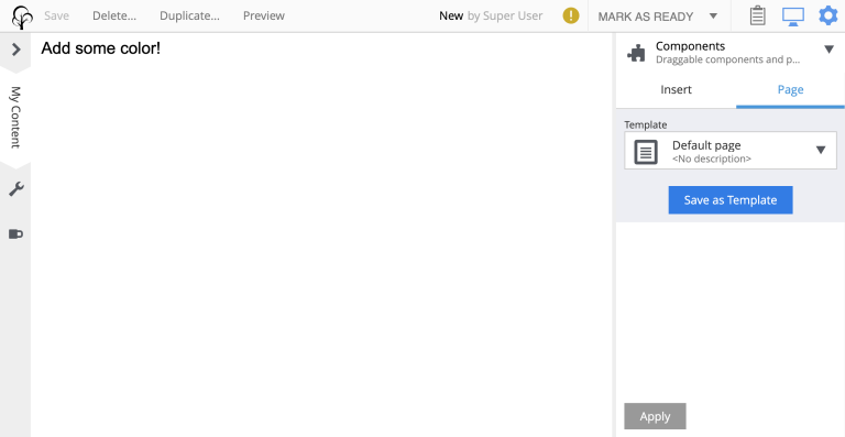
| 8 | If no colors have been added editorially, the part just displays an "Add some color!" paragraph. (12). Otherwise, the actual active content is rendered: |
| 9 | Two buttons, increasing and decreasing the selected color. This uses the imported Button component from (1) twice. Two different labels and onClick functions are mapped to them, and they are both given a my-button HTML class for styling. |
| 10 | The import ActiveColorOval is given the currently selected color string, and displays it in an elliptic label on the page. |
| 11 | Next, a list of buttons collected in a ColorButtons component. It’s given the list of colors and the currently selected index (5), as well as a function that changes the selection index. All in all: click the a color’s button to select it. |
| 12 | The fallback rendering if no colors have been added (5).` |
| 13 | Remember that entries need to export a function: (props?) ⇒ react component. Since this component is written in the class syntax (4), it needs to be wrapped like this for export. |
Dependencies for the entry
Styling
Now, with the entry done, we can look at the entry’s styling - a lot simpler, only the buttons' class my-button is targeted and styled:
.my-button {
    padding: 16px 35px;
    border-radius: 5px;
    border: 2px solid black;
    font-weight: bold;
    margin: 10px 40px;
}
Moving on to the shared/ folder, this is where we find source files that will be compiled into common assets: dependency chunks with the "shared" prefix and a content-dependent "<HASH>" (reminder: this will happen because we later will mark shared/ as a chunkDir in react4xp.properites).
First, some shared-styles.scss, also imported by the entry MultiColor.jsx. This could for example serve as common, normalizing styling imported by many react components across wide parts of a site:
* {
  font-family: 'DejaVu Sans', Arial, Helvetica, sans-serif;
  font-size: 15pt;
}
Imported react components
Next, shared/ also contains the secondary react components imported by MultiColor.jsx. Note how each of them imports their own specific styling the same way as the entry MultiColor.jsx.
| It’s important that these react components are not entries themselves. They are only imported by the MultiColor entry - hence the folder name shared/. |
Button
There’s the generic Button component. This is used both by MultiColor.jsx and the secondary component ColorButtons.jsx. It gets custom onClick function, HTML class, inline styling (for single-button-specific attributes) and label (children) from props (the spread-out function parameters):
import React from 'react';

import './Button.scss';    (1)

export default ({clickFunc, className, style, children}) =>
    <button className={className}
            type="button"
            onClick={clickFunc}
            style={style}
    >
        {children}
</button>;| 1 | The specific Button styling it imports is marginal - this is just a generic button, so most of the styling is left to the class it’s given, or inline attributes: |
button {
  cursor:pointer;
}
ActiveColorOval
Then there’s the ActiveColorOval component, which just displays props.color inside a circle/ellipse thing, filled with the same color:
import React from 'react';

import './ActiveColorOval.scss';

export default ({color}) =>
    <div className="active-color-oval"
         style={{backgroundColor: color}}
    >
        {color}
</div>.active-color-oval {
margin: 10px 40px;
background-color: transparent;
padding: 20px;
border-radius: 50%;
float: right;
color: white;
}
ColorButtons
And finally a ColorButtons component. It takes the list of props.colors (from the editorial data), and assigns each of them to a Button labeled with the color, each of them triggering the change-color-selection from MultiColor.jsx with its own specific color index i in the list of colors. In addition, the HTML class name(s) of the buttons is assigned dynamically: the buttons all have a color-button class, and each item checks if its own array index i matches the current selectedIndex. If it does, the class selected is added, making that button differently styled:
import React from 'react';

import Button from './Button';

import './ColorButtons.scss';

export default ({colors, selectedIndex, clickFunc}) =>
    <ul className="color-list">
        {colors.map( (color, i) =>

            <li key={i} className="color">
                <Button className={`color-button${i === selectedIndex ? ' selected' : ''}`}
                        clickFunc={ ()=>clickFunc(i) }
                        style={{backgroundColor: color, borderColor: color}}
                >
                    {color}
                </Button>
            </li>

        )}
</ul>;.color {
width: 50%;
list-style-type: none;
margin-bottom: 5px;
}
.color-button {
min-width: 100%;
padding: 6px;
border-radius: 5px;
border: 1px solid black;
&:focus {
outline: none;
}
&.selected {
color: white;
font-weight: bold;
}
&:not(.selected) {
background-color: white !important;
}
}
Configuring react4xp and webpack
In this section we’ll adjust some settings to make the code above work.
Folders for entries and chunks
First, open react4xp.config.js in your project root and add/look up the attributes entryDirs and chunkDirs. Make sure myEntries are added as an entryDir and shared is added as a chunkDir.
entryDirs: 'myEntries'   (1)

chunkDirs: 'shared' (2)| 1 | entryDirs is a list of where react4xp will look for source files to compile and serve as entries: in this case src/main/resource/react4xp/myEntries. This list is in addition to XP’s site/ folder - site/ always acts as a sort of default, special-case entryDir: under site/ only .JSX files are picked up as entries, while in all other entryDirs, .ES6 and .JS are picked up as well. |
| 2 | chunkDirs is a list of folders that will be turned into collection/library assets (dependency chunks): in this case src/main/resource/react4xp/shared. One chunk asset for each file type in each chunkDir, named after the chunkDir. If a different name is already here: entryDirs: ['entries', 'myEntries'] works fine. |
So in our example here, JSX files under myEntries/ are available to React4xp.render and friends, in XP controllers. Each entry becomes an asset file in itself.
And everything they import from under shared/ and that is compiled into JS (both react and otherwise), will be collected into the chunk shared.<HASH>.js - and everything under shared/ that’s compiled into CSS (our SASS, for example) is collected into shared.<HASH>.css. And so on.
|
Both Adding paths like e.g. |
Adding webpack rules
Next, we’ll add some custom webpack rules to handle the style imports.
const MiniCssExtractPlugin = require('mini-css-extract-plugin');

module.exports = function(env, config) {                     (1)

    // This makes 'npm link' symlinks in node_modules work:
    config.resolve.symlinks = true;

    // Compile .scss and friends:
    config.module.rules = [                                  (2)
        ...(config.module.rules || []),
        {
            test: /\.((sa|sc|c))ss$/i,
            use: [
                MiniCssExtractPlugin.loader,
                {
                    loader: 'css-loader',
                    options: {
                        importLoaders: 1,
                        modules: { auto: true },
                    }
                },
                {
                    loader: 'sass-loader',
                    options: {
                        sassOptions: {
                            outputStyle: 'compressed',
                        },
                    },
                }
            ]
        }
    ];

    // Set up how the compiled assets are exported:
    config.plugins = [
        ...(config.plugins || []),
        new MiniCssExtractPlugin({
            filename: '[name].css',
            chunkFilename: '[id].[contenthash:9].css',
        }),
    ];

    return config;                                           (3)
};| 1 | Currently, the whole file must export a function where the arguments are a standard webpack env object, and config which is the existing webpack config object from react4xp. |
| 2 | That function may mutate (or replace!) the react4xp webpack config object (on this line and later: "take any incoming config.module.rules and add this style-compilation-rule object"). So previously existing attributes will be overwritten by the new ones from this file. |
| 3 | The function must return the changed (or replaced) config object. |
NPM dependencies
Also, you’ll probably need to add the required NPM packages for this example:
npm install -D css-loader@3 node-sass@4 mini-css-extract-plugin sass-loader@8
Now we’re ready to look at it running!
Setup and rendering
Build again and add the multi-color Part in Content Studio, the same way as before.

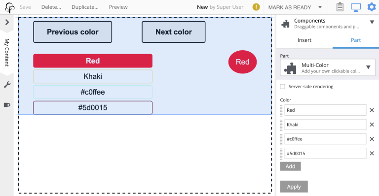
Click it in edit mode to edit the Part config. Here you can choose to render the part in serverside or clientside mode, as well as enter any number of colors. As long as they are standard web colors, they will create an array of colored buttons.

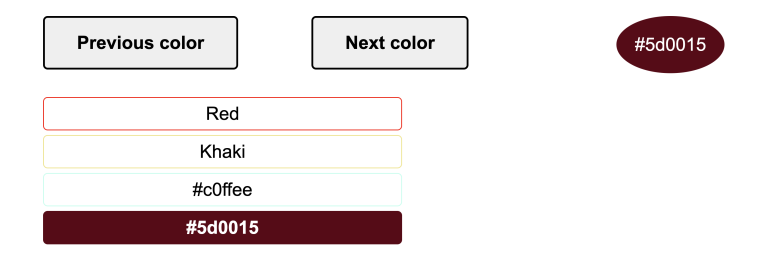
Outside of Content Studio, in the preview, the buttons are of course active and clickable. Each button selects itself, the Previous/Next buttons cycle through them, and the little elliptic label (the ActiveColorOval) is updated with both text and color:

Output
Let’s take a look at the rendered response from the controller and underline a few things that by now might be as you expected:
<html>
    <head>
        <title>MultColor</title>

        (1)
        <link href="(...your.app.service) /react4xp/shared.9fa09c20d.css"
              rel="stylesheet"
              type="text/css"/>
        <link href="(...your.app.service) /react4xp/MultiColor.css"
              rel="stylesheet"
              type="text/css"/>
    </head>

    <body class="xp-page">
        <div id="react4xp_453f84f9-043f-4376-89fc-93855501e063">
            <div class="default-page" data-reactroot="">
                <div data-portal-region="main" class="xp-region">

                    (2)
                    <div data-portal-component-type="part" id="_67815286"></div>
                </div>
            </div>
        </div>

        (3)
        <script src="(...your.app.service) /react4xp/shared.27a8a0669.js"></script>
        <script src="(...your.app.service) /react4xp/externals.489d97cdf.js"></script>
        <script src="(...your.app.service) /react4xp/client.5678abcd.js"></script>
        <script src="(...your.app.service) /react4xp/MultiColor.12345678.js"></script>

        <script src="(...your.app.service) /react4xp/dynamic.87654321.js"></script>    (4)
    </body>
</html>| 1 | Firstly, the SASS files have all been compiled to .CSS assets, and stylesheet links to them are inserted into the header by React4xp.render (if we had used the custom flow syntax, this would have been handled by .renderPageContributions). And secondly: while MultiColor.scss was compiled into a .CSS file by itself (because the source file is under the entryDir entries/), we see that all the other imported assets have been compiled into the common dependency chunk shared.<HASH>.css (not because they were imported by .JSX files under shared/ - the import location doesn’t matter. But because the .SCSS source files were under shared/). |
| 2 | Again, since we didn’t check the "Server-side rendering" checkbox, the clientRender flag became true and we got a clientside rendering. So this is just the target container element, filled in by the browser on render. Had we checked the checkbox, this would have contained the pre-rendered MultiColor entry, of course. |
| 3 | Among the dependencies are still the externals, the client wrapper code and the code to the compiled MultiColor entry. And in addition, there’s the shared.<HASH>.js dependency chunk, containing the compiled code for all the ES6/JS/JSX found under the shared/ folder. |
| 4 | The script that actually runs render with the props on the clientside. |
And that’s all in this chapter!