Macros
Contents
Rich Text also supports custom components - aka Macros.
Background
In order to support more complex structure within Enonic’s Rich Text editor, you can define macros.
| Details on defining macros can be found in the XP documentation. |
Default macro handling
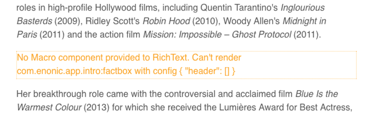
The sample content contains an example macro called Factbox, which has been added to the Lea Seydoux bio.
By default, the RichText component will simply render a fallback placeholder:
To improve the situation, start by implementing a FactBox component.
The FactBox component
Add the following files to your project:
import styles from './FactBox.module.css';
import type {ReactNode} from 'react';

declare type FactBoxProps = {
    header?: string[];
    children: ReactNode
};

export const FactBox = ({header, children}: FactBoxProps) => (<>
    <ins className={styles.factbox}>
        <strong className={styles.header}>{header?.length ? header.join(' ') : 'Fact Box'}</strong>
        <br/>
        {children}
    </ins>
</>)
The optional body of a macro is available as a React component called children. |
.icon {
    speak: none;
    font-style: normal;
    font-weight: normal;
    font-variant: normal;
    text-transform: none;
    line-height: 1;

    /* Better Font Rendering =========== */
    -webkit-font-smoothing: antialiased;
    -moz-osx-font-smoothing: grayscale;
}

.factbox {
    background-color: rgb(235, 249, 249);
    display: block;
    text-decoration: none;
    -webkit-border-radius: 2px;
    -moz-border-radius: 2px;
    border-radius: 2px;
    clear: both;

    -webkit-box-shadow: 0 2px 3px rgba(0, 0, 0, .3);
    -moz-box-shadow: 0 2px 3px rgba(0, 0, 0, .3);
    box-shadow: 0 2px 3px rgba(0, 0, 0, .3);

    min-height: 24px;
    line-height: 24px;

    font-family: sans-serif;
    font-size: 14px;
    color: #333;

    padding: 10px 20px 10px 44px;
    width: 75%;
    margin: 20px auto;
    position: relative;
}

.factbox .header {
    font-size: 14px;
    font-weight: bold;
    line-height: 24px;
    margin: 0;
    color: #1f71a1;
}

.factbox .body ul {
    padding-left: 0;
}

.factbox .body ul li {
    margin: 5px 0;
}

@media screen and (max-width: 720px) {
    .factbox {
        width: 90%;
    }
}
Like other components, you may also declare a query for your Macro - but in this case we already have everything we need in the data returned from the original bio query.
The Macro component
We now have a FactBox component, but we still need to map it to the Enonic macro definition. This can be solved by implementing a generic Macro component where you map specific macro descriptors to corresponding macro components.
import type {MacroComponent} from '@enonic/react-components';


import {FactBox} from './FactBox';


export const Macro: MacroComponent = ({
                                          component,
                                          data,
                                          children
                                      }) => {
    if (component.descriptor === 'com.enonic.app.intro:factbox') {
        return <FactBox header={data?.header as string[] | undefined}>{children}</FactBox>;
    }
    throw new Error(`Macro not found: ${component.descriptor}`);
}
This component takes care of mapping each macro to its corresponding React component. In our case, FactBox component implements the macro called com.enonic.app.intro:factbox in Enonic.
It will throw an error otherwise, which will cause the RichText component’s ErrorBoundary to render an Error placeholder.
Use in RichText
Just like with Link and Image components, import Macro component and pass it to the RichText component:
import {Macro} from './Macro';
// ..
<RichText
// ...
Macro={Macro}
// ...
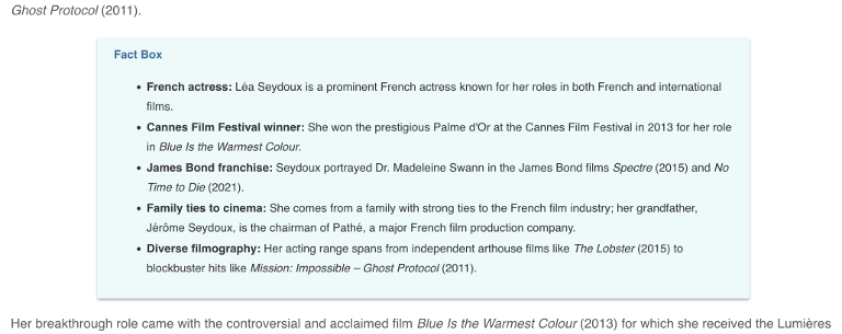
/>If you did everything correctly, you should now see the FactBox macro rendered inside the biography on the Lea Seydoux page:
A final tip
Make an interface for RestProps so you can use it in other components as needed:
export interface RestProps {
    personID: string;
  }
You may pass additional parameters, such as personID to the RichText component by supplying a generic interface which declares them:
import { RestProps } from './RestProps';
  ...
<RichText<RestProps>
  ...
  personID="paramValue"
  ...
/>
Import the interface and supply it to the Link.tsx, Image.tsx and Maxro.tsx components to make them aware of the new personID field:
import { RestProps } from './RestProps';

export const Link: LinkComponent<RestProps> = ({
Next steps
Congratulations on completing this tutorial!
For more details on our React Components library, visit the NPM documentation.
To learn more about Enonic’s CMS capabilities, we recommend the Developer 101 tutorial.
To dive deeper into React and building sites with Enonic, have a look at our Next.js integration.