Context Panel
Contents
This panel is a multi-function tool that can be toggled open and closed with the cog icon at the right of the toolbar. It is used in conjunction with the Page Editor to work with components on the page. There are five different widgets available on the pull down menu in a basic installation, and custom tools may be developed or added from Market.
Components
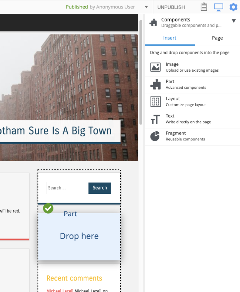
Using the components widget, you can choose the template for the page, then drag and drop components onto the page. This widget consist of two tabs, Insert and Inspect.
Insert tab
This tab has a list of Component types that can be added to the page in a two step process. The first step is to drag and drop a component type placeholder to a region in the page editor. The second step is to select the specific component from a dropdown selector in the placeholder.
For example, to add a part component called “Categories” to the page, simply click the part icon (puzzle piece) and drag it to a region in the page editor. A red circle appears when the component is dragged over an area where it cannot be dropped. A green checkbox appears when dragged over valid locations and a blue box shows where the component will land.
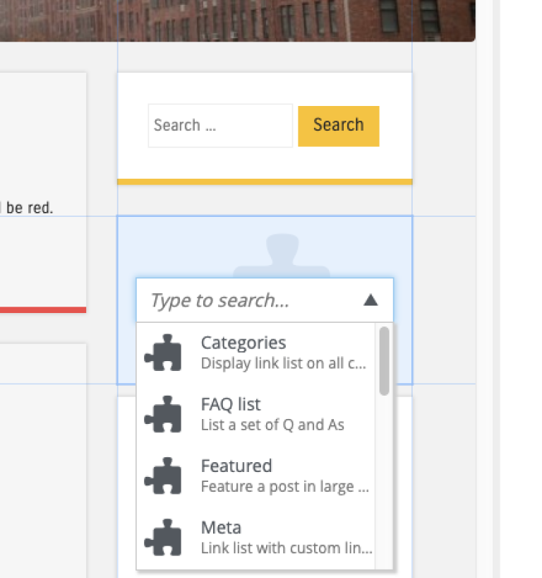
Once the part placeholder is dropped, it will have a combo-box where the “Categories” part can be selected from the list. When a component placeholder is selected, the inspection panel will also show a combo-box with a list of available part components.
Inspect tab
This is where components are configured. The inspection panel displays form inputs matching the configuration of whichever component is selected in the page editor, and changes name to match the type of component, so for instance, in the first screenshot above, the tab is named "Page".
Some components won’t have any configuration settings. The page will not update as configuration values change until the content is saved or when changes are applied with the button at the bottom of the panel.
The inspect tab is also used for changing the default page template of a selected content and choosing a page component to render content that does not have a supporting page template. Read more about this in Page Templates.
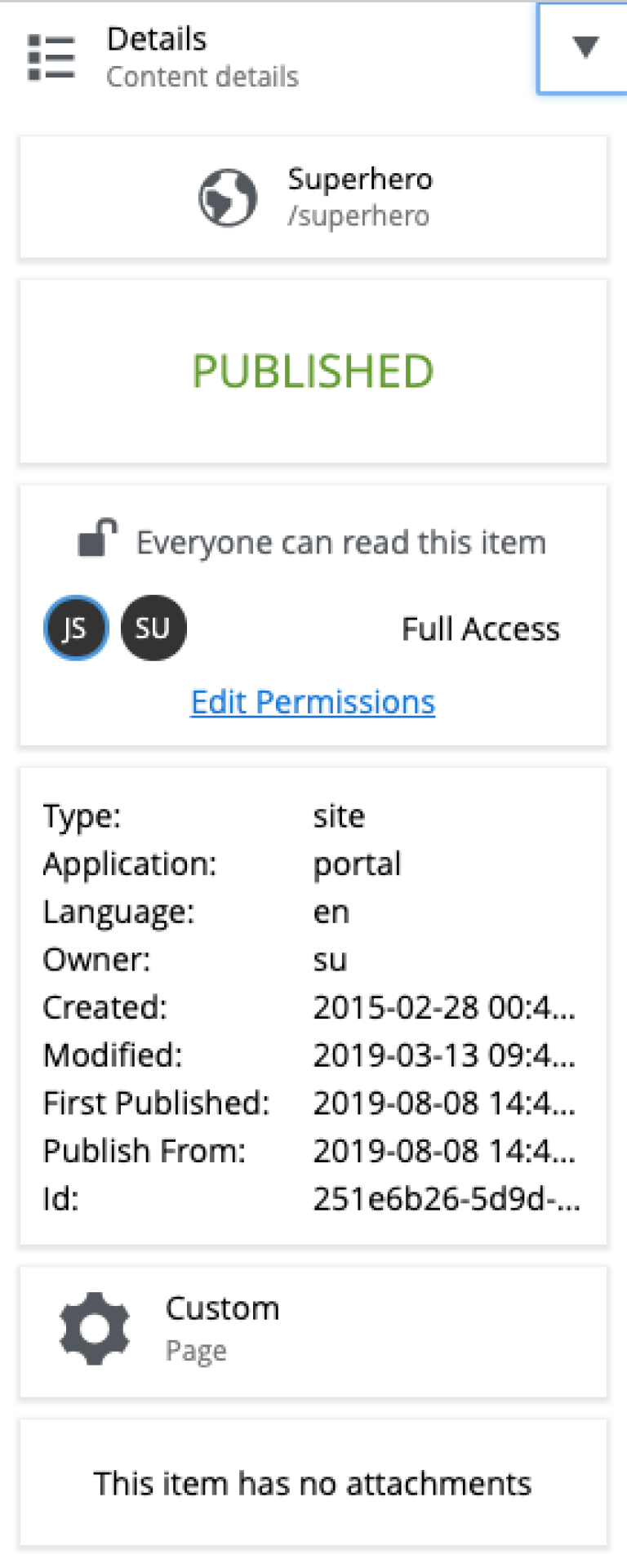
Details
The details widget will show some basic information about the selected component, including location, status, permissions, basic meta data, component type and attachments.
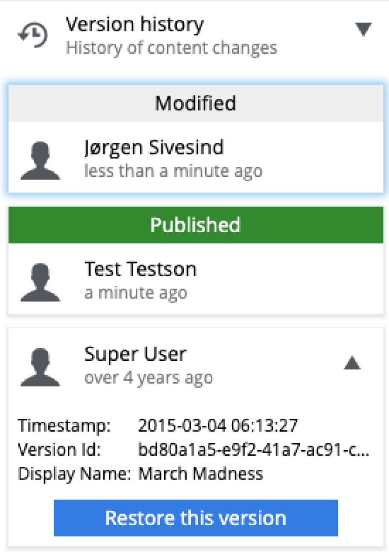
Version History
This widget lists all versions of the selected content, highlighting the published version, if there is one, and makes it possible to restore old versions.
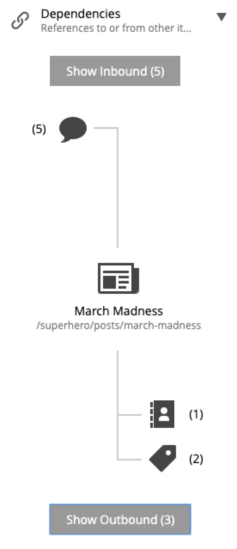
Dependencies
Here are two quick links to content that are referencing the current content (inbound) and content that the current conntent is referencing (outbound). Click on either box to see the content in a new window.
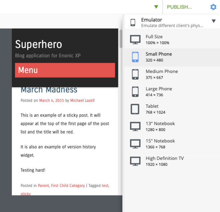
Emulator
This widget has buttons for emulating various sized devices. The page editor will shrink and expand to fit the selected device size.