Page Editor
Contents
The page editor is a modifiable preview of the content page that will open automatically when a content that has a supporting page template is created or edited. It is used in conjunction with the Context Panel to add, remove, and move components around the page with drag and drop. The page editor can be closed and reopened with the icon on the far right of the toolbar that looks like a computer monitor.
Selecting controller
As being said earlier, the live edit is not visible for the content, that can’t be rendered as a page, such as Folder, Image or a Shortcut.
The live edit will be shown, but not available for the Site without at least one application, that provides template or controller.
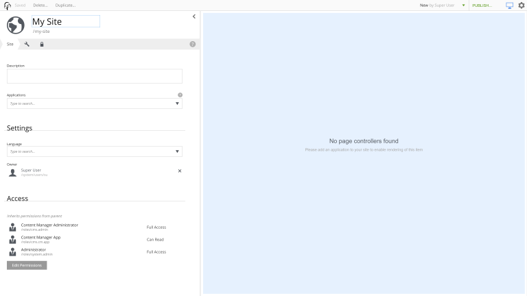
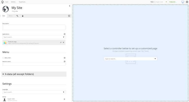
If there is at least one application, but the template was not set automatically, the dropdown with the list of available templates and controllers will appear.
Editing page
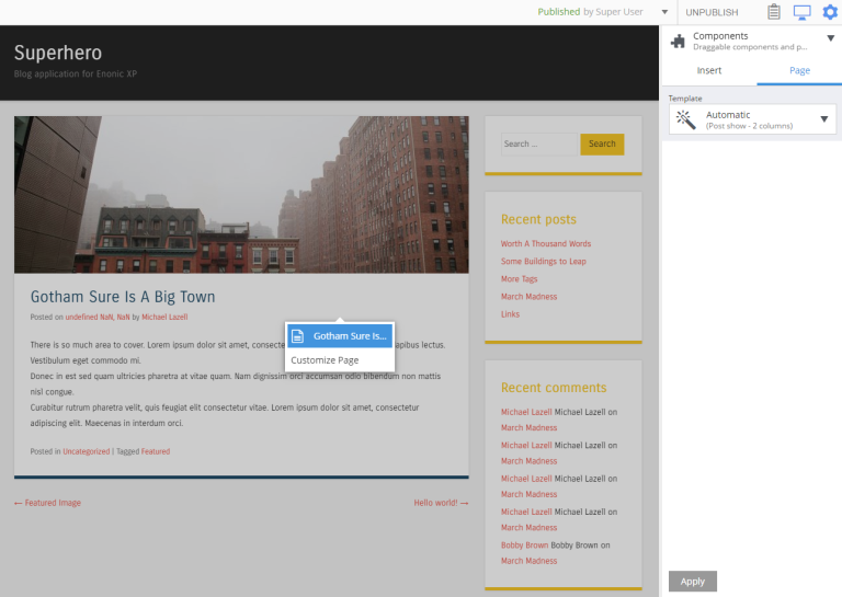
The page with the automatic template is disabled for editing. Clicking on it, or inside the Components View will show the menu with the option to enable the editing.
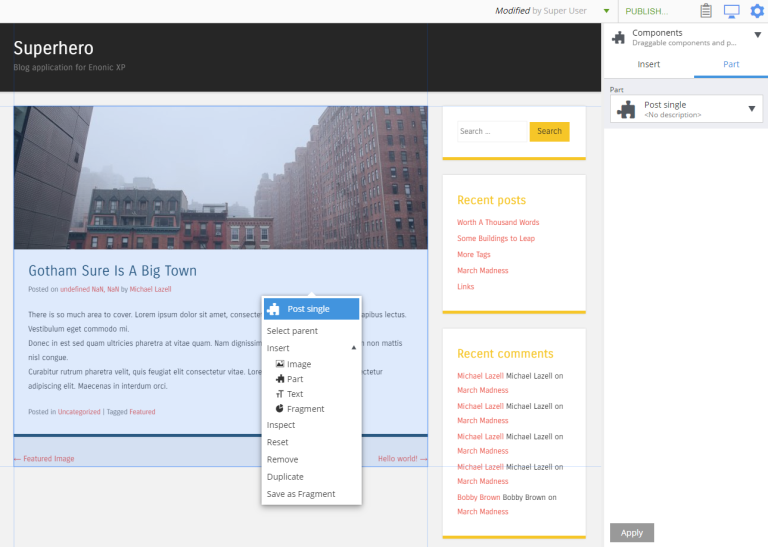
A component can be selected in the page editor by clicking on it. This will highlight the selected component and show its configuration in the inspect panel. Right-clicking a component will open a context menu with various actions that can be performed on the component. These options may include Select parent, Insert another component, Inspect its configuration, Reset the component’s configuration, Remove the component, Duplicate it, and Save as fragment.
For the Fragment component, the last action will be replaced with the Detach from fragment and the Edit action will be added.
Components View
This tool opens in a draggable internal window activated by the clipboard icon in the toolbar. It displays a hierarchical tree representation of all the components and regions on the page, including the page itself. This tool is extremely valuable in situations when an unconfigured component does not render or content structure is complex or device resolution is very small.
Selecting a component in the tree will highlight the component in the page editor and display its configuration in the Components widget. The triangle on the right of each component will open a menu of options that can be selected for the component. This menu completely replicates the menu, described in the previous section.
Components can be rearranged directly in the tree with drag’n’drop function.
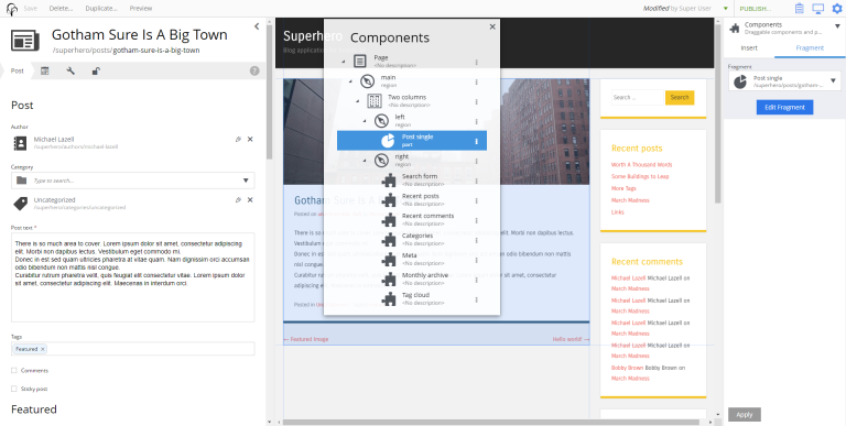
In the image below, a part named Post single is selected in the Components view and the part is highlighted with a blue mask at the center of the page editor. The Post single’s configuration is visible in the components widget on the right.
Page Editor widgets
When Page Editor is available, you’ll have access to all default widgets, including Emulator and Components widgets.