Release Notes
Contents
2.2.0
Configurable headings in HTML Area input type
By default all types of heading tags (<h1>… <h6>) are allowed in HTML area inputs. From version 2.2.0 allowed headings can be configured via HTMLArea input type config.
Customized headings
<content-type>
  <display-name>Html Area</display-name>
  <form>
    <input name="htmlarea_text" type="HtmlArea">
      <label>HTML Area with limited allowed headings</label>
      <occurrences minimum="0" maximum="0"/>
      <config>
        <allowHeadings>h2 h4 h6</allowHeadings>
      </config>
    </input>
  </form>
</content-type>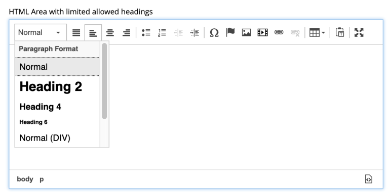
Improvements in HTML Editor
-
Paste mode
New toggle button  in the HTML Editor toolbar allows toggling between "formatted text" (default setting) and "plain text" modes when pasting text into the editor.
-
Fullscreen mode
Improved look and feel of the Fullscreen mode makes editing a pleasant experience, especially on small screen devices.
-
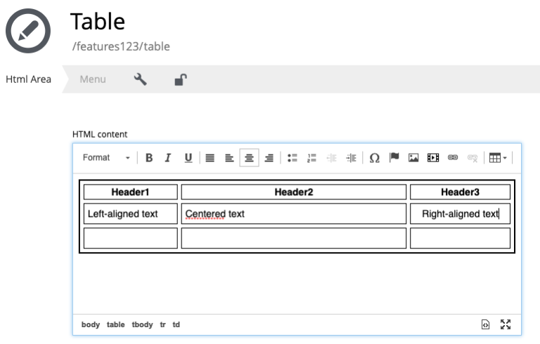
Changes in the "Table Properties" modal dialog
-
New "Caption" property in the "Table Properties" modal dialog allows adding caption for a table.
-
Border, Cell spacing and Cell padding properties have been removed. These properties should be set via stylesheets.
-
-
Misc changes
-
Cursor position is kept when switching to the "Fullscreen" mode
-
Cursor position is set to clicked position after user clicks inside HTML Area input to start editing
-
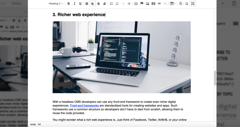
Toolbar buttons for B (Bold), I (Italic) and U (underline) are removed inside HTML Area input type to give room for the new paste mode button. Keyboard shortcuts should be used to apply this styling. They are still present in Fullscreen mode and inside Text component editor.
-
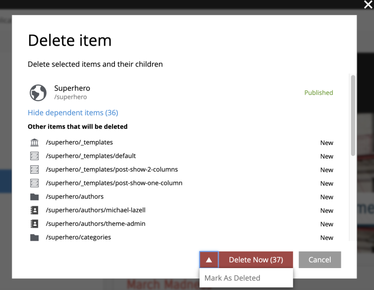
Improved content deletion
"Delete content" dialog has been improved to give better user experience when deleting published content. Delete button is turned into menu button with "Delete Now" as default action which will instantly delete published content. To mark selected content as deleted instead of instant deletion, expand the dropdown and select "Mark as deleted" from the menu. Offline content will always be deleted instantly, as before.
2.1.0
Content Workflow
Content Workflow is a process that helps web editor to get content through its entire lifecycle, from the moment of creation all the way to publishing. Checks on different workflow stages ensure that content doesn’t get published while it’s invalid or before it’s finished, and that it can be verified and published by a different user with sufficient permissions.
Read more about Content Workflow here.
Publish Requests
Publish Request is a stage of the Content Workflow when web editor has finished work on the content and requests its publishing from a different user(s) with sufficient Publishing permissions. Each request describes the changes to be published, which items will be published, and optional publishing schedule.
Read more about Publish Requests here.
Customizable placeholder for the Display Name field
When a new content item is created, default placeholder text for the Display Name field is "<Display Name>". From version 2.1.0 this text can be customised with new display-name-label field in the content type schema:
Customize display name field placeholder
<content-type>
  <display-name>My Content Type</display-name>
  <display-name-label i18n="displayName.placeholder">Some cool text here</display-name-label>
</content-type>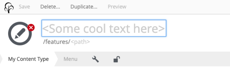
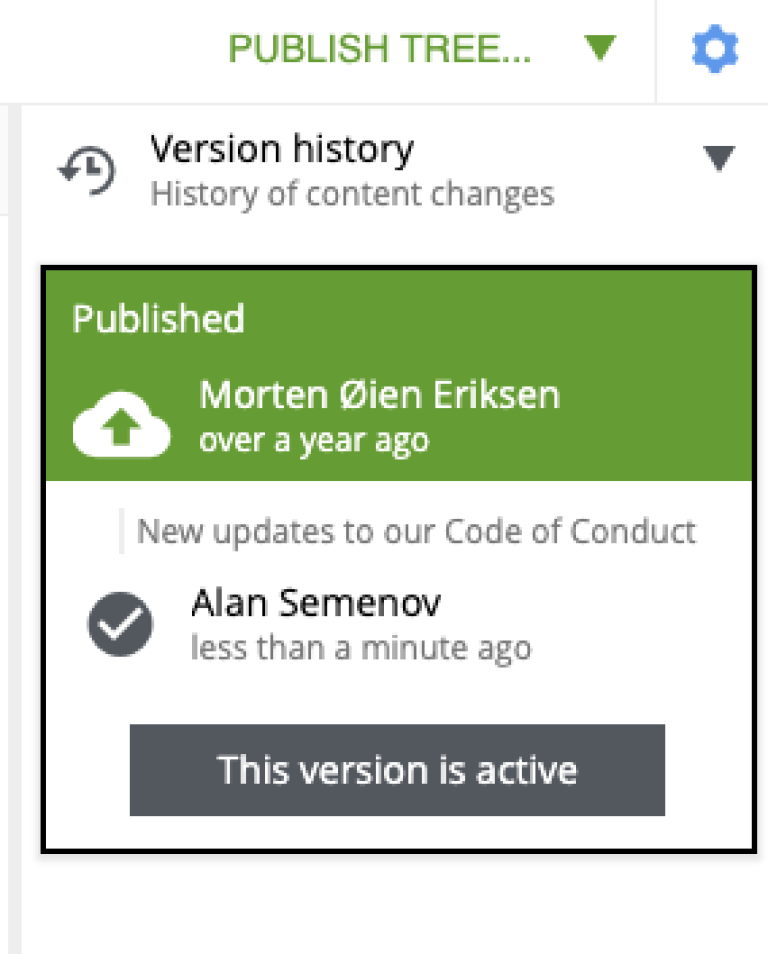
Publish Message
From version 2.1 publishers can specify optional message in the Publishing Wizard to describe the changes they are about to publish.
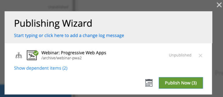
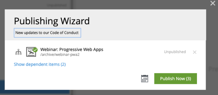
If specified, publish message will be shown in the Version History widget, which has also been completely revamped in Content Studio 2.1.
2.0.0
Until the release of Enonic XP 7 the Content Studio app used to be a part of the XP distribution package. Content Studio 2.0 is the first version released on Enonic Market separately from XP. It is compatible with XP 7.0 and will not work with earlier versions. This release includes some important features, as well as a number of major improvements and bugfixes.
Context panel
In previous versions Context panel (previously "Detail panel") was available only in the Browse Content view. Starting from version 2.0, the panel is available in the Content Edit view as well. User can now access widgets without having to switch to or open the Browse view. The panel can be opened and closed by clicking the cog icon in the top right corner of the view.
Compared to the Context panel available in the Browse Content view, in this view the panel adds the widget for managing selected content, such as adding new components to the page or configuring existing page components.
You can find more information about the Context Panel and widgets in the dedicated section.
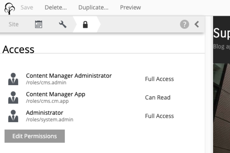
Icons in the Content Wizard form navigator
Schedule, Settings and Access steps of the Content Wizard form are now represented with icons in the navigator toolbar, to separate them from the custom steps of the form. Clicking the icon would scroll the form down to selected step.
Unlocked lock icon for the Access step means that this content is accessible by everyone (user Everyone has at least "Can Read" permissions). Locked lock icon means that read access is limited.
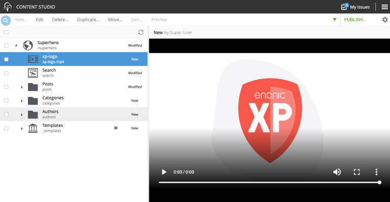
Attachment preview
Content Studio 2.0 enables automatic preview of the media content (video, audio, PDF, DOCX etc.) directly in the preview panel.
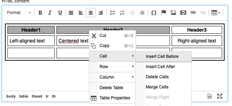
Improved table features in the Rich text editor
Table features in the Rich text editor have been greatly improved and now enable changing column width, cell spacing/padding and border width via "Table Properties" modal dialog (right-click the table and select "Table properties" from the context menu).
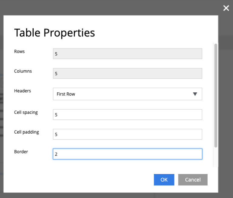
The same context menu can be used to add and delete rows and columns, merge several cells into one etc.
Relative image width in the Rich text editor
Image dialog of the Rich text editor now allows user to adjust relative width of the image. Check off "Custom width" checkbox in the modal dialog and adjust the width using the drag control.
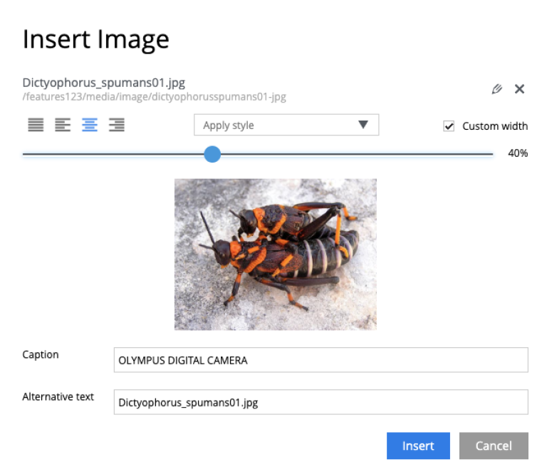
Image styles
Content Studio 2.0 introduces a new feature in the rich text editor called "Image styles". Image styles consist of both client side styling (css), and image service rendering specifications.
The rich text editor was previously limited to pre-defined and hard-coded styles, such as cinema (21:9) or square(1:1). Now, application developers may define custom styles that control both server side rendering aspect ratio, and specify classes to annotate the specific image.
Read more about defining custom image styles in the dedicated section.
New "inline" mode for content preview inside Content Studio
XP 7.0 introduced a new value for portal rendering mode (mode field in the HTTP request object). In addition to edit (when content is being edited in the Page Editor), preview (preview of a draft version) and live (preview of a master version), when content is rendered in the preview panel of the Content Studio the request.mode will have a value of inline.
Limiting Tag input to specific path
Previously, Tag input always allowed tags from all available content in the repo. Now tags are by default limited to current site. You can use allowPath config to adjust this limit and allow content outside of the current site.
Allow tags from other sites
<input name="MyTag" type="Tag">
  <label>Tags for this content</label>
  <occurrences minimum="0" maximum="0"/>
  <config>
    <allowPath>*</allowPath>
  </config>
</input>
Descriptions for content types, page and page component descriptors
XML schemas of content types, pages and page component descriptors now support optional description field which, if filled, will be shown in the Content Studio UI.
Content type description
If set, content type description will be shown under display name inside the "New Content" modal dialog.
Description in content type schema
<content-type>
  <display-name>Author</display-name>
  <description>Create authors to be selected on blog posts</description>
  <form/>
</content-type>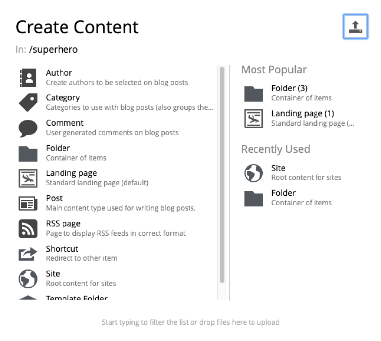
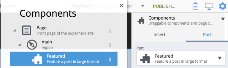
Page description
If set in the page descriptor schema, page description will be shown under page root in the Page Components tree and also the page descriptor dropdown inside the Inspect component widget.
Description in page descriptor schema
<page>
    <display-name>Page</display-name>
    <description>Front page of the Superhero site</description>
    <form/>
    <regions>
        <region name="main"/>
    </regions>
</page>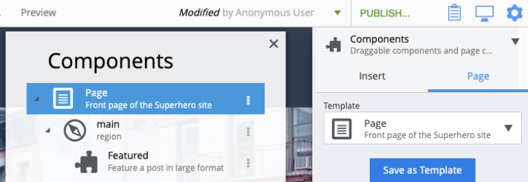
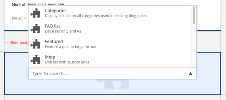
Part or Layout description
If set in the component schema, description will be shown under component’s display name in the Page Components tree and components descriptor dropdowns. Description is supported for layouts and parts.
Description in component descriptor schema
<part>
  <display-name>Featured</display-name>
  <description>Feature a post in large format</description>
  <form/>
</part>