XP content studio - pages, parts, regions and content
Contents
So far, we’ve used a "raw" XP Page and just rendered the react component directly from the controller there. It’s fine in itself, but not really making good use of XP’s excellent CMS powers. So let’s move into that territory!
TL;DR
Naturally, this example will focus quite a bit on XP Content Studio and how to use Parts, Pages, Regions and Templates. If this is familiar to you, you can pretty much just skim through it.
The key takeaways are:
1. render works the same way from any controller, and independently: - A Region in a React4xp-rendered Page can contain any kind of Component (React4xp-rendered or not). - And a React4xp-rendered Component can be placed inside the Region of any kind of Page (React4xp-rendered or not).
2. React4xp comes with an importable <Regions> react component for making XP Regions inside rendered output, - One caveat: Regions work best when server-side rendered. Specifically: using ssr = false when React4xp-rendering a Region can cause the components inside the Region to drop their page contributions. This can break rendering and/or functionality of the Components inside - both React4xp-type and other kinds.
3. Each time the rendered page contributions make the browser call hydrate or render, an independent top-level react root app is created in the browser - so a page can easily have more than one react root app.
|
This last point means: if you use React4xp to render an XP Region in a Page/Layout, and insert a React4xp-rendered Part into that Region, this is NOT the same as the regular react way of importing and nesting one react component inside another, within the same app. The Page/Layout controller will create one react app, and the Part will be another one. So be sure to structure your react app(s) to be self-contained, with an entry at the top level of each. This is especially important for functionality that’s shared inside one app, across react components - for example react context providers). |
Lesson overview
React4xp don’t need to render from a Page controller, but can also render from XP Part or Layout controllers, creating react-rendered XP elements that can be dragged into any regular XP Region. And besides, React4xp can (serverside) render these XP Regions themselves, which can then accept any XP Parts/Layouts dropped into them (as well as Fragments, Text and Image components of course).
In this example, we’ll do both:
-
Make a react-rendered general XP Page Controller with a working XP Region.
-
Make a react-rendered XP Part that can be dragged into the Region.
-
In addition, we’ll display it in the "regular XP way": using a Page Template to connect a Content Type to our new Page controller. This way, in this example and the next ones, we can just create content items of that type and have the Page controller up and running immediately instead of having to set it up manually each time.
site/content-types/
  my-content/
    my-content.xml

site/pages/
  default/
    default.xml
    default.ts
    default.tsx

site/parts/
  color/
    color.xml
    color.ts
    color.tsx
Template with React Page Controller
We’ll make a generic XP content type, then make a Template in Content Studio and connect the content type to a react-based XP Page, site/pages/default/, which is just a bare-bone page with nothing but a Region in it.
|
The Page controller default can be made from scratch, or you can copy site/pages/hello-react and change the copy (don’t delete hello-react.jsx just yet, we’re going to re-use it later). If you copy and modify, just remember this as usual: name the the folder and file names identically. |
Code
Content Type
Start with a completely generic content type: site/content-types/my-content/my-content.xml. Content types tend to define more than this, but for now, this is all we need:
<content-type>
  <display-name>My Content</display-name>
  <description>Just some content</description>
  <super-type>base:structured</super-type>
  <form/>
</content-type>
Again, this content type has nothing to do with React4xp, but it’ll make the setup of this and the next examples easier.
XP Page definition
The page definition is simple. We’re now leaving the <form> node empty, but adding a <regions> node with a single "main" Region defined in it:
<page>
  <display-name>Default page</display-name>
  <description>Default react-rendered Page controller</description>
  <form/>
  <regions>
    <region name="main"/>
  </regions>
</page>
React component
This react component has a single focus, namely rendering the Region.
|
We’re going to make a page controller with a react-rendered XP region and insert react-rendered components into the region, just to show how to react-render XP pages, parts and regions. But React4xp doesn’t depend on this structure, it works fine with other, "regular" XP components. As long as you follow the general patterns here, you can use parts with React4xp components inside any old XP region (e.g. from Thymeleaf), and the other way around - render XP regions with react and insert any XP components into them. |
import React from 'react';
import Regions from '@enonic/react-components/Regions'; (1)


export default (props) => (
    <div className="default-page">
        <Regions {...props} /> {/* <2> */}
    </div>
);| 1 | Importing a Region template from an NPM package that comes with React4xp (@enonic/react-components). |
| 2 | Nesting the Region in our component. To be precise: it uses props.regionsData and selects the Region name(s) in props.names, so it will render all Regions given by props if more than one is defined and selected. |
Page controller
The props of course come from the Page controller. Still similar to the previous examples, we’re mainly just adding props that are needed by <Regions> in the react component.
import {getContent} from '/lib/xp/portal';
import {render} from '/lib/enonic/react4xp';

export function get(request) {
    const content = getContent();
    const entry = content.page;

    const id = `react4xp_${content._id}`;   (1)

    const props = {
        regionsData: content.page.regions,  (2)
        names: "main",                      (3)
        tag: "main",                        (4)
    };

    return render(
        entry,
        props,
        null,                               (5)
        {
            id,
            body: `
                <html>
                    <head>
                        <title>${content.displayName}</title>
                    </head>
                    <body class="xp-page">
                        <div id="${id}"></div>
                    </body>
                </html>
            `
        }
    );
};| 1 | The XP content ID is nice and unique, let’s just use that to bind the react component to the target element in the DOM. |
| 2 | Here, content.page.regions are content data containing the Region we defined in default.xml as well as data about content dropped into it. This is mapped to the regionsData prop. |
| 3 | The names prop can be a string or a string array. It’s used to select which Regions (by Region name defined in default.xml) to render, in case there are more Regions in content.page.regions. Rendering will occur in the order of the string array. If the names prop is missing, all the regions defined in default.jsx are rendered (so we could technically skip this prop here), but the order is less predictable if there’s more than one Region. |
| 4 | The optional tag prop sets which HTML tag will be at the root of the section rendered by <Regions>, instead of <div>. Here, we’re going for <main>. |
| 5 | We’re setting the request argument of render to null - switching off the auto-handling of how this particular rendering is done inside/outside Content Studio, and just forcing render to always output a static, serverside rendered HTML body without page contributions. But why? Two reasons:
|
Adding an XP Region to a Layout is the same, only easier: since it will be injected inside a Page, you don’t need to add an outer body in the options parameter, and therefore you don’t need an id parameter either - same as in the XP Part controller below. |
Setting up the Template
Before we move on to the XP Part, we need to bind this Page controller to the my-content Content Type we just made, in the regular XP way: a Page Template.
This lays the foundation for this example and also the later ones. When this is done, using the default Page controller will be easy: create a new my-content item in your site, and it will come out ready to use with the Region from default.
-
When you’ve deployed the updated app and logged into Content Studio, make a new Site content and connect it to the React4xp app (or re-use one of your previous ones).
-
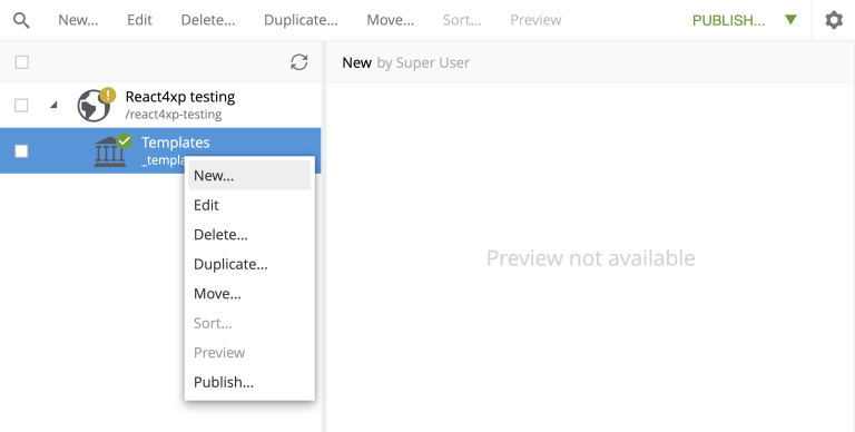
In the grid (Content Studio browse mode), under your Site, create a new Template content under Templates:
-
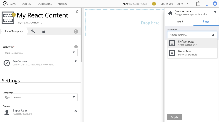
When editing your new Template, give it a display name, select your new content type my-content in the "Supports" drop-down menu on the left, and select the new Page controller Default under the "Template" (or "Page controller") drop-down menu on the right:
-
Apply/save and you’re done. Now every new myContent item in every site with this Template will be rendered with the default page controller.
XP Part
Now we’re ready to add a simple react-rendered Part to drop into the Region: site/parts/color/ .
Code
Part definition
The Part definition is still pretty unremarkable. There’s just a color TextLine input field in the form:
<?xml version="1.0" encoding="UTF-8" standalone="yes"?>
<part>
    <display-name>Color part</display-name>
    <description>React4xp rendered part with editorial color</description>
    <form>
        <input name="color" type="TextLine">
            <label>What's the color of the thing?</label>
            <occurrences minimum="1" maximum="1"/>
            <default>red</default>
        </input>
    </form>
</part>
React component
The react component only displays the color name from the props and inline-styles it with that color (as long as the props.color value is HTML-compliant):
import React from 'react';

export default (props) => (
    <div style={{
        border: `1px solid ${props.color}`,
        margin: "8px",
        padding: "8px",
        borderRadius: "10px"
    }}>
        <p style={{color: props.color}}>Hey, I'm pretty {props.color}!</p>
    </div>
);
Part controller
Like before, the controller mainly hooks the XP editorial data into the props:
import type {PartComponent} from '@enonic-types/core';


import {getComponent} from '/lib/xp/portal';
import {render} from '/lib/enonic/react4xp';


declare global {
  interface XpPartMap {
    ['com.enonic.app.samples-react4xp:color']: {
      color: string
    }
  }
}


export function get(request) {

  const component = getComponent<PartComponent<'com.enonic.app.samples-react4xp:color'>>();
  const {color} = component.config;
  const props = { color };

  const response = render(
    component,
    props,
    request,
    {                               (1)
        ssr: false,                 (2)
        pageContributions: {        (3)
            bodyEnd: `<script nonce="rAnd0m">console.log("The color of the thing is: ${color}");</script>`
        }
    }
  );

  // Allow execturing the script tag we added above:
  response.headers = {
    'content-security-policy': `script-src 'self' 'nonce-rAnd0m'`
  };

  return response;
}| 1 | In the options argument (the object with ssr and pageContributions), notice how we’re not adding body or id like we did before. body is only needed for the controller to add HTML around the rendered react - if you skip it a target container <div> will just be generated for you. With an autogenerated container, the ID will match either way: you can still set the ID value with the id option, or skip it and just let React4xp supply a unique ID. For details, see the React4xp.render API. For that matter, we don’t even need the options argument here at all - it could be completely skipped… |
| 2 | …but for demonstrating, let’s use it to show that this Part is independent (from both the default Page we defined a moment ago, and from any other Parts dropped into the same Region, react or otherwise), by clientside rendering the Part… |
| 3 | …and adding a tiny color-logging script with the Part. This is done by using the options parameter to pass pageContributions through render, the same way we’ve passed body through it so far. |
Setup and render
Time to get this displayed and see it all in action! Again, just XP routine: creating a my-content item, and since the Template makes it show up ready with a default Page controller and Region, we can just drop our new color Part into it.
-
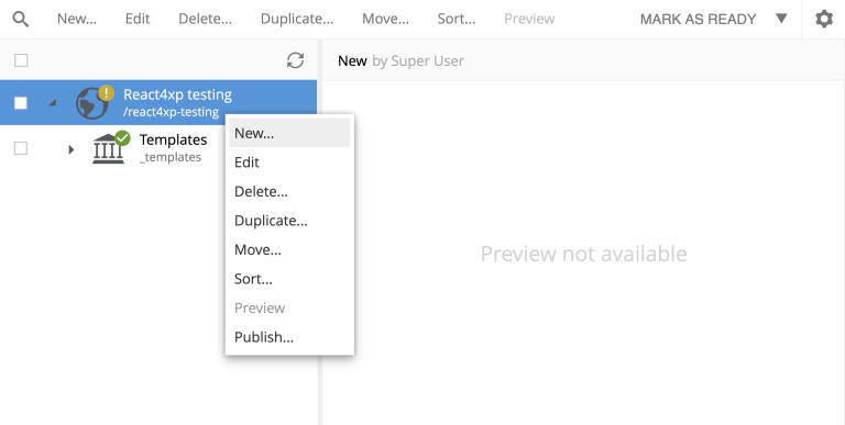
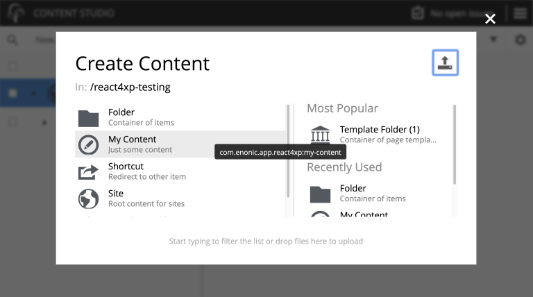
As before, recompile/deploy and enter Content Studio. In the same Site as the Template you just made (but not under Templates), create a new my-content item:
-
When you edit the new content, the preview panel with a dash-bordered "Drop here" area should appear on the right. This is the default Page controller rendering the initially empty Region. To the far right, there should be a config panel with the "Insert" tab (if you can’t see them, use the screen and cogwheel icons on the top right):
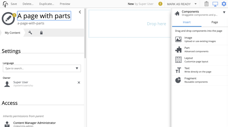
-
Drag "Part" from the config panel into the Region. In the dropdown menu ("Type to search…") that appears in the Region (or the "Part" dropdown menu now on the right), select your new color Part. It should now appear correctly rendered in the preview panel (occasionally, you might need to Save and refresh the page). The config panel for editing the settings of that particular part should appear on the far right (if it doesn’t, click the part itself: "Hey, I’m pretty red"):
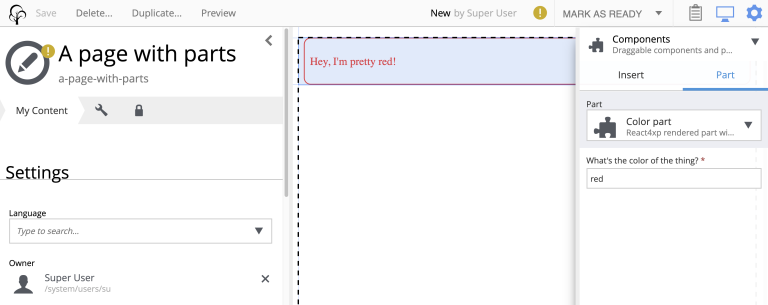
-
Try experimenting with dragging other XP components from the "Insert" tab into the Region. Say, a Text component, and/or adding another instance of the same color Part but with a different (HTML-compliant) color value in the Part config panel. You’ll see that the react-rendered Region accepts all regular XP components and that multiple instances of the same color Part remain independent of each other.
-
As usual, clicking Preview on the top will open a new Preview tab for your page.
Output
We won’t go into the details about the HTML output anymore - it’s structurally and conceptually the same as in the previous examples. Looking at the Page Source, it should all make sense to you by now: the Page controller and Part are compiled to separate assets and downloaded exactly once in the client before calling render and hydrate as needed (using a React4xp Part more than once does not make the client download the assets more than once - they’re recycled for performance).
|
Each time the client calls (*) Remember from the code explanation of our Page controller that (And just for the record, there is an alternative renderer: |
Now we’ve covered the basics of how to use React4xp. It’ll be enough for most simple setups and use cases.
Moving on from here, we’ll take a look at more advanced ways to use React4xp, giving you more control.