Part components
Contents
Part components are similar to layout and page components, but do not support regions.
Introduction
Parts are leaf-nodes in the component structure. Parts are typically used in combination with forms, and have a vast range of application areas.
Usage
Like pages and layouts, parts needs a descriptor. Place the descriptor in your project as follows: src/main/resources/site/parts/<part-name>/<part-name>.xml`.
Each part may also declare a form using the schema system. The form data will be stored together with each component instance.
<part>
  <display-name>Content List</display-name>
  <form />
</part>
Custom icon
XP 7.2.0
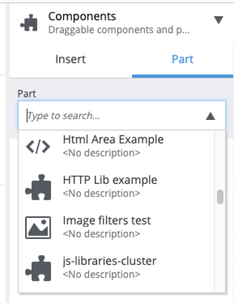
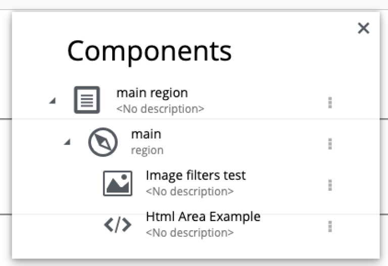
Parts support the definition of custom icon. The icon replaces the standard part icon when working in Content Studio. Simply place an icon (in either PNG or SVG format) in the part folder.
For example, if folder/part is called mypart then part descriptor is called mypart.xml and the icon file should be called either mypart.svg or mypart.png. In the screenshots below parts "HTML Area Example" and "Image filters test" are using custom icons.
Below are examples of what custom icons may look like in Content Studio.


Rendering
Parts can be rendered using your favorite front-end framework.
Visit the component rendering section for details on rendering parts with the Enonic Framework.