Regions
Contents
Usage
Regions are declared statically within other components. Below is a sample definition of a page component with a single region main:
Example - page component with a single region
<page>
  <display-name>The main page</display-name>
  <form/>
  <regions>
    <region name="main"/>
  </regions>
</page>
And here is a layout defining three regions:
Sample layout with three regions
<layout>
  <display-name>The main page</display-name>
  <form/>
  <regions>
    <region name="left"/>
    <region name="middle"/>
    <region name="right"/>
  </regions>
</layout>
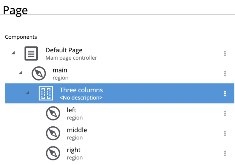
From Content Studio, this is what regions look like in the page form:

And here is what the the exact same structure might look like in the visual page editor.
| Ther dropzones are empty regions. |

Output
Using the Content API, you may access a JSON version containing the hierarchical structure of components and regions on the page.
Sample JSON from the Content api
"page": {
    "type": "page",
    "path": "/",
    "descriptor": "com.enonic.app.superhero:default",
    "regions": {
      "main": {
        "components": [
          {
            "path": "/main/0",
            "type": "layout",
            "descriptor": "com.enonic.app.superhero:three-column",
            "config": {},
            "regions": {}
          }
        ],
        "name": "main"
      }
    }
}| Empty regions are never persisted. Region names are only determined from the component path. |