Double - form item
Contents
Support high precision decimal numbers
Usage
- type: "Double"
  name: "my_double"
  label: "My Double"
  default: 3.89  (1)

- type: "Double"
  name: "angle"
  label: "Angle (rad)"
  min: 0  (2)
max: 3.14159 (3)| 1 | default can be any double-precision floating-point number, with the dot character as decimal separator |
| 2 | min optionally specifies the minimum allowed value |
| 3 | max optionally specifies the maximum allowed value |
Output
Value type: Double — not included in _alltext
{
"my_double": 3.89
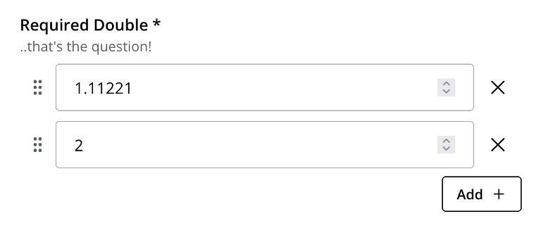
}Multiple occurrences
{
  "my_double": [
    3.89,
    2
  ]
}| Double is also capable of storing integer values, which are valid double-precision floating-point numbers. |