CheckBox input type
Contents
A checkbox field has a value if it is checked, or no value if it is not checked. Therefore, the only values for occurrences that makes sense is a minimum of zero and a maximum of one, which is default and may be skipped.
Appearance
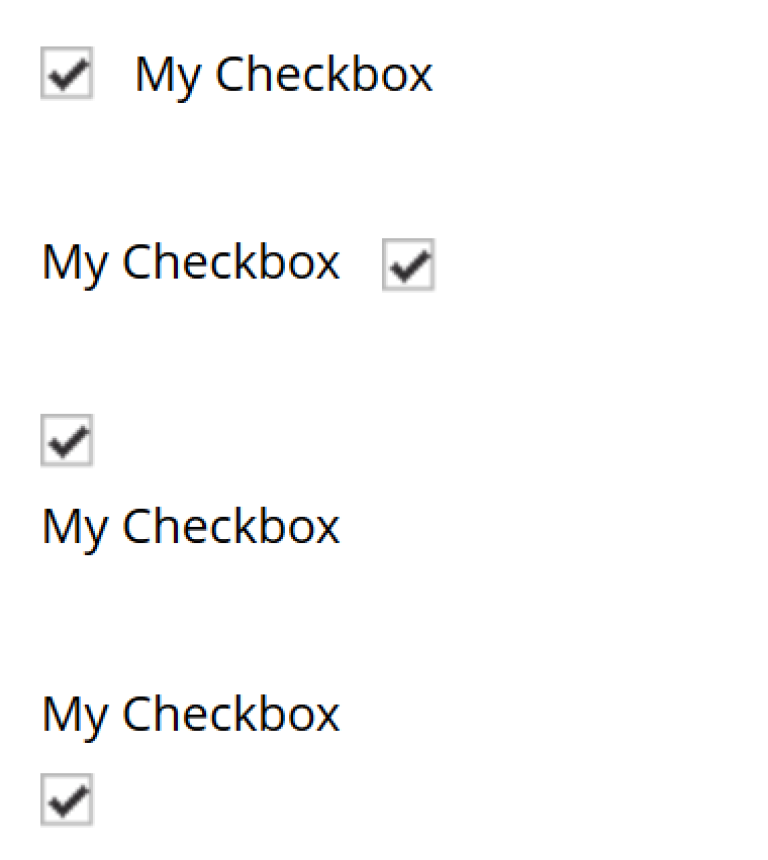
The below screenshot shows four variants of how a checkbox can be presented, based on use of alignment.
Usage
Sample definition with a default checked, right aligned checkbox.
<input  name="mycheckbox" type="CheckBox">
  <label>My Checkbox</label>
  <default>checked</default>  (1)
  <config>
    <alignment>right</alignment>  (2)
  </config>
</input>| 1 | default - Use checked to check it, default is unchecked. |
| 2 | alignment defines placement of checkbox relative to label text. Supported values are: "left", "right", "top", "bottom", default is "left". |