Parts
Contents
Enonic provides a highly customizable component type called parts and you actually have already created one called Paragraph in the previous chapter! Similar to page components, parts must be defined in both Enonic and Next.js in order to fully work.
Task: Add part to Enonic
We’ll start off by adding a simple component that lists child items in the tree structure.
-
Verify Enonic app (not the Next.js frontend) has the
child-listpart descriptor at:src/main/resources/cms/parts/child-list/child-list.yamlkind: "Part" title: "Child list" description: "Lists children of current item" form: - type: "ComboBox" name: "sorting" label: "Sort order" occurrences: min: 0 max: 1 options: - value: "displayName ASC" label: "Ascending" - value: "displayName DESC" label: "Descending" default: "displayName ASC"This component also contains a form, similar to content types. This means editors can configure it - sorting the items Ascending or Descending. Build and redeploy your Enonic app once more if it didn’t have it to make the new part available in Content Studio (happens automatically if you started
enonic project dev). -
Add parts to the page
Back in Content Studio, edit the
/hmdb/personsfolder item. Expand the page preview section by clickingShow Context Panelicon in the top right corner and selectPageextension in the dropdown. Then chooseMain pagetemplate to create a page. Now add a new part to the region (right-click → Insert, or drag-n-drop from theInsert panel`on the right hand side). Finally select theChild listin the part descriptor dropdown.The part will appear without making any changes to the front-end, this is because the Enonic Adapter contains fallback part rendering, as long as Next.js is running in DEV mode. 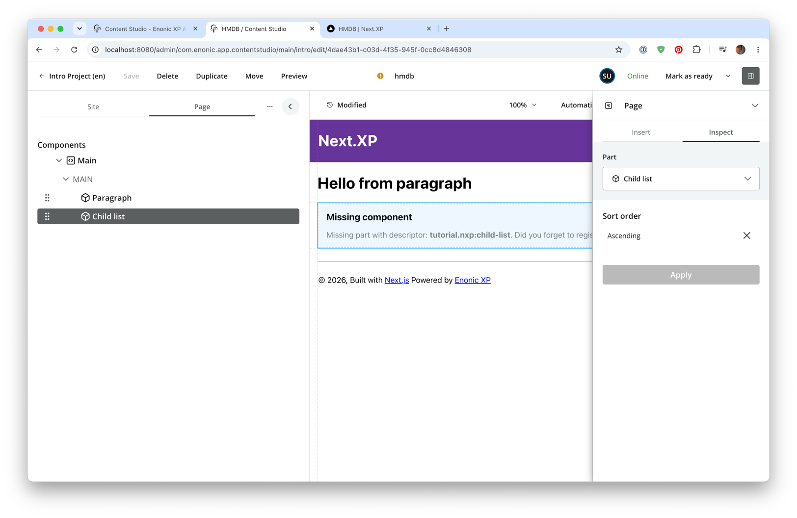
Task: Configure part rendering in Next.js
Heading over to the front-end, you must register a new component that supports rendering of this part.
-
Add the part implementation to the Next.js app
src/components/parts/ChildList.tsximport {Context, PartProps, VariablesGetterResult} from '@enonic/nextjs-adapter'; import Link from 'next/link'; import React from 'react' const FORBIDDEN_TYPES_REGEXP = "^media:.*|portal:fragment|portal:template-folder|portal:page-template$"; const ChildList = (props: PartProps) => { const {data, meta} = props; const children = data.get.children; if (!children || children.length === 0) { return null; } const prefix = meta.baseUrl + (meta.locale && meta.locale !== meta.defaultLocale ? meta.locale + '/' : ''); return ( <main style={{ margin: `0 auto`, maxWidth: 960, padding: `0 1.0875rem`, }}> { children && <ul>{ children.map((child: any, i: number) => ( <li key={i}> <Link href={prefix + child._path}>{child.displayName}</Link> </li> )) }</ul> } </main> ); }; export default ChildList; export const getChildList = { query: function (path: string, context?: Context, config?: any): string { return `query($path:ID!, $order:String){ guillotine { getSite { displayName } get(key:$path) { displayName children(sort: $order, first: 50) { _path(type: siteRelative) _id displayName type } } } }` }, variables: function (path: string, context?: Context, config?: any): VariablesGetterResult { return { path, order: config?.sorting } } }; export async function childListProcessor(data: any, context?: Context, config?: any): Promise<any> { // exclude forbidden types data.get.children = data.get.children?.filter((child: any) => !child.type.match(FORBIDDEN_TYPES_REGEXP)); return data; } -
Then, register the components in _mappings.ts:
Update _mappings.ts with the following new lines:
src/components/_mappings.tsimport ChildList, {childListProcessor, getChildList} from './parts/ChildList'; // Part mappings ComponentRegistry.addPart(`${APP_NAME}:child-list`, { query: getChildList, processor: childListProcessor, view: ChildList });As you may have noticed this component has a query, a view and a processor. Processors are optional JavaScript functions that can do whatever you need it to. For instance fetch data from another source than the CMS, or post-process the query response before it is passed to the view etc.
The Enonic adapter will execute the query, pass the result via the processor, and then to the view which renders the component.
Like macros, all page components support configQuery. Here though, ifconfigQueryis omitted, theconfigprop will fallback to the raw form values viaconfigAsJson.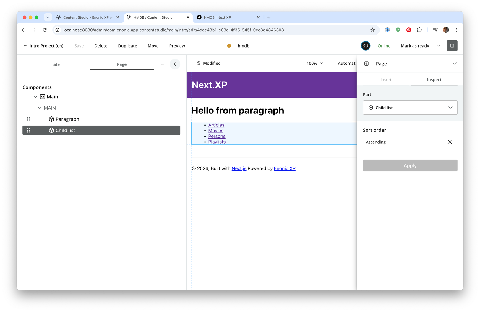
Try customizing the part configuration and see what happens.
Optional Task: The heading part
For more components to play with, you may add another part:
-
Verify Enonic app (not the Next.js frontend) contains the Heading part descriptor:
This part definition includes a form, with an input field called
heading.This makes it possible for editors to override the heading (aka displayName) coming from the content item.src/main/resources/cms/parts/heading/heading.yamlkind: "Part" title: "Heading" description: "Demo heading" form: - type: "TextLine" name: "heading" label: "Override heading"Redeploy the Enonic app if it didn’t have it and add the part to your page (happens automatically if you started
enonic project dev). -
Add the heading component in Next.js.
src/components/parts/Heading.tsximport React from 'react' import {APP_NAME, PartData} from '@enonic/nextjs-adapter'; // fully qualified XP part name: export const HEADING_PART_NAME = `${APP_NAME}:heading`; export interface HeadingData { part: PartData; common: any; } const HeadingView = ({part, common}: HeadingData) => ( <h2>{part?.config?.heading || common?.get?.displayName}</h2> ); export default HeadingView;Add the following lines to _mappings.ts:
src/components/_mappings.tsimport Heading from './parts/Heading'; // Part mappings ComponentRegistry.addPart(`${APP_NAME}:heading`, { view: Heading });You should now have three configurable parts to play with.
In the next chapter you will make page composition even more interesting, with the introduction of layouts.