Content navigator
Contents
The navigator is the default page of the Content Studio. It consists of Menu Toolbar on top and two or three panels underneath. On the left is the Content tree grid where all the sites and content can be found. To the right of the tree grid is the Preview panel which displays a preview of the selected content. On the far right is the Widgets panel that may be toggled on and off with the burger icon in the top right corner, next to the Publish button inside the Toolbar.
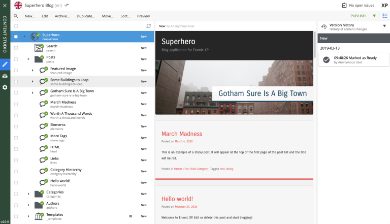
Toolbar
The Menu Toolbar in the Content Navigator has buttons for the following actions:
-
New: Opens the New content dialog for creating new content;
-
Edit: Opens the content for editing in a new browser tab;
-
Archive: Opens the Archive item(s) dialog for the selected content.
-
Duplicate: Makes a copy of the selected content;
-
Move: Opens the Move item(s) with children dialog;
-
Sort: Opens the Sort items dialog where child items of the selected content can be sorted;
-
Preview: Opens the selected content in preview mode, in a new browser tab. If more than one content is selected, each will open in its own tab. Only content that has a supporting page template can be previewed;
Action button on the right of the Toolbar is context-dependent and will have different main action depending on if content is selected, what state content has, permissions etc.:
-
If selected content is not published: Publish, opens the Publishing wizard dialog
-
If selected content is published: Unpublish, Unpublish Wizard dialog for taking the content offline
-
If selected content is published but has child items that are not published: Publish Tree, opens the Publishing wizard dialog with selected content and all descendants
-
If selected content has workflow state "In progress": Mark as Ready, to mark selected content as ready for publishing
-
If selected content is not published and current user doesn’t have publishing permissions: Request Publishing:, opens the Unpublish Wizard dialog for taking the item offline;
-
If no content is selected: Create Task, opens the New Task dialog

These options are also available in the context menu that appears when right-clicking on a content item in the tree grid panel.
Content tree grid
The content tree lists all the content that current user has read access to. Content can be organized and stored in a hierarchy with child content collapsed under parent content. Parent content will have a gray triangle to the left of the content icon that can be clicked to expand or collapse the view of its children.
The content tree can also be navigated with the keyboard arrow keys.
The top of the content tree has a button to refresh the tree and a checkbox to select (checked) or deselect (unchecked) all the content items in the grid.
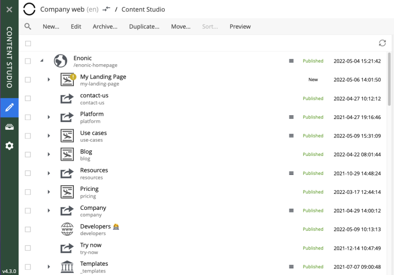
Information about the content is displayed in four columns. The number of columns may vary, depending on the content tree width.
-
The first column has an icon based on the type of content. A gray triangle will appear to the left of the icon if the content has children content. The column also has a display name and under this is the path name. The URL path to any content can be determined by following the tree grid path names from parent to child.
-
The second column shows the icon, representing the current sorting order of the content’s children.
-
The third column shows status of the content:
New,Published,UnpublishedorModified. -
The fourth column shows the date when content was last modified.
If the current user has only read access to a content item, such item will be slightly dimmed in the grid.
Checkboxes to the left of each content in the tree can be used to select more than one content. Group actions available in the menu bar will be performed on all the selected content. Some actions can only be performed on one content at a time.
Double-click on a content item will open it for edit in a new browser tab.
Right-click on a content item will expand its context menu.
Search Panel
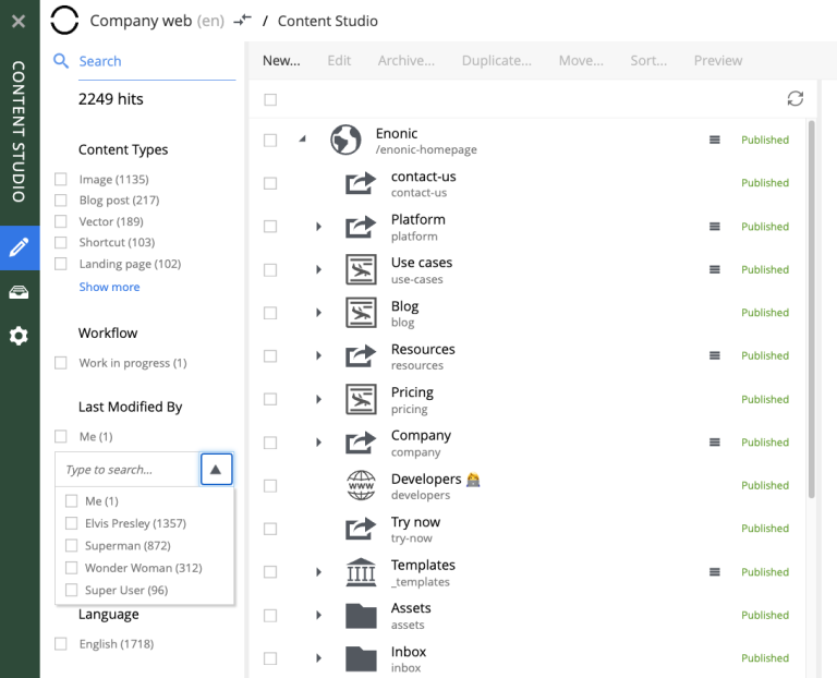
The search panel can be toggled with the magnifying glass icon at the far left of the menu bar. When opened, it has a text search field and categories to filter Content Grid by the following content properties:
-
Free-text search (by content Id, display name and path)
-
Workflow state (
Work in progress) -
Last modifier
-
Last modification date
-
Owner
-
Language
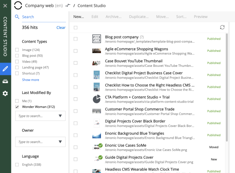
Search results are instantly updated in the tree grid as search parameters are changed. Children of matching content items will also be displayed in the tree grid but won’t be visible unless the parent node is expanded.
The number of hits will appear below the search field, along with a Clear button that will reset the filter.
Each content type that has at least one matching content will appear in the Content Types filter list with the number of matches in parenthesis (). Checking the box next to a content type will hide the results that do not match that type. Multiple content types can be selected. By default, only the 5 most popular content types will be shown, followed by "Show more" link to expand the entire list.
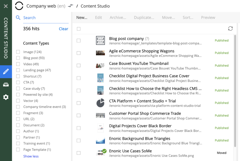
The Last Modified list works in a similar manner. It is used to limit results to content that has been modified in the last month, week, day or hour. This list may not appear if other search parameters have limited results to content that was modified more than a month ago.
Filter aggregations for Last modified by and Owner are dropdowns with the list of users who last modified content or are content owners. To simplify search for the current user, there’s Me checkbox in both aggregations which serves as an alias for the current user. Selected users will be displayed as checkboxes above the dropdown.
| Search results remain in the tree grid when the search panel is collapsed. Don’t forget to clear the search when you are done with your search. |
Preview panel
A preview of the selected content appears in the right-hand panel of the content navigator if page template supports the type of content selected. This is a working preview so links will take you to other pages and highlight the new page content in the content tree grid.
The Preview button in the toolbar will open the page in a new browser tab. When more than one content is selected in the content tree grid, the preview panel is replaced with a list of all selected content items. If the preview is for some reason unavailable the panel will indicate the reason with a message.
| Only the Draft version of content is visible in the preview panel. |
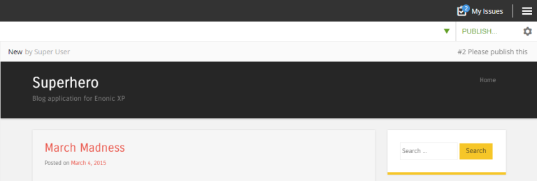
Preview panel has a toolbar which shows status and last modifier of the content, as well as the list of open publishing issues the content is currently a part of. The newest issue is shown by default and the entire list can be expanded via a dropdown. Clicking on the issue name will open the Issue Details dialog.
Widgets
Widgets are applications that expand the functionality of the Content Studio. As of version 7.0, there are five built-in widgets. All of them are described in the corresponding section of the docs.