Bonus: Layout components
Contents
Layouts are containers of other components that also support regions.
Two column layout
Unlike parts, layouts may contain regions. Here, we’ll define two regions, each working as columns in the final result. We’ll also throw in some configuration options so editors can control the sizes for each of those two columns.
Like for the parts and pages, layout consists of a descriptor, a controller and a view - which have already been set up in the special src/main/resources/site/layouts/ folder:
<layout xmlns="urn:enonic:xp:model:1.0">
  <display-name>Two columns</display-name>
  <description>A layout with configurable two columns</description>
  <form>
    <input type="ComboBox" name="sizes">
        <label>Column sizes</label>
        <occurrences minimum="1" maximum="1"/>
        <config>
            <option value="33_66">33/66</option>
            <option value="50_50">50/50</option>
            <option value="66_33">66/33</option>
        </config>
        <default>50_50</default>
    </input>
  </form>
  <regions>
    <region name="left"/>
    <region name="right"/>
  </regions>
</layout>
Notice that it doesn’t change much from what you’ve seen so far. It’s basically a mix of pages and parts.
import { LayoutComponent, LayoutRegion } from '@enonic-types/core';
import type { Response } from '/index.d';

// @ts-expect-error no-types
import {render} from '/lib/thymeleaf';
import {assetUrl, getComponent} from '/lib/xp/portal';

type LayoutDescriptor = "company.starter.myfirstsite:two-column"
type LayoutConfig = { sizes: '33_66' | '50_50' | '66_33' }
type Layout = LayoutComponent< LayoutDescriptor,LayoutConfig, {left: LayoutRegion, right: LayoutRegion} >

// Specify the view file to use
const VIEW = resolve('./two-columns.html');

// Handle the GET request
export function get(): Response {

  // Get the layout component
  const component = getComponent<Layout>();

  // Prepare the model that will be passed to the view
  const model = {
    sizes: component.config.sizes,
    leftRegion: component.regions.left,
    rightRegion: component.regions.right
  }

  // Prepare the response object
  const response: Response = {
    body: render(VIEW, model),
    pageContributions: {

      headEnd: [
        `<link rel="stylesheet" href="${assetUrl({ path: 'styles/two-columns.css' })}" type="text/css" />`
      ]
    }
  };


  return response;
}<section data-th-class="'two-columns two-columns--' + ${sizes}">
<div data-portal-region="left">
<div data-th-if="${leftRegion}" data-th-each="component : ${leftRegion.components}" data-th-remove="tag">
<div data-portal-component="${component.path}" data-th-remove="tag"></div>
</div>
</div>
<div data-portal-region="right">
<div data-th-if="${rightRegion}" data-th-each="component : ${rightRegion.components}" data-th-remove="tag">
<div data-portal-component="${component.path}" data-th-remove="tag"></div>
</div>
</div>
</section>Page contribution
To spice up the tutorial, we include some css which will only be available on pages where this layout exists. The following file has been placed in the assets folder:
.two-columns {
    display: grid;
    gap: 2rem;

    &--33_66 {
        grid-template-columns: calc(33.3% - 1rem) auto;
    }

    &--50_50 {
        grid-template-columns: repeat(2, calc(50% - 1rem));
    }

    &--66_33 {
        grid-template-columns: calc(66.6% - 2rem) auto;
    }
}
The scss file will be automatically built to css by the build system. |
To inject the CSS dynamically, we use a trick called pageContributions.
Its naming speaks for itself but, just for clarity, it’s a way for components to inject HTML on certain places within the resulting markup. Those places are on the <head> begin or end, or on <body> begin or end.
Study the TypeScript controller response above to see how the pageContribution is passed along with the response.
Using the layout
So far you’ve understood what a layout is and created the code for a two column layout. Let’s see it in practice by adding it to a page and using its regions.
-
Back in content studio edit the site content (root item) once more.
-
Insert the two-column layout in the main region:
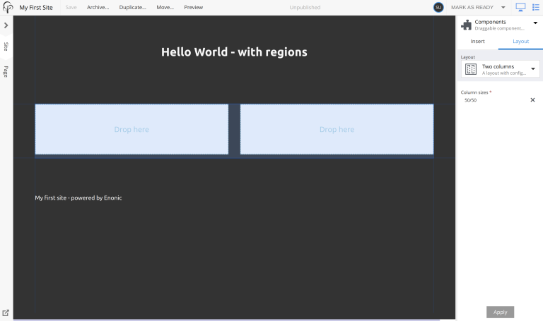
-
Add a text component to each region, and write some text:
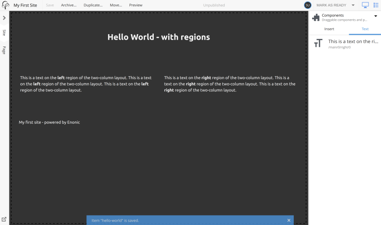
-
Finally, try switching between different configuration options
33/66,50/50and66/33(in the Inspect panel on the right) and check the results: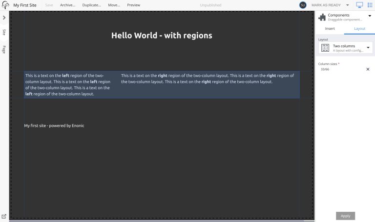
Summary
By combining content types, layouts, parts, pages and page templates, the sky is the limit for what you can build.
| For more details, dig deeper into layouts in the layout documentation. |
The journey so far has provided you a starting ground to build your first website. Let’s now take a look on how to go online!