Regions
Contents
Create component hierarchies with the power of regions.
Component dropzones
Content Studio also supports adding more components to a page. To get going, the page component must define one or more regions.
Complete the steps below to add a single region called main to the hello page component.
-
Start off by updating your page component descriptor. The new descriptor (below) statically declares the region:
src/main/resources/site/pages/hello/hello.xml<page xmlns="urn:enonic:xp:model:1.0"> <display-name>Hello Regions!</display-name> <description>Drag'n drop enabled</description> <form/> <regions> <region name="main"/> </regions> </page> -
Update your controller and view with the code below to support the region:
src/main/resources/site/pages/hello/hello.tsimport type { Response } from '/index.d'; // @ts-expect-error no-types import {render} from '/lib/thymeleaf'; import {getContent} from '/lib/xp/portal'; // Specify the view file to use const VIEW = resolve('./hello.html'); // Handle the GET request export function get(): Response { // Get the content that is using the page const content = getContent(); // Prepare the model that will be passed to the view const model = { displayName: content.displayName, mainRegion: content.page.regions.main } // Prepare the response object const response: Response = { body: render(VIEW, model) }; return response; }src/main/resources/site/pages/hello/hello.html:<!DOCTYPE html> <html> <head> <title data-th-text="${displayName}">Sample title</title> </head> <body> <header> <h1 data-th-text="${displayName} + ' - with regions'">Sample header</h1> </header> <main data-portal-region="main"> <div data-th-if="${mainRegion}" data-th-each="component : ${mainRegion.components}" data-th-remove="tag"> <div data-portal-component="${component.path}" data-th-remove="tag"></div> </div> </main> <footer>My first site - powered by Enonic</footer> </body> </html>Your sandbox should automatially pickup the changes, as we are running in dev mode.
-
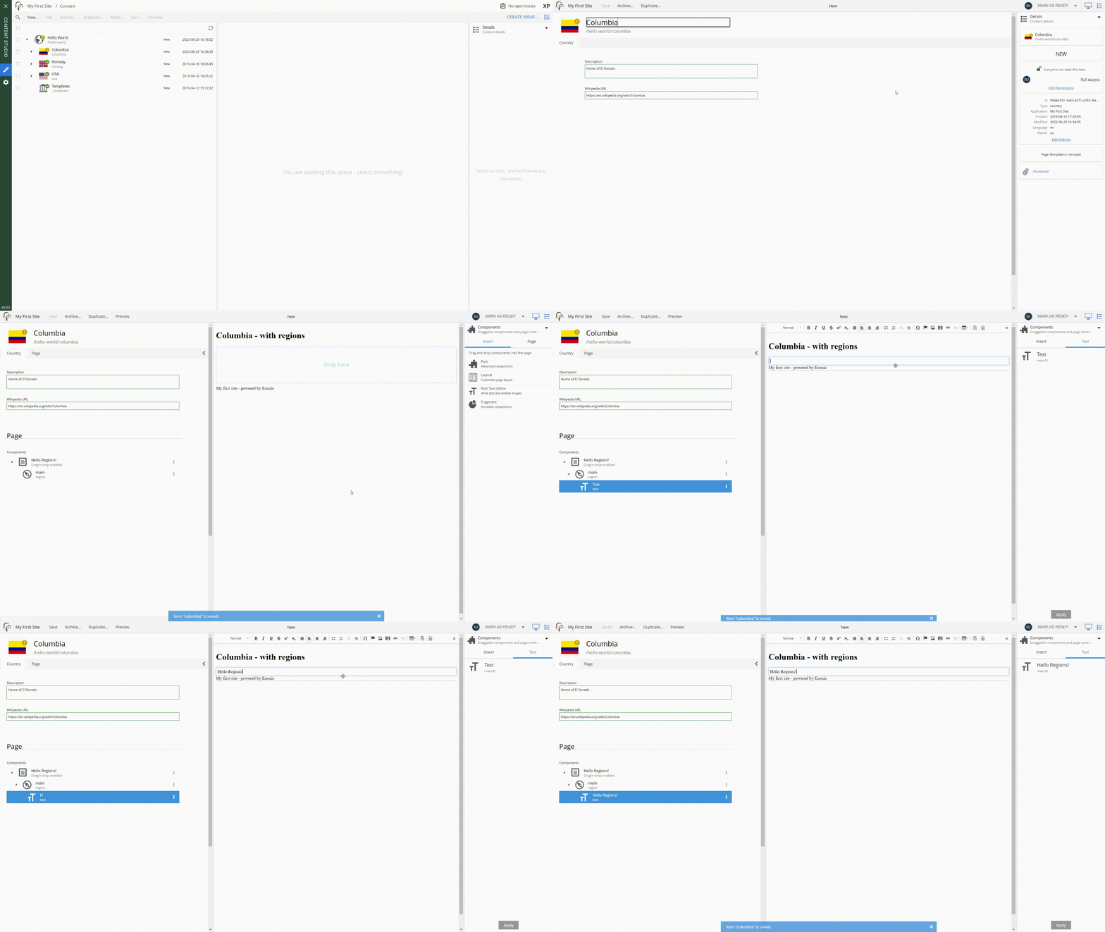
Back in Content Studio, select, and edit one of the country content items.
-
Activate the page editor (from the top right monitor icon), and select the
Hello Regions!controller.
Sweet. You now have a page with a single region!
Text component
To make use of your new and shiny region, lets fill it with some content.
Add a text component to the region. It can be found inside the "Components" widget on the right hand side, and can be added to the page with drag-n-drop or by using the right click menu: Insert → Text.
| The Text component is a standard component included in Enonic XP, it has standard rendering, but can be customized if needed. |
Fill in some text, for example "Hello Regions!", then save the content.
Visit the reference documentation for more details on the Text Component.
Summary
You’ve been introduced to regions, a concept that can be used on a page, as you just saw, but also on layouts, a new component type you’ll be introduced to soon.
| To learn more about regions, visit the regions documentation. |
In the next chapter you’ll learn about parts. A highly customizable component type that can be inserted into regions.