Parts - flexible components for your pages
Contents
Parts are the visual building blocks to make pages more interesting.
The country part
It’s about time we show some details from the Country content type.
Rather than making another page component, lets use parts. Like the Text component, parts can be added to regions.
A descriptor, controller and view have already been added to the src/main/resources/site/parts/ folder:
<part xmlns="urn:enonic:xp:model:1.0">
  <display-name>Country</display-name>
  <description>Show simple details of the country</description>
  <form/>
</part>import { Content } from '@enonic-types/core';
import type { Response } from '/index.d';
// @ts-expect-error no-types
import {render} from '/lib/thymeleaf';
import {getContent} from '/lib/xp/portal';
type ContentCountry = { description?: string, wikipedia?: string }
// Specify the view file to use
const VIEW = resolve('./country.html');
// Handle the GET request
export function get(): Response {
// Get the country content as a JSON object
const content = getContent<Content<ContentCountry>>();
// Prepare the model object with the needed data from the content
const model = {
name: content.displayName,
description: content.data?.description || "Missing description",
wikipedia: content.data?.wikipedia
}
// Prepare the response object
const response: Response = {
body: render(VIEW, model)
};
return response;
}<div>
<ul>
<li data-th-if="${description}" data-th-text="${description}">Nice city indeed</li>
<li data-th-if="${wikipedia}">
<a data-th-href="${wikipedia}">Wikipedia</a>
</li>
</ul>
</div>Add the part to the country page by drag’n’dropping Part from the right-hand-side. Then select the Country component from the list.
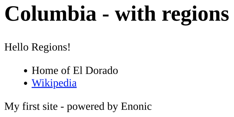
The resulting page should look something like this:
| You may also use the page component input (visible on the left hand , or floating above the page editor) to manage the components on your page. |
Configurable part
Let’s try something slightly more advanced. The City list part will:
-
list cities within a country,
-
show an image of each city,
-
let you choose the image cropping format.
The part already exists in your app via the following files:
<part xmlns="urn:enonic:xp:model:1.0">
  <display-name>City list</display-name>
  <description>Show all cities in a country</description>
  <form>
    <input type="ComboBox" name="crop">
      <label>Image crop</label>
      <occurrences minimum="0" maximum="1"/>
      <config>
        <option value="ORIGINAL">Original</option>
        <option value="WIDESCREEN">Widescreen</option>
        <option value="SQUARE">Square</option>
      </config>
    </input>
  </form>
</part>import { Content, PartComponent } from '@enonic-types/core';
import type { Response } from '/index.d';
// @ts-expect-error no-types
import {render} from '/lib/thymeleaf';
import {query} from '/lib/xp/content';
import {getComponent, getContent, imageUrl, ImageUrlParams} from '/lib/xp/portal';
type PartDescriptor = "company.starter.myfirstsite:city-list"
type PartConfig = { crop: 'ORGINAL' | 'WIDESCREEN' | 'SQUARE' }
type ContentCity = { photo?: string, slogan?: string, population: string }
// Specify the view file to use
const VIEW = resolve('./city-list.html');
// Handle the GET request
export function get(): Response {
// Get the part configuration for the map
const config = getComponent<PartComponent<PartDescriptor, PartConfig>>().config;
const countryPath = getContent()._path;
// Get all child item cities's
const result = query<Content<ContentCity>>({
start: 0,
count: 100,
contentTypes: [app.name + ':city'],
query: "_path LIKE '/content" + countryPath + "/*'",
sort: "modifiedTime DESC"
});
// Create a crop based on configuration
const scale = getImageScale(config.crop)
// Map results to cities
const cities = (result.hits || []).map(item=> ({
name: item.displayName,
photo: item.data.photo && imageUrl({ id: item.data.photo, scale: scale }),
caption: getCitySlogan(item.data.slogan,item.data.population)
}));
// Set the model object
const model = {cities};
// Server log to inspect the model object
log.info('Model object %s', JSON.stringify(model, null, 4));
// Prepare the response object
const response: Response = {
body: render(VIEW, model)
};
return response;
}
function getImageScale(crop: string = 'ORIGINAL'): ImageUrlParams['scale'] {
if (crop == 'SQUARE') {
return 'square(1080)';
}
if (crop == 'WIDESCREEN') {
return 'block(1080,300)';
}
return 'width(1080)';
}
function getCitySlogan(slogan: string, population?: string): string {
return [slogan, population ? 'population: ' + population : '']
.filter(Boolean)
.join(' - ');
}<div class="cities" style="min-height:100px;">
<h2>Cities</h2>
<p data-th-if="${#lists.isEmpty(cities)}">No cities found</p>
<div data-th-unless="${#lists.isEmpty(cities)}" class="city" data-th-each="city : ${cities}">
<h3 data-th-text="${city.name}">Utopia</h3>
<figure>
<img data-th-if="${city.photo}" data-th-src="${city.photo}"/>
<figcaption data-th-if="${city.caption}" data-th-text="${city.caption}">Best city every</figcaption>
</figure>
<br/>
</div>
</div>| The th:if and th:unless attributes: If no cities are found the template will display "No cities found", otherwise it will loop through the list of cities and output details for each city. |
-
Add the city list part to the same page as before, and verify that it is working.
-
Configure the part by changing the settings in the right hand panel, e.g. choose
widescreenin the "Image crop" dropdown. Click Apply button to see the result.
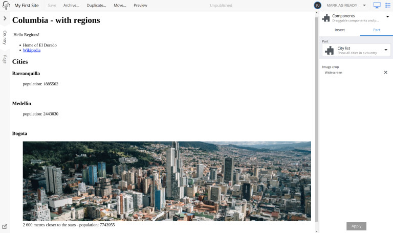
Image service
Images are scaled and cropped in real-time by the Image service. The part controller uses the imageUrl() function to create a link to the desired image, with desired sizes and cropping.
Logging
The controller above also outputs the model object to the log. Check your sandbox log after visiting a country page to see what is going on.
Summary
You’ve been introduced to parts, a powerful concept that will enable you to build customizable visual blocks for your pages.
| To learn more about parts, visit the parts documentation. |
In the next chapter you’ll learn how to reuse pages through page templates.