Content Types
Contents
Content Types are the essential elements of Content Studio and the content API. Some content types are built into Enonic XP. A basic understanding of these will be essential to building sites with the Content Studio.
Special content types
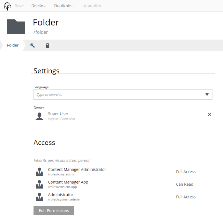
Folder
Content of type Folder is only used to group other contents. Folders have no data fields other than the display name and path name. They also have the Settings and Security sections like any other content.
Shortcut
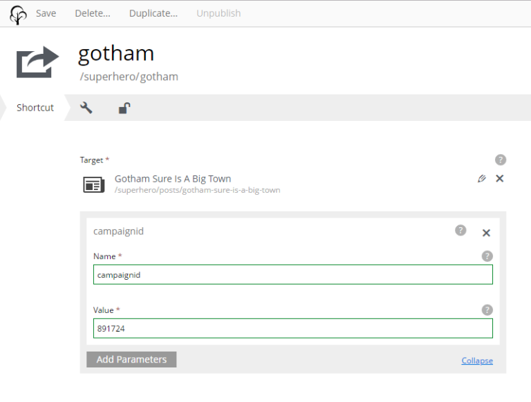
Shortcuts create a content path that will redirect to another content. This allows a content deep inside a site to be accessed with a short URL.
For example, a content in the “Posts” folder named “Gotham sure is a big town” would normally be reached at a URL with superhero/posts/gotham-sure-is-a-big-town. But a shortcut as a first child of “Superhero” would make it available at superhero/gotham.
Each shortcut has a required Target field. The selected target content can be edited with the pencil icon.
In addition it is possible to set custom parameters as a list of name-value pairs. These optional parameters will be added to the redirect URL.
Site
Sites are usually created at the root level of the tree grid from a special built-in content type represented by a globe icon. Site contents have a textarea field for the site description and a dropdown selector for adding and configuring applications. Every site content will have a Templates folder which is automatically created along with the site content.
Applications
Applications contain all the code behind a website. Apps are installed with the Applications tool and apps are used by adding them to a Site content. Some apps will have components for building a site and others will only add functionality to existing sites. Sites will need at least one app that has at least one page component before any rendering can happen.
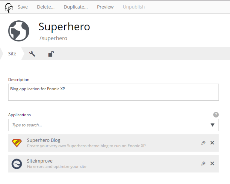
Edit a Site content and add the desired apps with the Applications dropdown selector. Only users with the role “Administrator” or “Content Manager Administrator” can add an application to a site. The image below shows the edit view for the Superhero Site content. This site has two applications: one is the Superhero Blog which was used to build the site and the other is the Siteimprove that adds some functionality.
Configuration
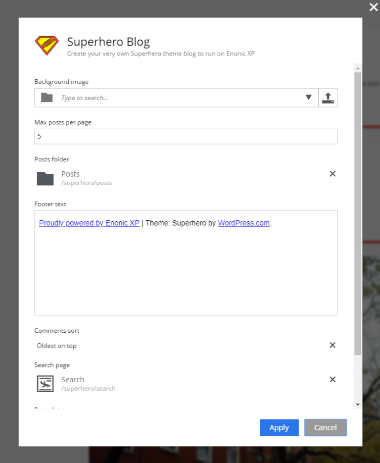
Applications that have been added to a Site are listed in the content edit panel with the display name and app name. The X icon removes the app from the site and the pencil icon opens the application configuration dialogue with the current values. Only users with the role “Administrator” or “Content Manager Administrator” can remove an application from a site or edit application configuration. The configuration options available are defined in the application code.
Page templates
A page template is special content that enable other content to be rendered as pages. Page template must support one or more content types. When a request endpoint matches a content path, the content’s supporting template will be used to render it. The Page Editor is used to build page templates by placing the desired components into regions on the page in the desired locations.
Page components
Page components are defined in the application code and contain the basic HTML structure of all rendered pages. Each page template uses one page component. They usually contain the page header, footer and menu. Most page components will have one or more regions where other components (parts, layouts, etc.) can be placed with the page editor. A single page component can be used by any number of page templates.
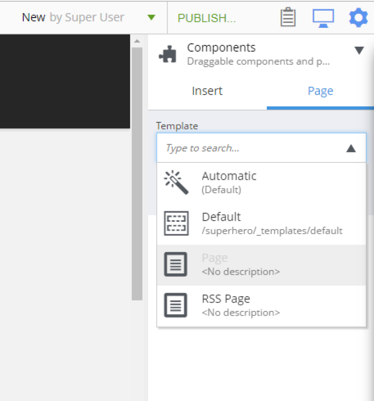
Creating page templates
A page template can only be created in its site’s Template folder. Create a new template content here and choose which content types will use it for rendering with the dropdown selector labeled Supports. A dropdown selector on the right side of the page is used for choosing the page component. Once a page component is selected, the page preview will be visible in the page editor. Use the inspect panel or the component view to add components to the region(s) in the page.
Customizing content
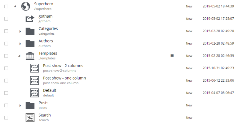
More than one page template can support the same content type. In this situation, the template that appears first in the Templates folder will be used to render the content by default. But individual content can be manually configured to use any template that supports its type. For example, in the image below there is a content type called “Post” and two templates that support the Post type, first is “Post show — 2 columns” and then “Post show — 1 column”. The “Post show — 2 columns” will be used automatically by all Post content. To force an individual Post content to use the 1 column template, edit the content and select the 1 column template in the Page Template dropdown at the top of the Inspect panel.
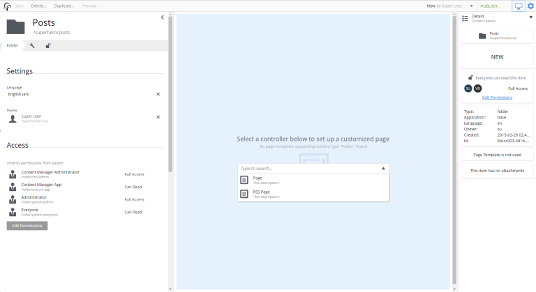
Rendering other content
Even content that has no supporting templates can be rendered as a page. For example, if a site has a Folder content called “Articles” and it has child Article content then it might be desirable to render the “Articles” folder as a page with a list of the articles that it contains. This is achieved by adding a page component to the unsupported content with the page editor. Edit the content and open the page editor. Select a page component from the dropdown selector and then add components (parts, layouts, etc.) to the page.
Templates folder
The Templates folder is just like a regular folder except that it has a special icon and it can only contain Page-template content. When a Site content is created, a Templates folder is automatically created with it as a child of the Site.
Unstructured
Unstructured content cannot be edited in the Content Studio except for the display name, the content name, and the settings and security. Content of this type is meant to be used by applications to store data when the structure is not known. Form entries are often stored as unstructured content to avoid the need to create a custom content type for each form on a site. The stored data cannot be viewed in the Content Studio without a custom page component or page template that supports the Unstructured content type.
Image content
An image content is created when an image file is uploaded. Storing images as content allows them to be indexed for searches and have the same language and security settings as other content. Image content items have fields for Caption, Artist, Copyright, Tags and Text. Image content also has fields that are automatically filled in with any Exif data the image file contains. The image file itself can be swapped out with the upload button or by dragging a file onto the image. Images can be cropped and a focal point can be added in the editor.
Cropping
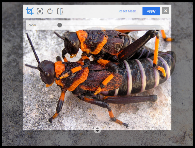
Clicking the crop icon (above the image) will darken the page outside of the image preview and the editing tools. The zoom slider will make the preview larger and parts of the image will extend into the dark regions of the page. The image can be moved by clicking and dragging it around. The aspect ratio can be changed by clicking and dragging the circle (arrows icon) at the bottom of the picture. Make the necessary adjustments so that the part of the picture you want to keep is within the highlighted area. The Apply button will restore the page to normal edit mode.
Focal point
Images can be displayed on a web page with a different aspect ratio than the original. When this happens, the top and bottom or the left and right edges of the picture will be automatically cropped. This can cause the subject of the image to be lost. For example, the heads of people in a portrait image could be cut off when the image is rendered with a landscape ratio. Setting a focal point on an image ensures that the subject will always be in the picture, no matter the ratio used to render it.
Click the focal point icon. A red circle appears in the center of the image preview. Click on the part of the picture that you want to always keep in frame and then click the Apply button. Once a focal point is set, its location will be marked with a red circle when the content is in edit mode.
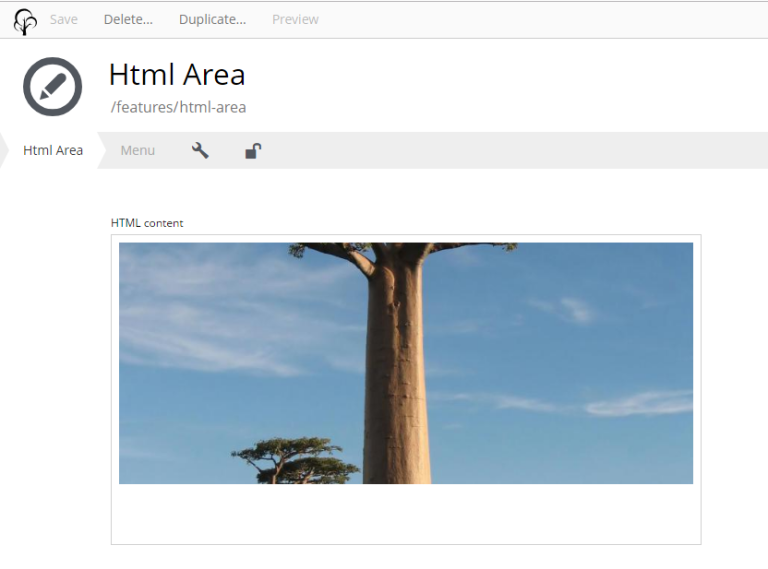
In the image above, the original picture has a tall aspect ratio. No focal point is set.
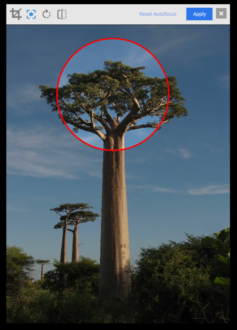
Setting the focal point.
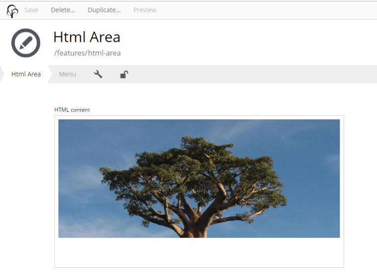
The crown of the tree remains in frame with the focal point set.
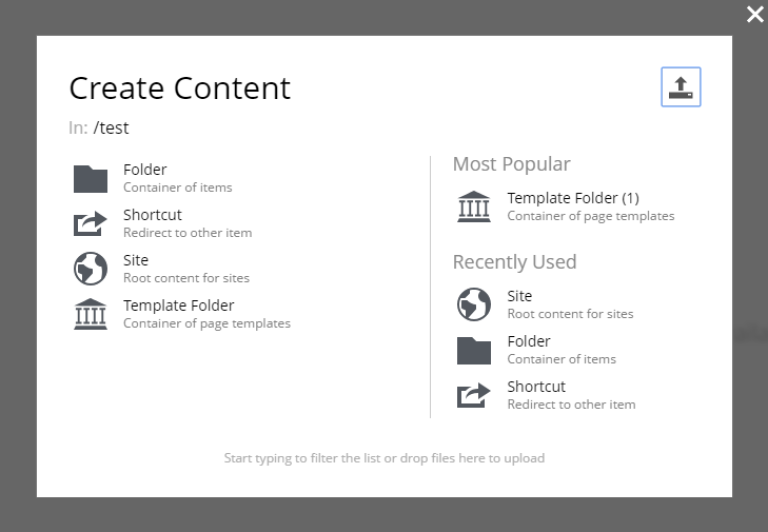
| More information on built-in content types can be found here |
Custom content types
Custom content type can be built by implementing a content type schema as described here. In addition to the fields described on that page, content type schema supports optional config object with additional configuration of content type behaviour in Content Studio.
<content-type>
  <display-name>Person</display-name>
  <super-type>base:structured</super-type>
  <form>
    <input name="firstName" type="TextLine">
      <label>First Name</label>
    </input>
    <input name="lastName" type="TextLine">
      <label>Last Name</label>
    </input>
    <input name="city" type="TextLine">
      <label>City</label>
    </input>
  </form>
  <config>  (1)
    <allow-new-content>false</allow-new-content>  (2)
  </config>
</content-type>| 1 | config Optional object that defines content type behaviour in the Content Studio. |
| 2 | allow-new-content (default: true) When set to false, removes the content type from the "New Content" modal dialog. Existing content items of this type will not be affected. New content of this type can still be created via Content API. |
Display name expression
It’s possible to auto-generate display name based on values from the form fields by using ES6 template literals. In the example below, the display name will consist of the values from the firstName and lastName fields, separated by a space.
| Only simple input types may be used as variables, so input types like HtmlArea or CheckBox are not supported. Additionally, if an input allows multiple occurrences, only the first occurrence will be used in the generated display name. |
<content-type>
  <display-name>Person</display-name>
  <display-name-expression>${firstName} ${lastName}</display-name-expression> (1)
  <form>
    <input name="firstName" type="TextLine">
      <label>First Name</label>
    </input>
    <input name="lastName" type="TextLine">
      <label>Last Name</label>
    </input>
  </form>
</content-type>
List title expression
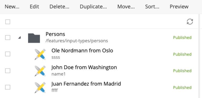
This config is similar to display-name-expression but used for displaying a composite content title in the Content Studio’s Content Browser. For example, by defining an expression like in the example below you can combine three field values with some static text.
<content-type>
  <display-name>Person</display-name>
  <super-type>base:structured</super-type>
  <form>
    <input name="firstName" type="TextLine">
      <label>First Name</label>
    </input>
    <input name="lastName" type="TextLine">
      <label>Last Name</label>
    </input>
    <input name="city" type="TextLine">
      <label>City</label>
    </input>
  </form>
  <config>
    <list-title-expression>${data.firstName} ${data.lastName} from ${data.city}</list-title-expression>
  </config>
</content-type>