Component Types
Contents
Enonic XP has five types of components that can be added to regions on a page. These component types are listed under the Insert tab of the components widget in the Page Editor. This section covers each type of component in detail.
Image component
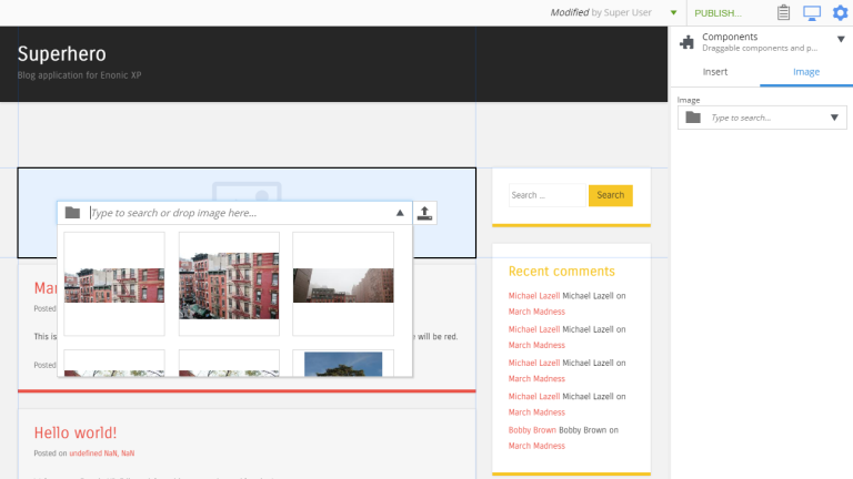
The Image component allows content editors to place an image into any region on a page without writing any code.
In the Page Editor, drag an Image component placeholder from the components widget to the desired region on the page. Once placed, the empty image placeholder contains an image selector that can be used to find and select any previously uploaded image content. If the name of the image is known, simply start typing it in the box to filter the list of images. If the name is not known, use the down arrow to open a list of images to choose from. Note that the list will contain all image content items in the XP installation, including images that were created in a different site of a multi-site environment.
If the desired image does not already exist as a content, simply upload it with the button on the right side of the image selector dropdown. The new image content will be created as a child of the page being edited, but it could be moved later if needed.
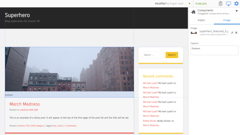
The components widget will also show the dropdown image selector. After the image is added and selected, a text area for writing an image caption will be shown as well. If a caption is entered, it will appear below the image.
Part component
Part components are reusable, configurable components that can be placed into any region of a page. This allows content editors to build and customize pages without writing any code. There are no built-in part components. Each one is custom made in the application code. Parts are typically created to render custom content, lists of content, forms, etc.
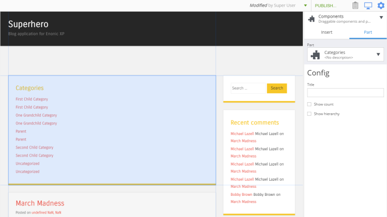
The first step in adding a part component to a page is to edit the page content and open the Insert tab of the Components widget. Drag the part component placeholder (puzzle piece) to the desired location on the page. The part placeholder will now appear as a blue box with a dropdown selector. The same part dropdown selector will appear in the components widget. Use one of the selectors to find the desired part component.
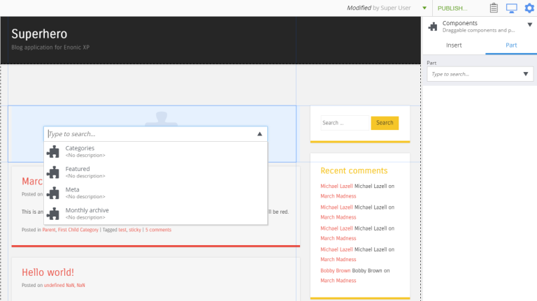
Once a part component is selected, the placeholder will be replaced with the actual part and the Insert tab will show the part’s configuration options in a form.
Some parts won’t have any configuration. Parts with configuration options are independently configured. This means that the same part component can be added to multiple pages, or even multiple times on the same page, and each instance can have different configuration values.
| It’s possible to limit a part to be used only on specific content type(s). |
<part>
  <display-name>My article part</display-name>
  <form></form>
  <config>
    <allow-on-content-type>portal:site</allow-on-content-type>
    <allow-on-content-type>${app}:article*</allow-on-content-type>
  </config>
</part><part>
<display-name>My article part</display-name>
<form></form>
<config>
<allow-on-content-type>^(?!.*[:]post$).*$</allow-on-content-type>
</config>
</part>Layout component
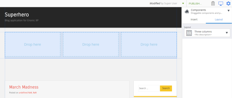
Layout components are reusable, configurable components (similar to Part components) that can be placed into any region defined in a page component. Layouts themselves define regions where other components can be placed with the Page Editor. The primary purpose of a layout is to enable other components to be placed side-by-side. As of version 6.15, a layout cannot be placed inside another layout. There are no built-in layouts. Each one is custom made in the application code. Layouts are typically created for two or three columns and have configuration options for column widths.
In the Page Editor, drag a Layout component placeholder from the components widget to the desired region on the page. The layout placeholder will now appear as a blue box with a dropdown selector. The same dropdown selector will appear in Insert tab of the components widget. Use one of the selectors to find the desired layout component.
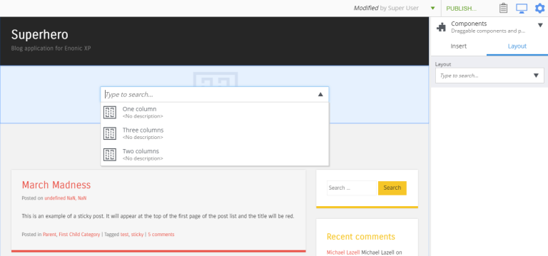
Once a layout is selected, the actual layout rendering will replace the placeholder and its configuration options will appear in the components widget. Some layout components may not have any configuration options.
| While editing a page, it may be difficult to select a layout to access its configuration. In this case, the Components View can help to select the layout. Alternatively, a part within the layout can be selected and then that part’s parent can be selected from the right-click context menu. Continue selecting the parent component until the layout is the selected component. |
| Just as with parts, you can limit a layout to be used only on specific content type(s). |
<layout>
  <display-name>My article part</display-name>
  <form></form>
  <config>
    <allow-on-content-type>portal:site</allow-on-content-type>
  </config>
</layout>
This layout will only be allowed on a site, but not for example on a page template or any of custom content types.
Text component
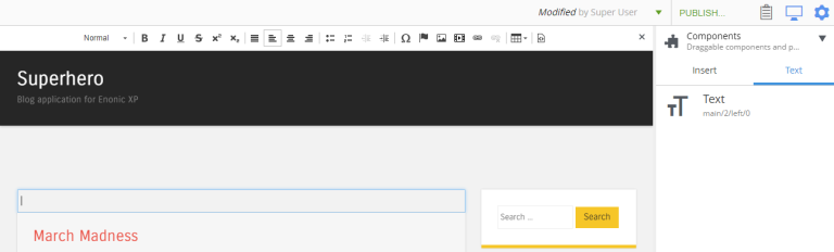
The Text component allows content editors to place and format text into any region on a page without writing any code. Images, videos, and links can also be added inside text components. Macros allow YouTube videos, embedded code, and no-format text to be added as well. The formatting and macro options are the same as those for the HtmlArea inputs that can be found in content types and other configuration forms in the Content Studio. The only difference is that the formatting toolbar is at the top of the page for text components.
In the Page Editor, drag a Text component from the Insert tab of the components widget to the desired region on the page. A cursor will appear inside the text component and editing can begin. If another component is selected, the text component will need to be double-clicked to resume editing.
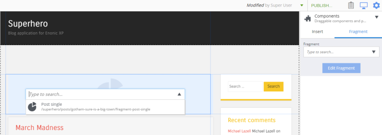
Fragment component
Fragments are created as content from an instance of another component. What makes a fragment special is that it uses the same configuration on every page where it’s added. When a fragment content is altered, the change is instantly visible on every page that uses it. All of the other components are independently configured.
Creating fragments
Fragments can be created from any component on a page. When a fragment is created, it makes a content copy of the part, layout, image or text component. In the page editor, right-click the desired component and select “Create fragment” from the context menu. The new fragment content is created as a child of the page being edited. The fragment content will open in a new editor tab where its name and configuration can be changed. At the same time, the component that was copied is replaced with the new fragment.
Using fragments
Once a fragment content has been created, it can be added to pages with the page editor. Drag a fragment placeholder from the Insert tab of the components widget to the desired location on the page. Use the dropdown selector in the placeholder to find the desired fragment content. Once selected, the fragment will appear.