Widgets
Contents
Widgets are applications that expand the functionality of the Content Studio. As of version 7.0, there are five built-in widgets. All widgets are listed in the dropdown selector at the top of the panel. The top 5 widgets are internal, they are followed by the installed external widgets.
Widgets panel can be assessed via the cog icon in the top right corner:
… or in the content editor:
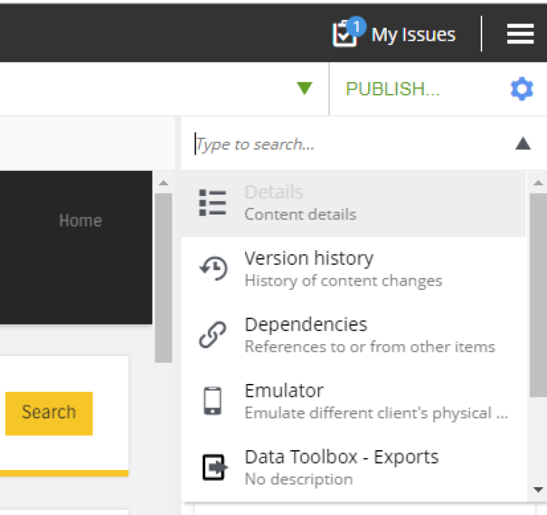
The list of widgets can be accessed from the dropdown: the top 5 widgets are internal, they are followed by installed external widgets (if any). On top of the dropdown is the text field enabling filtering the list by keywords.
Internal widgets
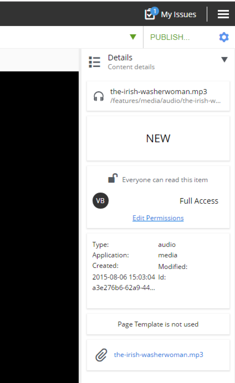
Details
This widget shows various properties of the selected content item.
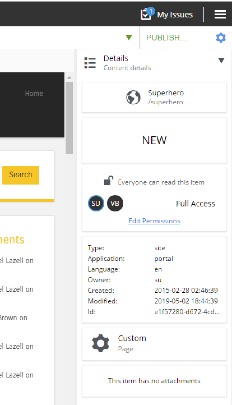
Details widget was designed to provide all the basic information about the content and contains the following views:
-
Content: The top view shows the icon of the content with the display name and full path;
-
Status: The view shows the current content status, like New, Published etc.;
-
User access: The view lists all the permissions set for the selected content. Clicking on the
Edit Permissionslink will open the permissions dialog for updating content permissions; -
Properties: The view shows useful metadata (application type, create/modified date etc.);
-
Page template: The view shows the template used by this content;
-
Attachments: The view shows the link to the attachment content so that the content like video or image can be downloaded or open in a separate tab. The example of such content can be seen below.
Version History
A new version of content will be created each time you make changes to the content. Version History widget lists all versions of the content and allows comparing the versions and reverting content to a specific version. In addition to versions, the widget also shows publish and unpublish actions. Current content status is displayed in the Widget header.
To revert to the specific version, click on the version box to expand details, and then click the Revert button. Note that current version cannot be reverted and is therefore not expandable, as well as Publish/Unpublish actions.
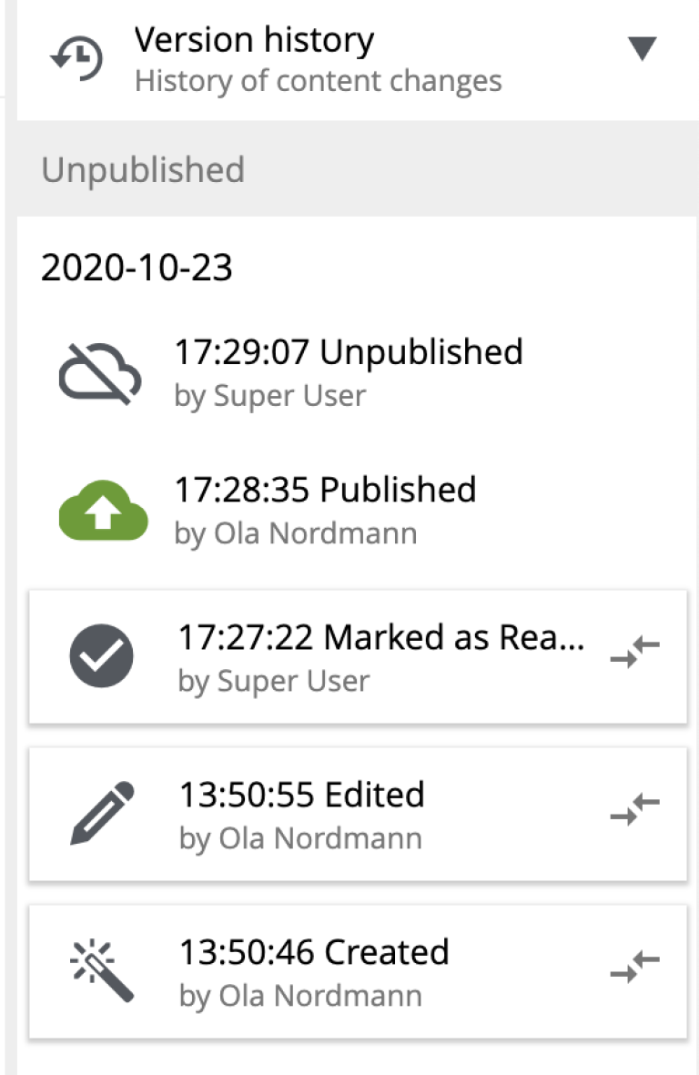
By clicking the  icon you can compare the version with the current (or any other) version in the
 Compare versions modal dialog.
| Version Comparison has been introduced in Content Studio 3.0.0 and requires XP 7.3.0 or higher. |
Two dropdowns on top of the dialog contain the full list of versions: the left one (Older) is the one being compared, and the right one (Newer) is the one being compared against. By default the version you clicked will be selected in the left dropdown and current/active version will be selected in the right dropdown, but you can change the selection to compare any versions you like, as long as the "left" version is older than the "right" one.
By default, the dialog shows only differences between the selected versions, but you can see the entire content JSON by checking off Show entire content checkbox.
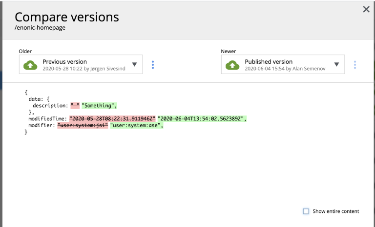
| Both dropdowns have aliases on top of the list which you can use to compare a version with previous, next, published and current version without having to browse through the list. |
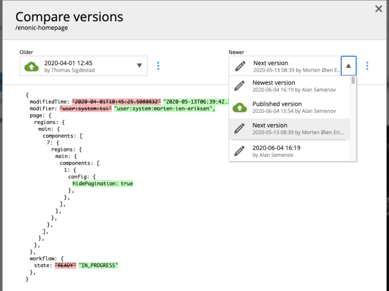
The "kebab" menu icon on the right of each dropdown has just one option - "Revert" - to revert to this version.
Dependencies
Every content can have inbound and outbound dependencies, and this widget shows them. Simply put, the inbound dependency is something that uses the content, and the outbound dependency is something used by the content. For example, if there is a Shortcut, and it has a link to the Superhero site, the Shortcut is the inbound dependency for the site, and at the same time the Superhero is the outbound dependency for the Shortcut.
The inbound dependencies are listed above the content, and the outbound dependencies are listed below.
If there are no dependencies of a specific type, the widget will show No incoming dependencies.
If there are some dependencies, the button showing the total number of dependencies will be shown. The icon of the content type and a number of the dependencies of each content type will be shown below or above the button.
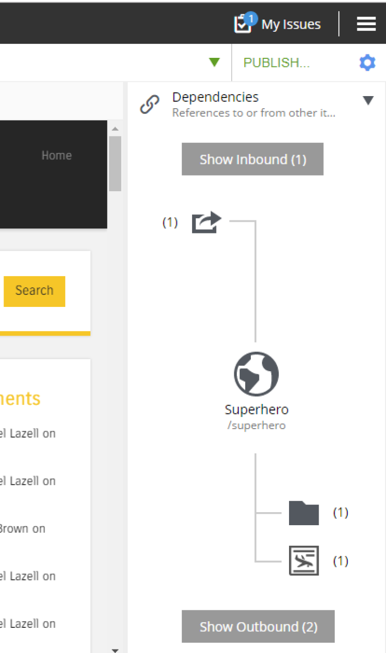
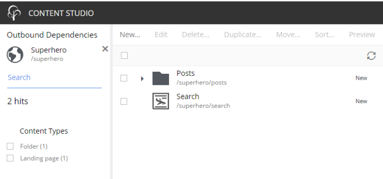
Clicking on the button will open a new browser tab showing the list of the content item’s dependencies, either inbound or outbound. If you click on the dependencies icon, then the same tab will open, but only the dependencies of the selected type will be shown in the list.
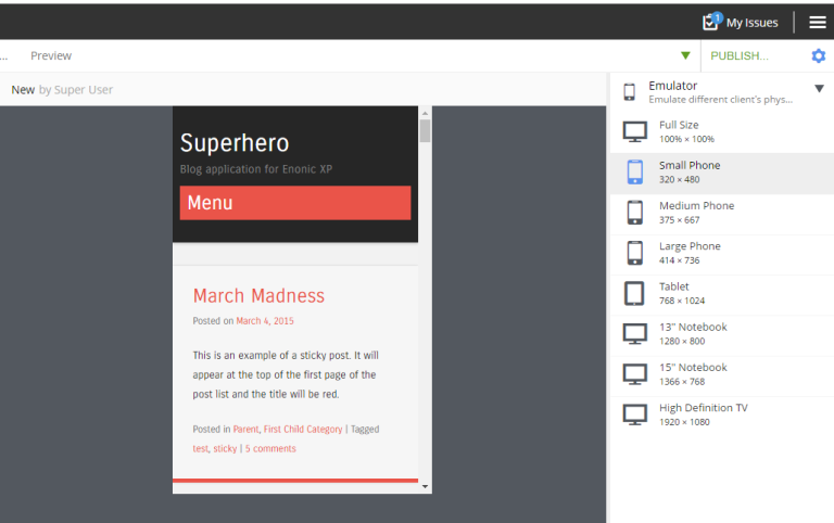
Emulator
This widget allows you to quickly preview the content on a number of different screen resolutions (desktop, mobile phone, tablet etc.)
| The emulator widget won’t be available in the content wizard, if the content is not renderable, like a folder or a site without a template/controller. |
Clicking on the emulation option will resize the preview. To reset the emulation, click on the Fill Size option.
Components
| The components widget is only available in the content wizard, just like the Emulator widget, won’t be visible for the content that is not renderable. |
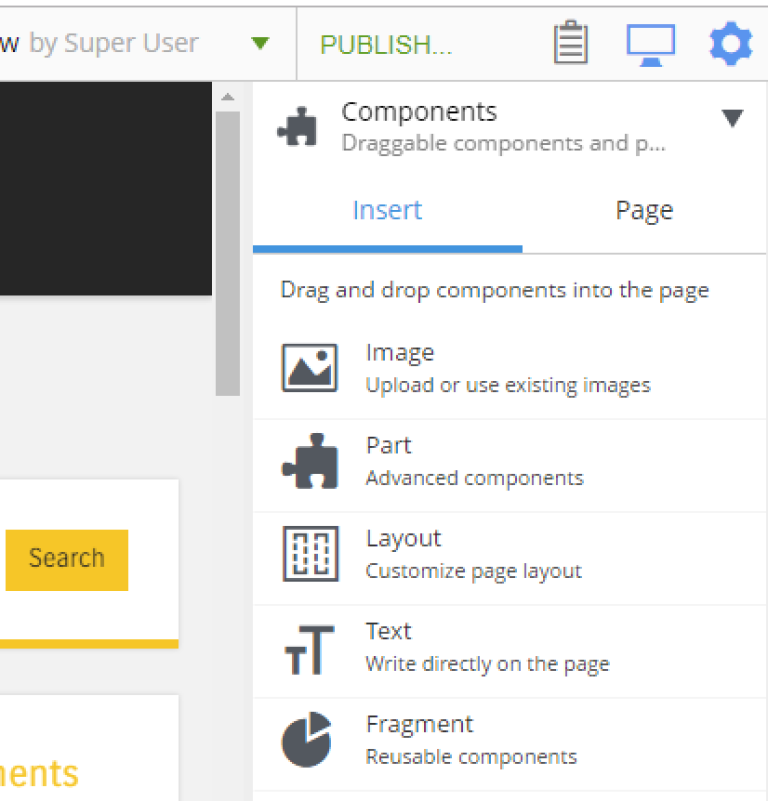
The components widget manipulates the page content and contains two tabs.
Insert tab
Insert tab allows to drag and drop components onto the page. There are five types of components in total:
-
Layout. Enables adding a layout (container of other components) from one of the supported applications;
-
Part. Enables adding a part from one of the supported applications;
-
Image. Enables adding a new or existing image to the page;
-
Text. Enables adding a text using Rich Text Editor which provides ample opportunities for editing, such as creating links, placing videos, adding text headers etc;
-
Fragment. Enables adding one of reusable fragments to the page.
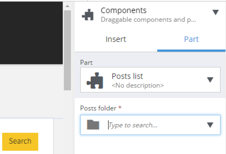
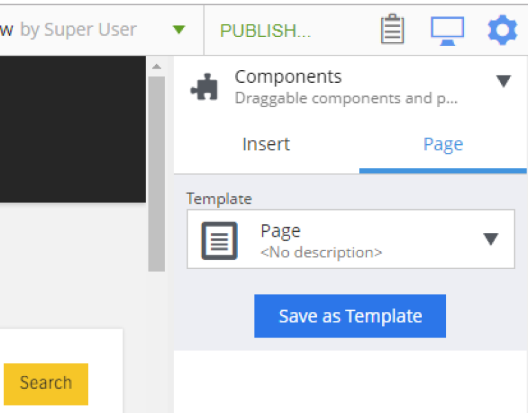
Component tab
This tab enables configuration of the component selected on the page. The tab caption will change to reflect the type of the currently selected component. If nothing is selected, the tab caption will be Page.
For the Page, it is possible to select different controller or template or save the current controller as a template.
The Part component tab, for example, will allow you to replace the currently selected part or configure it (like selecting the Posts folder in the example below)