TextArea - form item
Contents
A plain text, multi-line input field.
Appearance
Visualized as a standard multi-line text input field, which can be configured to show a character counter and limit the maximum allowed characters.
| The form input will automatically grow in height to fit the content. |
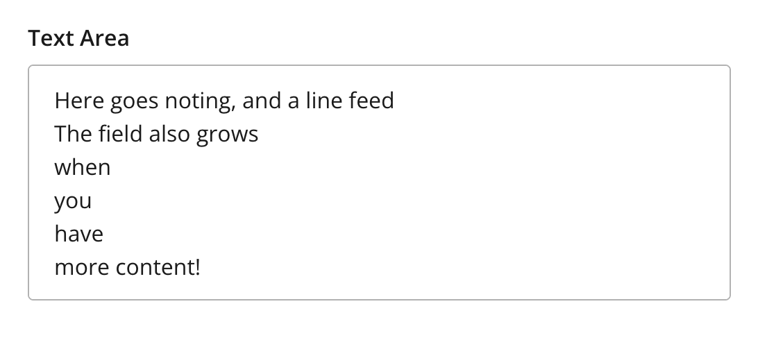
Figure 1. Example showing multiple lines of text
Figure 2. Example showing character counter and max length
Usage
- type: "TextArea"
  name: "my_textarea"
  label: "My TextArea"
  default: "Default text goes here"  (1)
  max-length: 42  (2)
show-counter: true (3)| 1 | default specifies the default string for the TextArea |
| 2 | max-length specifies the maximum allowed number of characters (default: unlimited) |
| 3 | show-counter specifies whether text length counter should be shown (default: hidden) |
Output
Value type: String — included in _alltext
{
  "my_textarea": "This is plain text.\nLine breaks are preserved."
}
Multiple occurrences
{
  "my_textarea": [
    "Sweet home Alabama!\nI'm counting emojis too 😊😊",
    "Two occurences are more than one."
  ]
}