TextLine - form item
Contents
A plain text, single line input with advanced validation options.
Appearance
Textline is visualized as a standard single-line text input field, supports multi-occurence and adavaced regex validation. You may also enable a character counter and set a maximum allowed characters for the input.
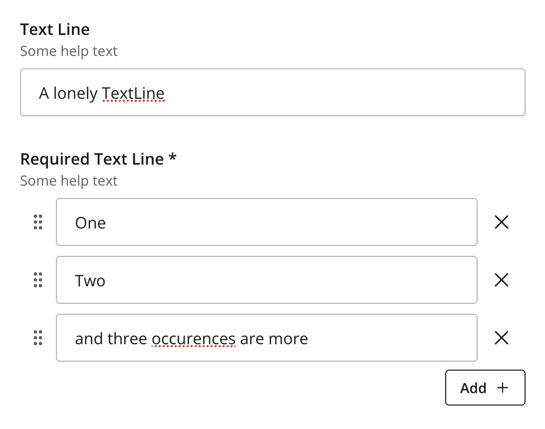
Figure 1. Two instances of TextLine, single and multi-occuerence
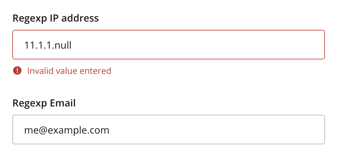
Figure 2. Regex validation examples with error handling
Usage
# Basic sample
- type: "TextLine"
  name: "my_textline"
  label: "My TextLine"

# Using regex validation and a default value.
- type: "TextLine"
  name: "social_security_number"
  label: "My SSN"
  occurrences:
    min: 1
    max: 3
  default: "000-00-0000"  (1)
  max-length: 11  (2)
  show-counter: true  (3)
regexp: "\\b\\d{3}-\\d{2}-\\d{4}\\b" (4)| 1 | default specifies the default string for the TextArea | ||
| 2 | max-length specifies the maximum allowed number of characters (default: unlimited) | ||
| 3 | show-counter specifies whether text length counter should be shown (default: hidden) | ||
| 4 | regexp supports validation by defining regular expressions
|
Output
Value type: String — included in _alltext
{
  "my_textline": "Some text value"
}
Multiple occurrences
{
  "my_textline": [
    "First value",
    "Second value"
  ]
}