Parts and Layouts
Contents
Parts and layouts are the building blocks the editors place inside regions to compose pages.
Insert
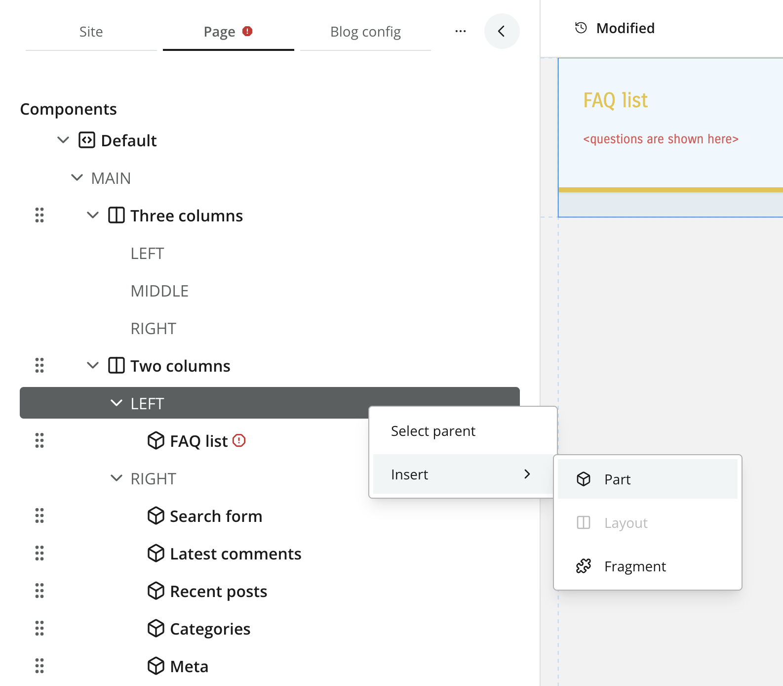
From Content Studio, editors may insert parts and layouts into regions by right-clicking the page form, or by dragging and dropping them into the visual editor.
The available parts and layouts are determined by the components registered in your project.
Configuration
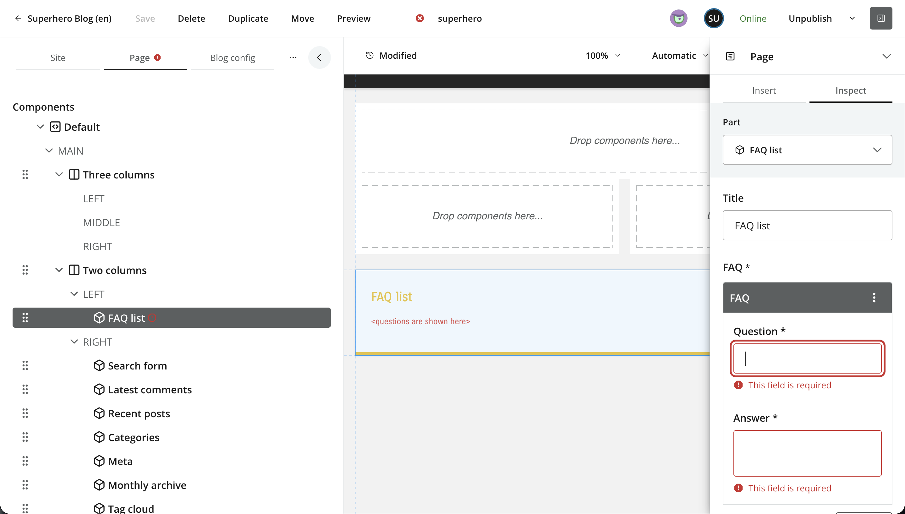
Once added to the page, a part or layout can be configured. The form fields are defined in the component descritor, similar to a content type.
Parts
Parts are leaf components in the page structure — they do not contain regions. Parts are typically used in combination with forms, and have a vast range of application areas.
Usage
Place a descriptor in your project: src/main/resources/cms/parts/<part-name>/<part-name>.yaml.
Each part may declare a form using the schema system. The form data will be stored together with each component instance.
kind: "Part"
title: "Content List"
form: []
Custom icon
Parts support custom icons that replace the standard part icon in Content Studio. Place an icon (PNG or SVG) in the part folder with the same name as the descriptor.
For example, if the part is called mypart, the icon file should be called either mypart.svg or mypart.png.
Layouts
Layouts are essentially parts that support regions regions. This allows editors to create nested structures of components within the page. Layouts are commonly used to style groups of components in a specific way, or for columnar presentation of parts.
Usage
Place a descriptor in your project: src/main/resources/cms/layouts/<layout-name>/<layout-name>.yaml.
Similar to page descriptors, layouts support both schema forms and regions.
kind: "Layout"
title: "3 regions"
form: []
regions:
  - name: "left"
  - name: "main"
  - name: "right"
Querying via GraphQL
Guillotine generates a GraphQL type for every part and layout config, following the naming convention <appname>_<partname>_PartConfig / <appname>_<layoutname>_LayoutConfig (with dots and dashes replaced by underscores). Use an inline fragment on that type to access typed config fields, or fall back to configAsJson when the front-end does not need typed access.
Typed part config
{
  guillotine {
    get(key: "/site/articles/hello") {
      components {
        ... on PartComponent {
          descriptor
          config {
            ... on com_enonic_app_superhero_featured_PartConfig {
              heading
              postCount
            }
          }
        }
      }
    }
  }
}{
"data": {
"guillotine": {
"get": {
"components": [
{
"descriptor": "com.enonic.app.superhero:featured",
"config": {
"heading": "Featured posts",
"postCount": 5
}
}
]
}
}
}
}Untyped part config
Use configAsJson when you need to handle arbitrary parts generically — for example, a front-end that renders any registered part without knowing the schema at build time:
{
  guillotine {
    get(key: "/site/articles/hello") {
      page {
        regions {
          components {
            ... on PartComponent {
              descriptor
              configAsJson
            }
          }
        }
      }
    }
  }
}
Layouts follow the same pattern with LayoutComponent and <appname>_<layoutname>_LayoutConfig.