Option Set - form item
Contents
An OptionSet is a list of options presented either in a multi-select mode (checkbox style), or in single-select mode (radio button / dropdown style).
Every option may contain form items, similar to an ItemSet. It also support further nesting of Item- and OptionSets. An option may be selected, even if it does not contain a form.
Appearance
OptionSets have three different appearances, depending on your configuration.
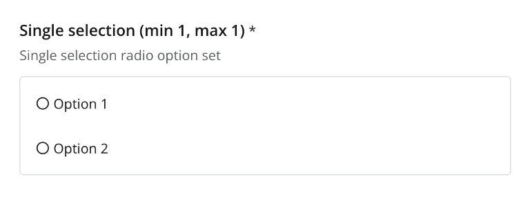
Radio button (single selection, single occurrence)
You will get this mode with the following settings on the option set:
-
selection/min AND max = 1(single option) -
occurrences/min AND max = 1(mandatory, single occurence)
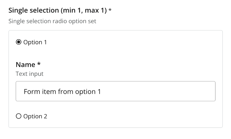
Dropdown (single selection, multiple occurrences)
This is the most commonly used mode. It allows you to select an option, which will then be presented as a card, similar to itemSets, but you can choose between different cards (options).
By allowing multiple occurrences, you suddenly have the ability to create and manage blocks of content, each with a different structure, as defined by the options.
Activated by the following settings:
-
selection/min AND max = 1(single option) -
occurrences- any other variation than min AND max = 1
Checkbox (multiple selection, any occurrences)
The final mode allows you to select multiple options within a single OptionSet instance. This looks similar to the radio buttom mode, but replaces the radio buttons with checkboxes. Depending on your configuration, you may control the minimum and maximum number of options that can be selected.
-
selection' - any other variation than min AND max = 1(multiple options) -
Any combination of
occurrencessettings
| Just like the dropdown mode, you may enable multiple occurences of the whole OptionSet, which allows you to create a list of blocks, each with multiple options to select from. |
Usage
Below are examples of various OptionSet configurations.
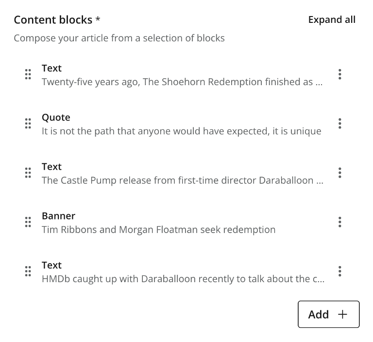
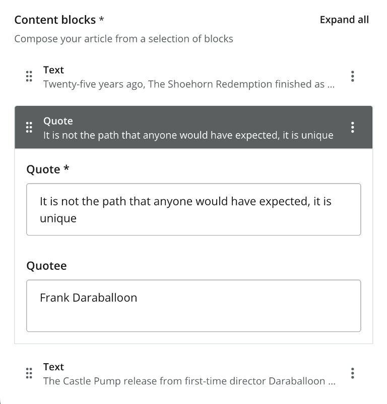
Dropdown example
hr, text, gallery and quote.
- type: "OptionSet"
  name: "blocks"
  label: "Content blocks"
  occurrences:  (1)
    min: 0
    max: 0
  help-text: "Create content with optional blocks"
  selection:  (2)
    min: 1
    max: 1
  options:  (3)
    - name: "hr"
      label: "Horizontal line"
      help-text: "Adds a separator between blocks"
    - name: "text"
      label: "Text"
      items:
        - type: "TextArea"
          name: "text"
          label: "Text"
          occurrences:
            min: 1
            max: 1
    - name: "gallery"
      label: "Image gallery"
      items:
        - type: "ImageSelector"
          name: "images"
          label: "Images"
          occurrences:
            min: 1
            max: 0
    - name: "quote"
      label: "Quote"
      items:
        - type: "TextLine"
          name: "quote"
          label: "Quote"
          occurrences:
            min: 1
            max: 1
        - type: "TextLine"
          name: "quotee"
          label: "Quotee"
          occurrences:
            min: 1
max: 1| 1 | occurrences — set max: 0 for unlimited option-set (block) instances. |
| 2 | selection/max Refers to selectable options per instance. A value of 1 ⇒ single-select mode. |
| 3 | options (required) Container of options. Each option may be empty or contain items, just like an item set. |
Multi-select mode example
Demonstrates multi-select mode with the options Coloring, Wood upgrade, Include curtains and Exclusive wallpaper. Only options 1 and 4 contain form elements. Also, user may maximally select two options.
- type: "OptionSet"
name: "styling"
label: "Room styling"
expanded: true (1)
occurrences: (2)
min: 1
max: 1
help-text: "Select up to 2 options"
selection: (3) (4)
min: 1
max: 2
options:
- name: "coloring" (5)
label: "Coloring"
help-text: "Select a color palette for the room"
selected: true (6)
items:
- type: "ComboBox"
name: "palette"
label: "Palette"
occurrences:
min: 1
max: 1
options:
- value: "spring"
label: "Spring"
- value: "summer"
label: "Summer"
- value: "autumn"
label: "Autumn"
- value: "winter"
label: "Winter"
default: "spring"
- name: "wood"
label: "Wood upgrade"
help-text: "Wooden floor and doors"
- name: "curtains"
label: "Include curtains"
help-text: "Adds curtains to all windows"
- name: "wallpaper"
label: "Exclusive wallpaper"
items:
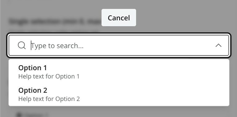
- type: "ContentSelector"
name: "product"
label: "Wallpaper"
occurrences:
min: 1
max: 1| 1 | expanded Set to true to expand all of the options by default |
| 2 | occurrences Allow zero, one or more instances of the whole option-set. |
| 3 | selection/min (required) Minimum number of options that must be selected in this option set. |
| 4 | selection/max (required) Maximum number of options to create. > 1 ⇒ multi-select mode. 1 ⇒ single-select mode. |
| 5 | option name (required) Must be unique within the option set. |
| 6 | selected Set to true to pre-select one of the options. |
Check out a sample output from this configuration
Output
Value type: PropertySet (object) — child properties are indexed individually by their respective types.
The output always follow the same pattern, regardless of the configuration.
{
  "my_optionset": {
    "option_1": {
      "formitem_1": "Value 1",
      "formitem_2": "Value 2"
    },
    "_selected": "option_1"
  }
}{
"my_optionset": {
"option_1": {
"formitem_1": "Value 1",
"formitem_2": "Value 2"
},
"option_2": {
},
"_selected": [
"option_1",
"option_2"
]
}
}{
"my_optionset": [
{
"option_1": {
"formitem_1": "Value 1",
"formitem_2": "Value 2"
},
"_selected": "option_1"
},
{
"option_2": {
},
"_selected": "option_2"
},
{
"option_3": {
"formitem_1": "Value 1"
},
"_selected": "option_3"
}
]
}_selected contains the name of all selected options for the occurence. It can be used when searching for content where specific options are selected. |
{
  "styling": {
    "_selected": [
      "coloring",
      "wood"
    ],
    "coloring": {
      "palette": "spring"
    },
    "wood": {
    }
  }
}
The _selected property contains information about which options were selected. |
GraphQL
Guillotine generates a typed object for each option set with the same naming pattern as item sets — the parent content type name plus the option-set name, e.g. com_example_myproject_Article_Blocks. The generated type has a _selected field plus one nullable field per declared option; only the selected option(s) carry data, the rest are null.
You don’t reference this generated type directly in queries — it’s the type of the blocks field, reached through an inline fragment on the parent content type (see below).
_selected is a single string in single-select mode and a list of strings in multi-select mode. It is the dispatch key the client reads to know which option’s data is present.
Selecting an option-set’s data
Use a typed inline fragment on the parent content type, then select _selected alongside the fields of each option you want to handle:
{
  guillotine {
    get(key: "/articles/hello-world") {
      displayName
      ... on com_example_myproject_Article {
        data {
          blocks {
            _selected
            quote {
              quote
              quotee
            }
            text {
              text
            }
          }
        }
      }
    }
  }
}{
"data": {
"guillotine": {
"get": {
"displayName": "Hello world",
"data": {
"blocks": [
{
"_selected": "quote",
"quote": { "quote": "Hi there", "quotee": "Mr Enonic" },
"text": null
},
{
"_selected": "text",
"quote": null,
"text": { "text": "A short text" }
}
]
}
}
}
}
}The data shape mirrors the stored property structure above. Two rules govern what comes back:
-
Option fields you don’t ask for in the query never appear in the response.
-
Option fields you do ask for always appear, but are
nullwhen that option isn’t selected for the given instance.
Dispatching on _selected
The snippets below are illustrative client-side code, iterating over the data.blocks array from the GraphQL response above — not part of the query itself.
You branch on _selected rather than checking which option fields are populated, because an option can be selected without containing any form items (e.g. hr above). Such options have no data field to inspect, so _selected is the only reliable signal of what was chosen.
In single-select mode _selected is a string, so you can switch on it directly. The blocks option set above is single-select, so each instance carries exactly one selected option:
for (const block of data.blocks) {
  switch (block._selected) {
    case "quote": renderQuote(block.quote); break;
    case "text":  renderText(block.text);  break;
    case "hr":    renderHr();              break;
  }
}
In multi-select mode _selected is an array and several option fields may carry data at once, so test for membership instead of switching:
if (block._selected.includes("coloring")) renderColoring(block.coloring);Filtering content by selected option
Because _selected is indexed like any other field, you can find content whose option set contains a given option using a term query against its dotted path:
{
  guillotine {
    queryDsl(
      query: {
        term: {
          field: "data.blocks._selected",
          value: { string: "quote" }
        }
      }
    ) {
      _id
      displayName
    }
  }
}
For multi-select option sets the same query works — _selected is a multi-valued field on each instance, and a term match succeeds if any value matches.
Nested option sets and item sets
Option sets may contain item sets or further option sets. The typed-access pattern compounds: each nesting level becomes its own generated type, and field paths for filtering extend with additional dotted segments (e.g. data.blocks.gallery.images, which holds the image references directly).