Form Items
Contents
Form items are the building blocks of forms. They define structure of your content.
Introduction
A form item optionally produce output based on its type and configuration. Each form item has a UI (front-end) component and server (back-end) component. The UI represents the visual editing interface in Content Studio, where the back-end is solely used for validation purposes.
Appearance (UI)
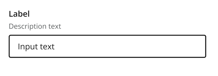
All form items share a common component structure, with a label, help text and the rendition which is specific to every form item.
Below you see examples of what a form item looks like in Content Studio, based on the TextLine form item.
Usage
The following configuration is common for for most form items:
- type: "InputTypeName"  (1)
  name: "my_name"
  label:  "My label" (2)
  default: ""  (3)
  help-text: "Help text here" (4)
  occurrences:  (5)
    min: 0
    max: 1
# config properties are specified directly (6)| 1 | type and name are mandatory:
name is used when storing the data in a property, and must be unique on each level. type refers to one of the many input types which are listed below.
|
||
| 2 | label is another mandatory field that holds the human readable value that will be displayed when listing the input type control in the administrative interface. | ||
| 3 | default is an optional field that lets you specify default values to be used by the input type. | ||
| 4 | help-text is an optional field that lets you specify a text label shown below the input field. Used for explanation of the field’s purpose.
Like label, supports localization via the text/i18n object pattern. |
||
| 5 | occurrences is an optional field used to control the number of values stored by a single input.
min set to zero means the input is not mandatory max set to zero means there is no upper limit to the number of values. This element is optional, if omitted the default will be min: 0 and max: 1. |
||
| 6 | Config properties are specified directly on the form item, rather than in a separate config element. |
Editor behaviors
Some behaviors come from the Content Studio editor and the browser rather than from individual form-item configuration. The following apply to the text-based inputs — TextLine, TextArea and HtmlArea.
Spell checking
Spell checking is handled by the browser, subject to these conditions:
-
Spell checking must be enabled in the browser.
-
It only works for the languages enabled in the browser. For example, if the content language is Norwegian but Norwegian is not enabled in the browser, spell checking will not work.
Text direction (RTL)
Content Studio automatically renders text inputs right-to-left (RTL) when the content’s language is set to a language written in an RTL script. This follows the content’s language setting — no configuration on the form item is required.
Languages that trigger RTL include, but are not limited to:
-
Arabic
-
Hebrew
-
Persian / Farsi
-
Urdu
-
Pashto
-
Sindhi
-
Kurdish (Sorani)
-
Dhivehi / Maldivian
-
Uyghur
-
Yiddish
-
N’Ko
More generally, any language written in an RTL script — such as the Arabic or Hebrew scripts — will be rendered right-to-left.
Output
Form items that produce output will generate a property, with a deterministic value type, with zero, 1 or multiple occurences.
For instance, a TextLine will always produce a String value, while the output of an ItemSet is a propertySet (aka object).
The value type dictates how the value is stored and indexed, which also controls how you can query the value.
Form items grouped by output
Each form item produces a value o
String
-
TextLine — single line plain text
-
TextArea — multi-line plain text
-
HtmlArea — multi-line rich text (HTML)
-
ComboBox — select from predefined options
-
RadioButton — single select from predefined options
-
Tag — free-text tags
-
CustomSelector — custom data source selection
-
ContentTypeFilter — content type name
Reference
-
ContentSelector — reference to other content
-
ImageSelector — reference to image content
-
MediaSelector — reference to media content
Attachment Reference
-
AttachmentUploader — file attachment