ComboBox - form item
Contents
A ComboBox lets the user select one or more options from a statically defined list. The selected values are stored as strings.
Appearance
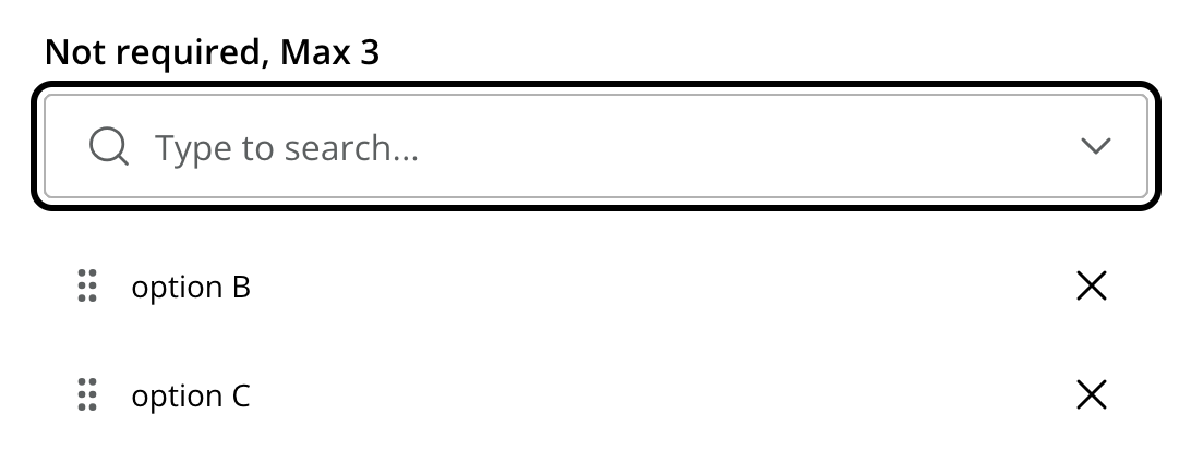
The example below demonstrates use of combobox with multi-select support. Here, two options are selected.
Usage
- type: "ComboBox"
  name: "my_combobox"
  label: "My Combobox"
  occurrences:
    min: 1
    max: 2
  options:  (1)
    - value: "one"
      label: "Option One"
    - value: "two"
      label: "Option Two"
default: "one" (2)| 1 | options define the available choices. The value is stored when the option is selected. Multiple options are allowed and ordered. |
| 2 | default is optional, and may be equal to one of the option values. |
Output
Value type: String — not included in _alltext
When a single option is selected, the value is returned as a string. When multiple options are selected (via occurrences), the values are returned as an array.
Single selection
{
  "my_combobox": "one"
}
Multiple selections
{
  "my_combobox": [
    "one",
    "two"
  ]
}
The stored values correspond to the value attributes in the schema, not the display labels. |