Pages and regions
Contents
At least one page component must be available in your project to be able to create pages.
Introduction
At the root of every page, you will find the page component. In most cases you will only need a single page component, as this can be reused across all pages.
To create a page component, place a descriptor file in your project: src/main/resources/cms/pages/<page-name>/<page-name>.yaml.
| The name you choose for a component will be used in the underlying data of the stored page. So choose your name wisely. |
Usage
kind: "Page"
title:  (1)
  text: "My first page"
  i18n: "component.page.name"
description: "Front page of our site"  (2)
form: []  (3)
regions:  (4)
- name: "main"| 1 | title provides a display name used by the editorial interface. Supports localization via the text/i18n object pattern. |
| 2 | description Description field shown when creating a part in Content Studio |
| 3 | form allows the definition of a configuration form based on the schema system |
| 4 | regions optionally specify one or more regions for the page |
A page component may define zero to many regions. Conventionally, a page should at least define a single region called main. |
Appearance
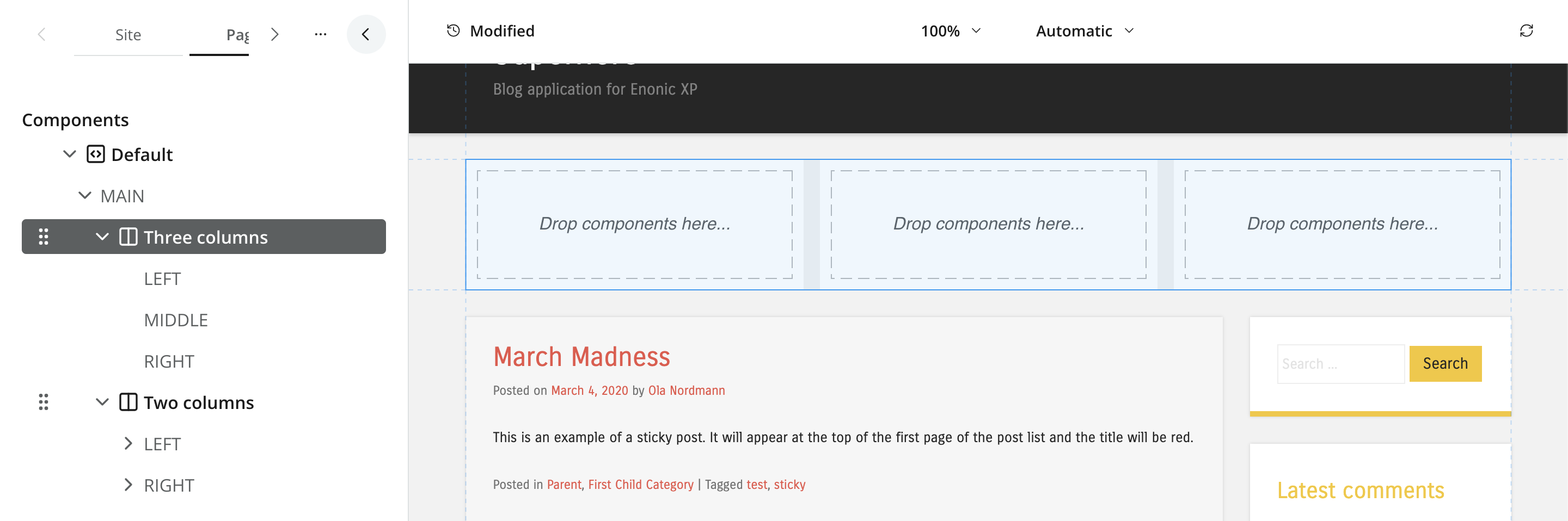
In content Studio, a page component is represented by a tree structure, where the page itself is the root and the regions are branches. The components placed within the regions are the leaves of the tree.
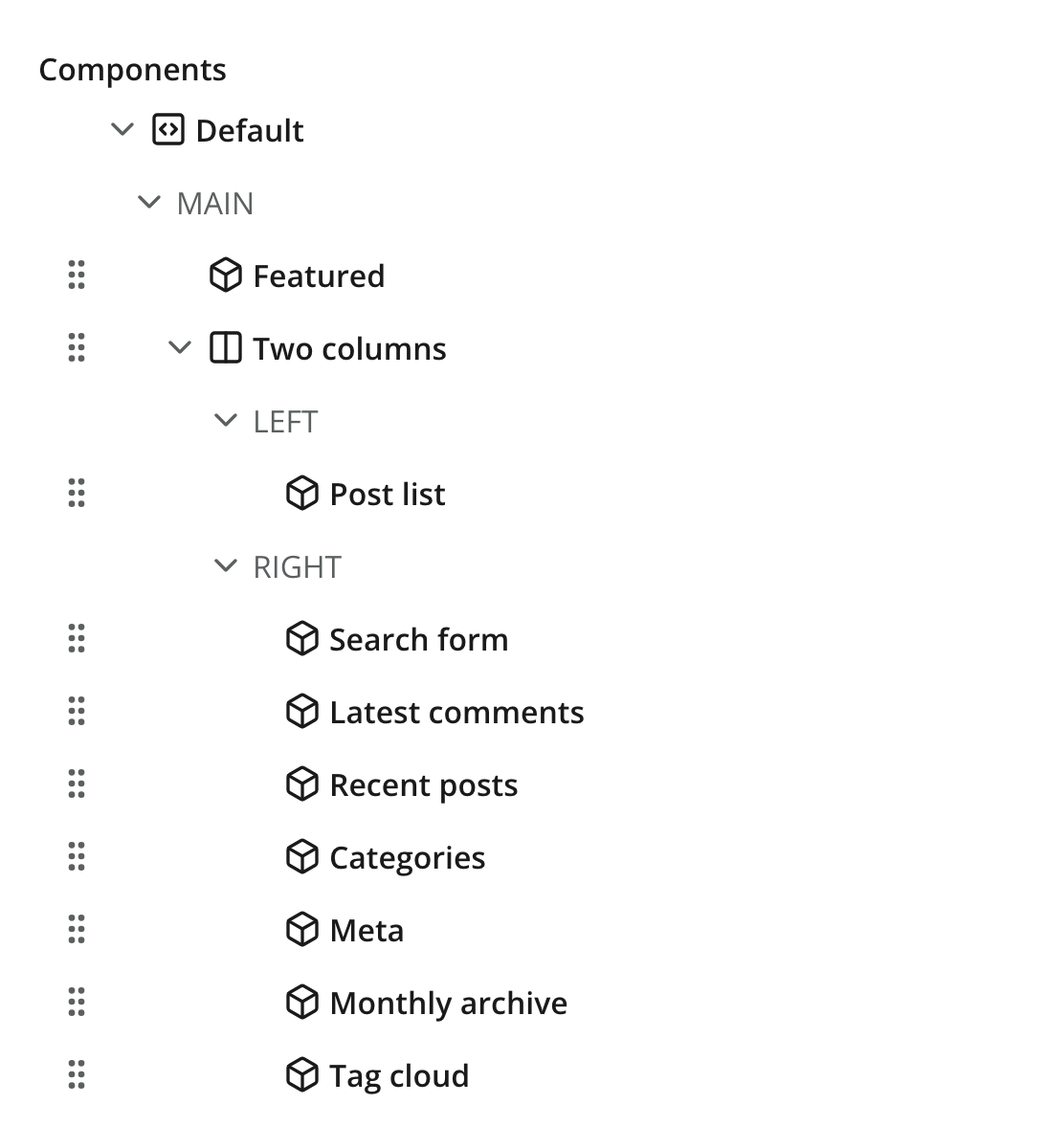
Regions
Regions are explicitly named drop zones where editors can place other page components. Only page and layout components support regions. Each region must have a unique name within the component.
In content Studio, regions have both a form-based view and a visual representation (if enabled). Empty regions will be visualized as drop zones.
Output
Using the Content API, you may access a JSON representation of the hierarchical structure of components and regions on a page.
{
  "page": {
    "type": "page",
    "path": "/",
    "descriptor": "com.enonic.app.superhero:default",
      "components": [
        {
          "path": "/main/0",
          "type": "layout",
          "descriptor": "com.enonic.app.superhero:three-column",
          "config": {},
          "regions": {}
        }
      ]
  }
}| Empty regions are never persisted. Region names are only determined from the component path. |
Querying via GraphQL
Guillotine exposes pages in two shapes — a tree rooted at the pageAsJson field, or the strongly typed flat list under components (see Component indexing).
PageAsJson
This query returns the hierarchical page structure as JSON, with all components and regions nested under the pageAsJson field. Useful for rendering the page as-is, but does not provide typed access to component config fields.
{
  guillotine {
    get(key: "/path/to/page") {
      displayName
      pageAsJson
    }
  }
}{
"data": {
"guillotine": {
"get": {
"displayName": "Hello World",
"pageAsJson": {
"type": "page",
"path": "/",
"descriptor": "com.enonic.app.superhero:default",
"components": [
{
"path": "/main/0",
"type": "layout",
"descriptor": "com.enonic.app.superhero:three-column",
"config": {},
"regions": {}
}
]
}
}
}
}
}Component list
To access the full list of components on a page, regardless of their position in the tree, use the components field on the page query. This allows you to perform queries against typed component data, similar to how you would with any other content type.
This structure mirrors how components are stored and indexed, giving a 1:1 mapping between query shape and indexed shape.
{
  guillotine {
    get(key: "/site/articles/hello") {
      components(resolveFragment: true) {
        type
        path
        page {
          descriptor
          configAsJson
        }
        layout {
          descriptor
          configAsJson
        }
        part {
          descriptor
          configAsJson
        }
      }
    }
  }
}{
"data": {
"guillotine": {
"get": {
"components": [
{
"type": "page",
"path": "/",
"page": {
"descriptor": "com.enonic.app.superhero:default",
"configAsJson": null
},
"layout": null,
"part": null
},
{
"type": "layout",
"path": "/main/0",
"page": null,
"layout": {
"descriptor": "com.enonic.app.superhero:two-column",
"configAsJson": null
},
"part": null
},
{
"type": "part",
"path": "/main/0/left/0",
"page": null,
"layout": null,
"part": {
"descriptor": "com.enonic.app.superhero:featured",
"configAsJson": {
"headline": "Welcome",
"showLogo": true
}
}
}
]
}
}
}
}See Fragments for the trade-offs between server-side resolution and manual traversal, Parts for typed access to a part’s form config, and Component indexing for searching across pages by component.