Component Types
Contents
Enonic XP has five types of components that can be added to regions on a page. These component types are listed under the Insert tab of the components widget in the Page Editor. This section covers each type of component in detail.
Part component
Part components are reusable, configurable components that can be placed into any region of a page. This allows content editors to build and customize pages without writing any code. There are no built-in part components, each one is implemented in the application code. Parts are typically created to render custom content, lists of content, forms, etc.
The first step in adding a part component to a page is to edit the page content and open the Insert tab of the Page widget. Click, hold and drag the ( ) icon to the desired location on the page. The part placeholder will now appear as a blue box with a dropdown selector. The same dropdown selector will appear in the Inspect panel of the Page widget. Use any of these two dropdowns to select the desired part component.
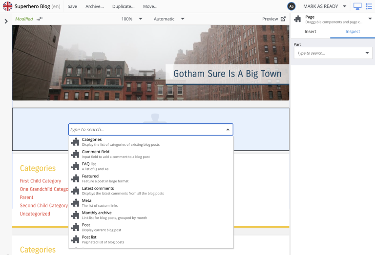
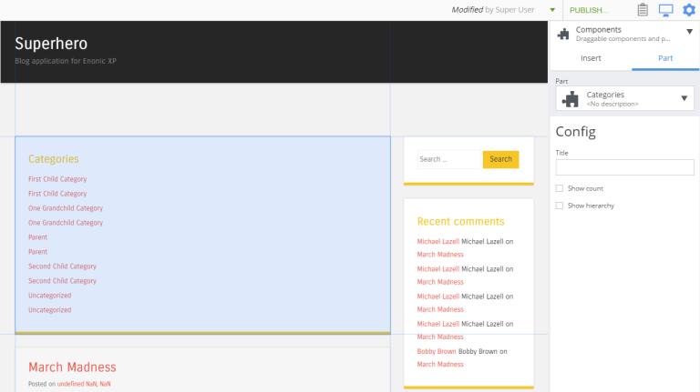
Once a part component is selected, the placeholder will be replaced with the actual rendered part, and the Inspect tab will show the part’s config form (if it’s defined in the part schema).
Configurable parts are configured in the context of the current content. This means that the same part component can be added to multiple pages, or even multiple times on the same page, and each instance may have different configuration values.
| It’s possible to limit a part to be used only on specific content type(s). |
<part>
  <display-name>My article part</display-name>
  <form></form>
  <config>
    <allow-on-content-type>my.cool.app:my-cool-type</allow-on-content-type>
    <allow-on-content-type>${app}:article*</allow-on-content-type>
  </config>
</part><part>
<display-name>My article part</display-name>
<form></form>
<config>
<allow-on-content-type>^(?!.*[:]post$).*$</allow-on-content-type>
</config>
</part>Note that sites and page templates are considered content types as well (portal:site and portal:page-template respectively), so if you want to enable a part (or layout) for a specific content type(s) and still be able to use it on a site and/or template then you have to explicitly add their types to allowed content types: |
<part>
  <display-name>My article part</display-name>
  <form></form>
  <config>
    <allow-on-content-type>${app}:article</allow-on-content-type>
    <allow-on-content-type>portal:site</allow-on-content-type>
    <allow-on-content-type>portal:page-template</allow-on-content-type>
  </config>
</part>
Layout component
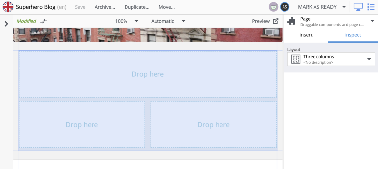
Layout components are reusable, configurable components (similar to Part components) that can be placed into any region defined in a page component. Layouts themselves define regions where other components can be placed with the Page Editor. The primary purpose of a layout is to enable other components to be placed side-by-side. As of version 6.15, a layout cannot be placed inside another layout. There are no built-in layouts. Each one is custom made in the application code. Layouts are typically created for two or three columns and have configuration options for column widths.
In the Page Editor, drag a Layout component placeholder from the components widget to the desired region on the page. The layout placeholder will now appear as a blue box with a dropdown selector. The same dropdown selector will appear in Insert tab of the components widget. Use one of the selectors to find the desired layout component.
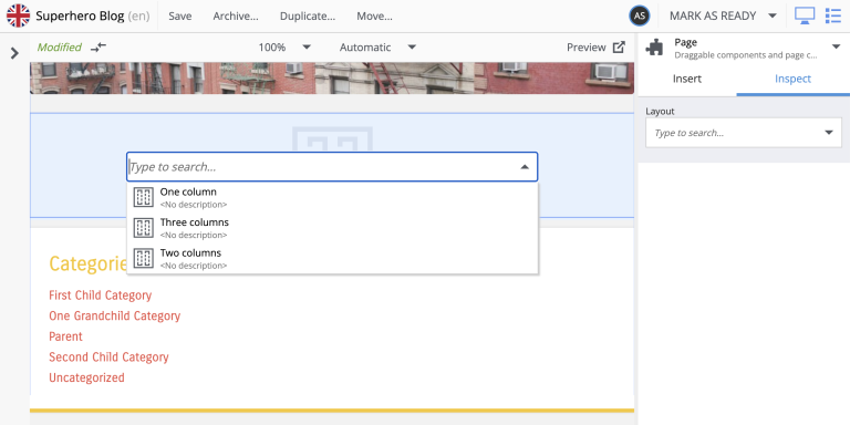
Once a layout is selected, the actual layout will replace the placeholder and its configuration options will appear in the Inspect panel of the Page widget. Just as with parts, config of layout components is optional and has to be defined in a layout schema inside an application.
| Just as with parts, you can limit a layout to be used only on specific content type(s). |
<layout>
  <display-name>My article part</display-name>
  <form></form>
  <config>
    <allow-on-content-type>portal:site</allow-on-content-type>
  </config>
</layout>
This layout will only be allowed on a site but not, for example, on a page template or any of custom content types.
Text component
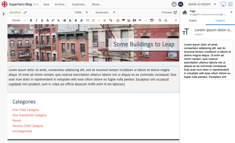
The Text component allows content editors to place text blocks into any region on a page without writing any code. Images, videos, and links can also be added inside text components. Macros allow YouTube videos, embedded code, and no-format text to be added as well. The formatting and macro options are the same as those for the HtmlArea inputs that can be found in content types and other configuration forms in the Content Studio. The only difference is that the formatting toolbar is at the top of the page for text components.
In the Page Editor, drag a Text component from the Insert tab of the components widget to the desired region on the page. A cursor will appear inside the text component and editing can begin. If another component is selected, the text component will need to be double-clicked to resume editing.
Alternatively, edit the text component directly in the Inspect panel of the Page widget.
| Documentation on Rich Text Editor used by Text component can be found here |
Fragment component
Fragments are reusable components stored as content items. What makes a fragment special is that it uses the same configuration on every page where it’s added. When a fragment content is altered, the change is instantly visible on every page that uses it. All the other components are independently configured.
Creating fragments
Fragments can be created from any component on a page. When a fragment is created, it makes a content copy of the part, layout, image or text component. In the page editor, right-click the desired component and select “Create fragment” from the context menu. The new fragment content is created as a child of the page being edited. The fragment content will open in a new editor tab where its name and configuration can be changed. At the same time, the component that was copied is replaced with the new fragment.
Using fragments
Once a fragment content has been created, it can be added to pages with the page editor. Drag a fragment placeholder from the Insert tab of the components widget to the desired location on the page. Use the dropdown selector in the placeholder to find the desired fragment content. Once selected, the fragment will appear.
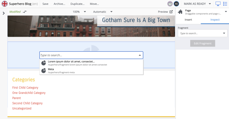
| Click "Edit Fragment" in the "Inspect" panel of a selected fragment to open the fragment content in a new editor tab for editing. |
