Page editor
Contents
The Page editor is the drag-and-drop surface for building pages. It replaces the Preview panel on the right side of the Content Editor when the selected content is renderable (sites, page templates, and content with a supporting template). It is both a live rendering of the page and the primary tool for placing, configuring, and arranging the components that make up that page.
The Page editor works in tandem with the Content Form (for the content’s data fields) and the Context panel (for component configuration and other widgets).
Selecting a controller or template
The Page editor is hidden for content that cannot be rendered (folders, shortcuts, unstructured content without a supporting template).
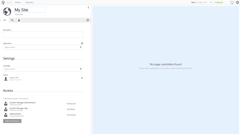
For a Site without any installed applications that contain a page controller, the editor is shown but disabled:
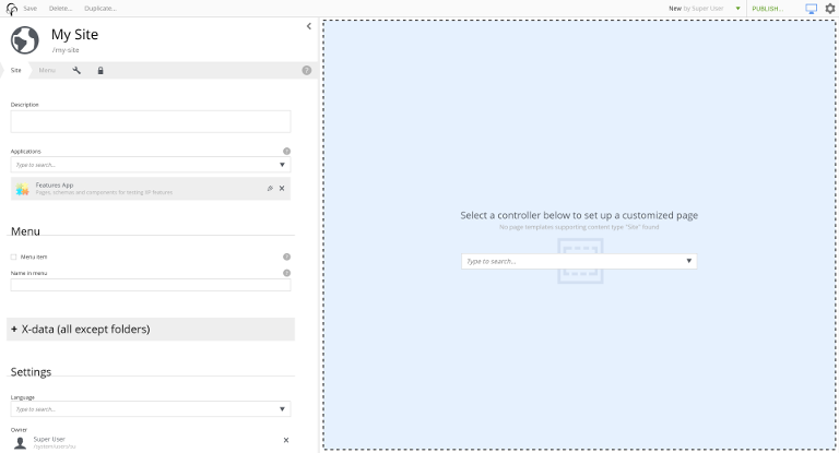
If an application is installed but no template was matched automatically, the editor shows a dropdown of available templates and controllers:
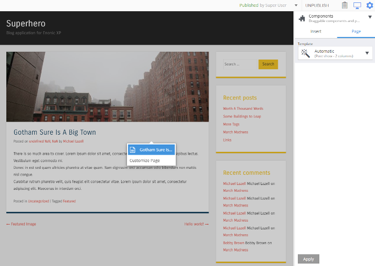
Pages rendered by an automatic template are locked against editing by default. Click the page (or an empty region) and choose Customize from the menu to enable editing for this content item.
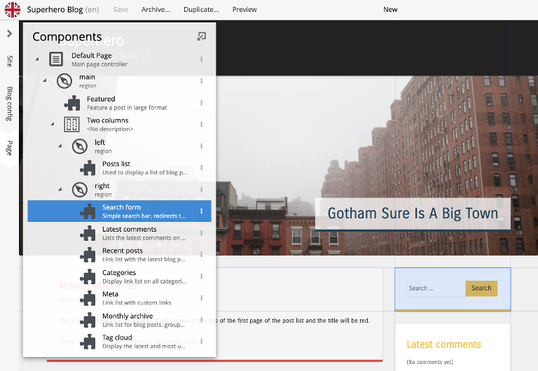
Components widget
The Components widget appears in the Context panel whenever the Page editor is available. It has two tabs: Insert for adding new components to the page, and a per-component Inspect tab for configuring the currently selected component.
Insert tab
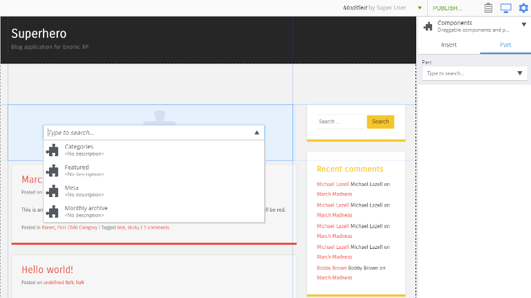
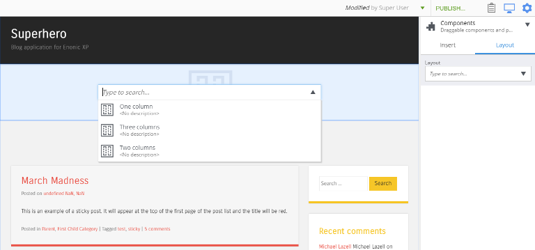
The Insert tab lets you drag and drop component placeholders onto the page.
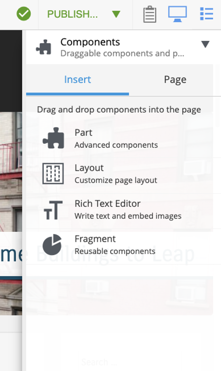
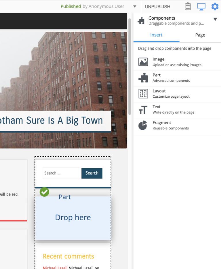
When you drag a placeholder across the page, a red circle indicates an area where the component cannot be dropped; a green checkmark and blue target box appear over valid drop locations. Once dropped, the placeholder shows a combo-box where you pick the specific part, layout, fragment, etc. to use.
The five available component categories are documented under Component categories below.
Inspect tab
The Inspect tab configures whichever component is currently selected in the page. The tab header changes to match the selected component’s type (Page, Part, Layout, etc.). When nothing is selected, it defaults to Page.
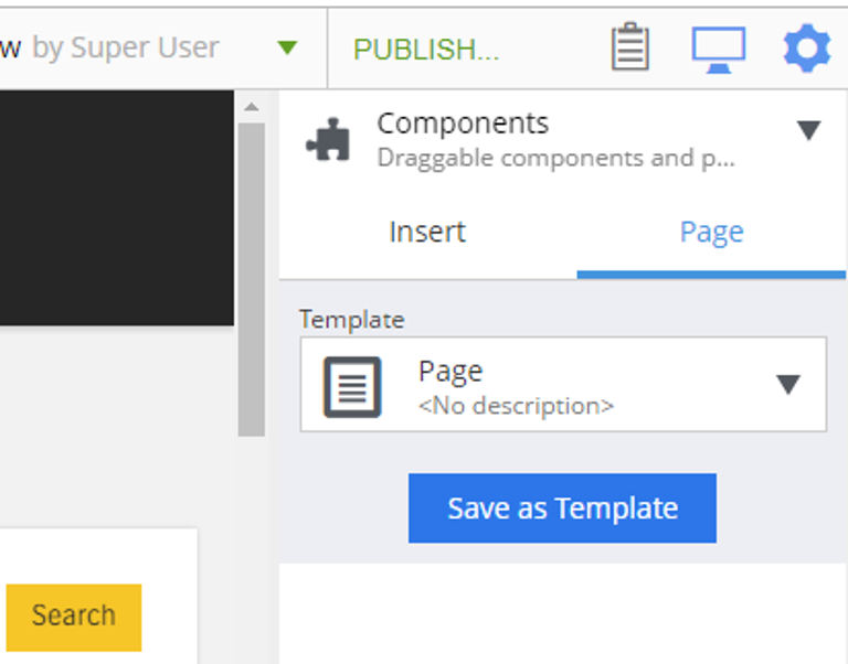
For the Page itself, the Inspect tab is where you choose the controller or page template for the content item. For other components, the tab shows the component’s configuration form.
Configuration changes take effect on save, or immediately when you click the Apply button at the bottom of the panel.
Working with components
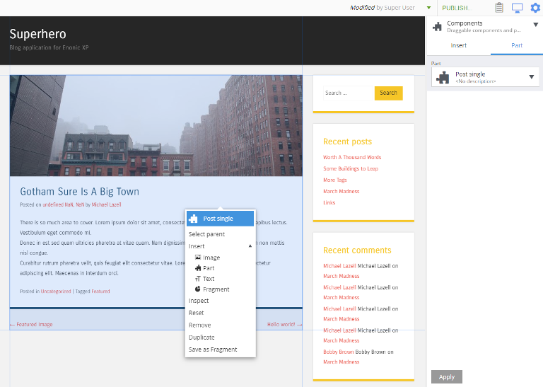
Click a component in the page to select it — the selection is highlighted and its configuration appears in the Inspect tab of the Components widget. Right-clicking a component opens a menu with the available actions:
-
Select parent — move the selection up the component tree.
-
Insert — add another component.
-
Inspect — jump to the component’s configuration.
-
Reset — revert the component to its default configuration.
-
Remove — delete the component.
-
Duplicate — make a copy alongside the original.
-
Save as fragment — convert the component into a reusable Fragment.
For a Fragment component, the last item is replaced with Detach from fragment, and an Edit action is added.
Component categories
Enonic XP has five categories of components that can be placed in page regions. All are available from the Insert tab of the Components widget.
Part
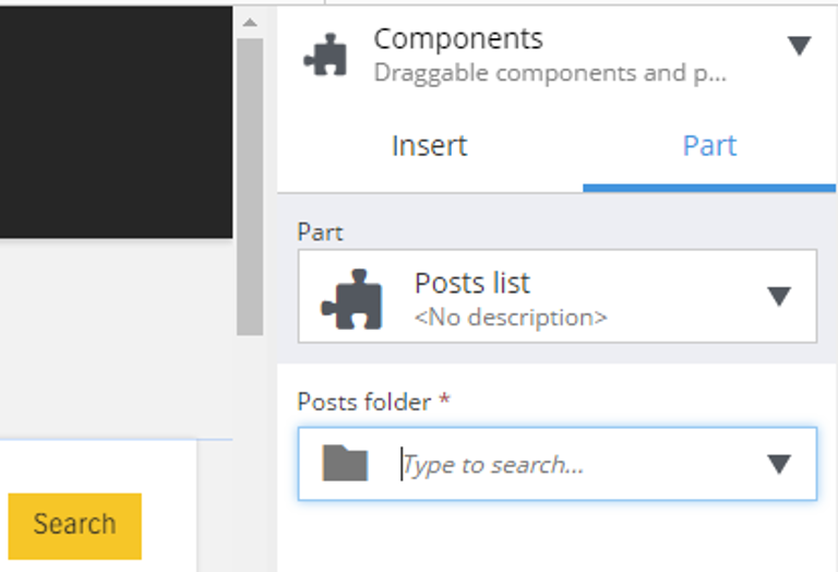
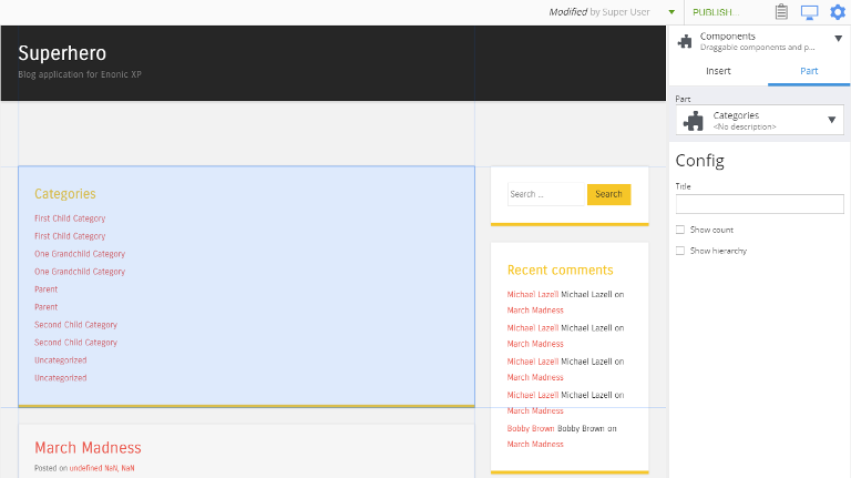
Parts are reusable, configurable components supplied by the site’s applications. Parts render custom output — for example a list of articles, a form, or a hero banner.
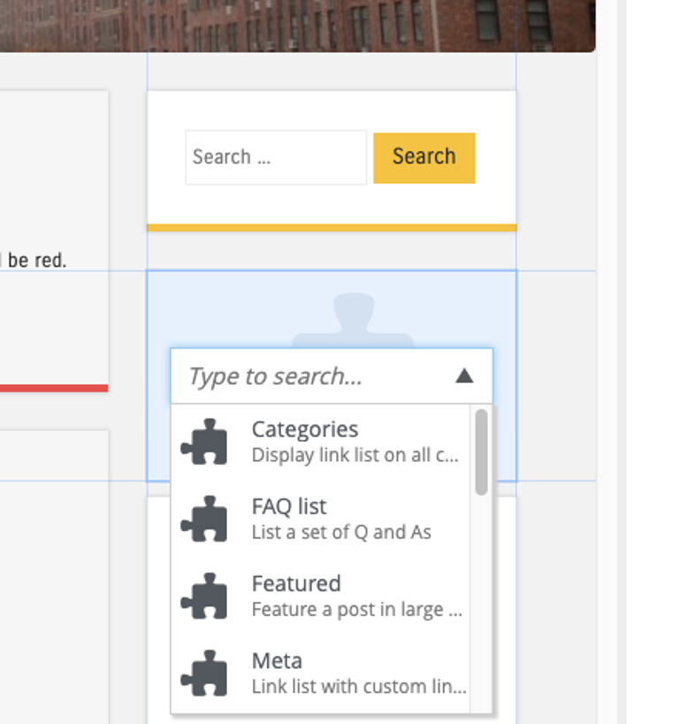
To add a part: open the Insert tab, drag the part placeholder (puzzle-piece icon) onto a region, then use the dropdown in the placeholder to select which part. Once selected, the placeholder is replaced with the rendered part and its configuration form appears in the Inspect tab.
A single part can be added to many pages — or several times on one page — and each instance is configured independently.
| Applications can restrict a part to specific content types. See the XP part descriptor reference for details. |
Layout
Layouts are configurable containers that define regions where other components can sit. Their primary purpose is to place components side-by-side — typically as two- or three-column structures. Layouts are supplied by applications and may have configuration options such as column widths.
Drag a Layout placeholder into a region, then pick the specific layout from the dropdown. Its configuration appears in the Inspect tab.
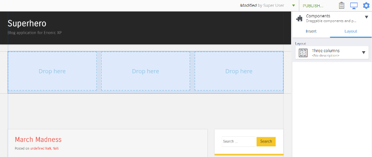
| Layouts cannot be nested inside other layouts. If a layout is hard to click in the rendered page, use the Page Components tree (see below) or right-click a child component and use Select parent. |
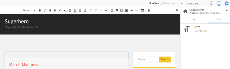
Text
The Text component is a formatted text block — it places a rich-text surface directly into a page region. Text components support images, videos, links, and macros, all edited via the Rich Text Editor.
Drag a Text component into a region and start typing. If another component is selected first, double-click the text component to return to editing.
Image
The Image component inserts an image content item directly into a page region. The image is selected from existing content, and any crop or focal point settings on the underlying image content apply automatically when the page is rendered.
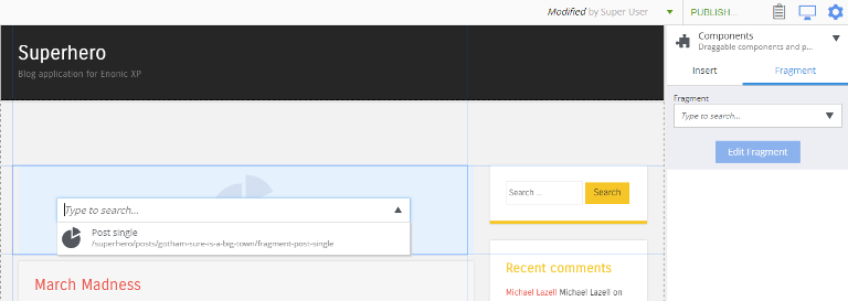
Fragment
A Fragment is a component saved as its own content item so it can be reused on multiple pages with identical configuration. Editing a fragment updates every page that uses it — unlike the other components, which are configured independently on every page. Fragment is a built-in content type; see Fragment for the content-side behaviour.
Fragments are created by right-clicking any component in the Page editor and choosing Save as fragment. The new fragment opens in its own editor tab, and the original component is replaced with a reference to the fragment.
To place an existing fragment on a page, drag a Fragment placeholder from the Insert tab and pick the desired fragment content from the dropdown.
Page Components tree
When the Content form is collapsed (with the "<" icon in the menu toolbar), the Page Components tree undocks into floating mode:
The floating view can be collapsed with the icon in its header; the tree then docks into the vertical menu toolbar and its icon appears at the bottom. Clicking the icon reopens the view.