Content navigator
Contents
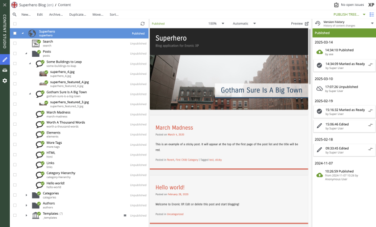
Content navigator is the default page of Content Studio. It consists of the action toolbar on top, followed by the main view divided in four vertical responsive panels, from left to right: Search panel, Content tree, Preview panel and Context panel.
Toolbar
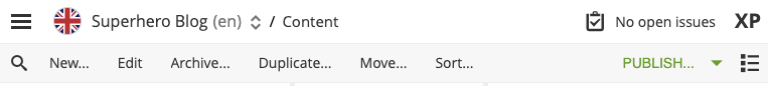
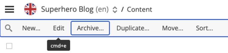
The Menu Toolbar in the Content Navigator has buttons for the following actions:
-
New: Opens the New content dialog for creating new content;
-
Edit: Opens the content for editing in a new browser tab;
-
Delete: Opens the Delete dialog for the selected content. Deleted items are moved to the Archive.
-
Duplicate: Makes a copy of the selected content;
-
Move: Opens the Move item(s) with children dialog;
-
Sort: Opens the Sort items dialog where child items of the selected content can be sorted;
Dropdown action button on the right of the Toolbar is context-dependent and will have a different main action preset, depending on if a content is selected, what state content has, current user permissions etc.:
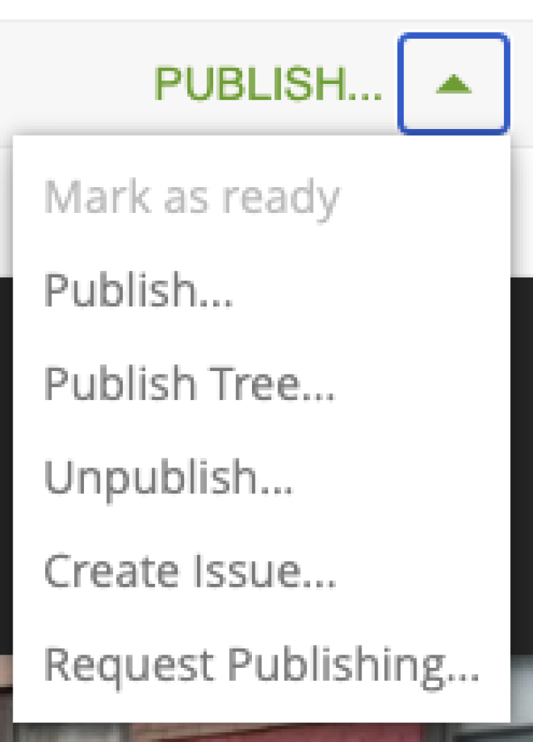
-
If selected content is not published: Publish (opens the Publishing wizard dialog)
-
If selected content is published: Unpublish (opens the Unpublish Wizard dialog for taking the content offline)
-
If selected content is published but has child items that are not published: Publish Tree (opens the Publishing wizard dialog with selected content and all descendants)
-
If selected content has workflow state "In progress": Mark as Ready (to mark selected content item(s) as ready for publishing)
-
If selected content is not published and current user doesn’t have publishing permissions: Request Publishing (opens the Publish Request wizard)
-
If no content is selected: Create Task opens the New Task dialog
These options are also available in the context menu that appears when right-clicking on a content item in the tree grid panel.
Accessibility
The toolbar supports keyboard navigation. When focused, the toolbar itself and its every interactable child element will be highlighted with a border. When the toolbar is focused, the following keys can be used to navigate and activate its elements: * Arrow buttons to navigate between action buttons * Enter or Space to activate the focused action button or expand the dropdown
Additionally, some action buttons have keyboard shortcuts that are displayed on cursor hover.
Search Panel
The search panel can be toggled with the  icon at the far left of the menu bar. It contains a free-text search field and several parameters to filter the content list by:
-
Free-text search (by content Id, display name or path)
-
Content type
-
Last modification date
-
Last modifier
-
Owner
-
Language
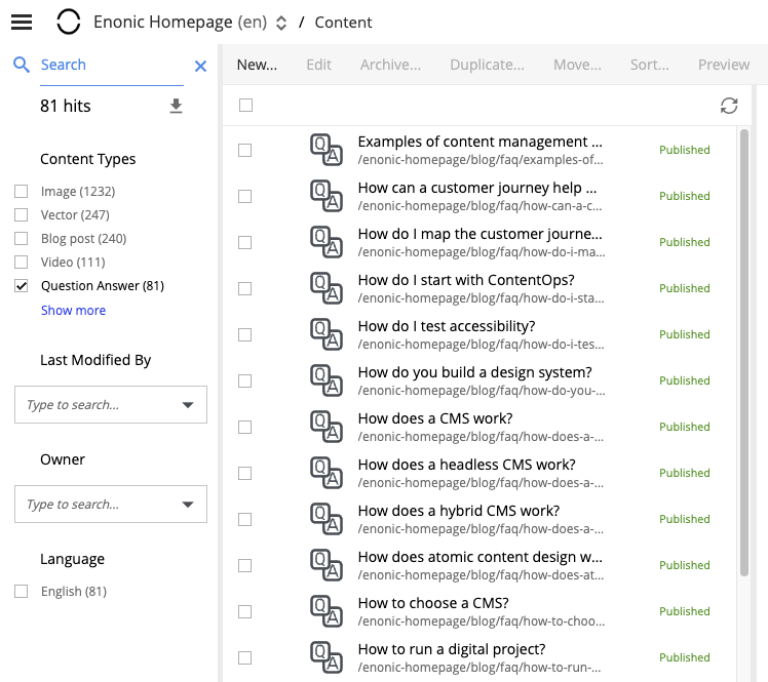
| Search results can at any time (except for when there are no hits) be exported to a CSV file using the download icon underneath the free-text search field. The file will contain basic meta fields (id, display-name, path etc.), not custom input fields from the content type schema. |
Search results are instantly updated in the tree grid as search parameters are changed. Children of matching content items will also be displayed in the tree grid but won’t be visible unless the parent node is expanded.
The number of hits will appear below the search field, along with a Clear button that will reset the filter.
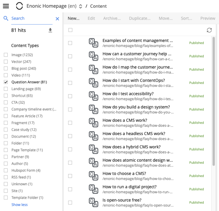
Each content type that has at least one matching content will appear in the Content type filter list with the number of matches in brackets (). Checking the box next to a content type will hide the results that do not match that type. Multiple content types can be selected. By default, only the 5 most popular content types will be shown, followed by "Show more" link to expand the entire list.
The Last Modified list works in a similar manner. It is used to limit results to content that has been modified in the last month, week, day or hour. This list may not appear if other search parameters have limited results to content that was modified more than a month ago.
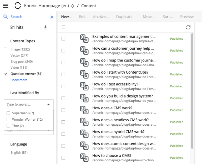
Filter aggregations for Last modified by and Owner are dropdowns with the list of users who last modified content or are content owners. To simplify search for the current user, there’s Me checkbox in both aggregations which serves as an alias for the current user. Selected users will be displayed as checkboxes above the dropdown.
| Search results remain in the tree grid when the search panel is collapsed. Don’t forget to clear the search when you are done with your search. |
Content Tree
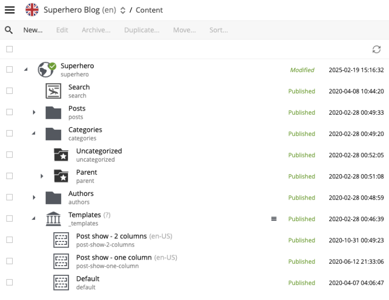
Content items can be organized and stored in a tree hierarchy with child items collapsed under parent content. Parent content will have a gray triangle to the left of the content icon that can be clicked to expand or collapse the list of its children.
The content tree can also be navigated with the keyboard arrow keys.
Content tree has its own toolbar with an icon to refresh the content list and a checkbox to select or deselect all the content items in the grid.
Information in the content list is displayed in four columns. The number of columns may vary, depending on the content tree width.
-
The first column contains a content type icon, a display name and a path. A gray expand icon will appear to the left of the icon if the content has child content.
-
The second column shows the icon, representing the current sorting order of the content’s children.
-
The third column shows status of the content:
New,Published,UnpublishedorModified. -
The fourth column shows the date when content was last modified.
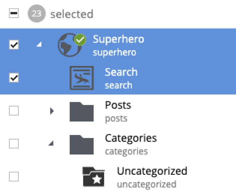
Checkboxes to the left of each content in the tree can be used to select more than one content. Group actions available in the menu bar will be performed on all the selected content. Some actions can only be performed on one content at a time.
Double-click on a content item will open it for edit in a new browser tab.
Right-click on a content item will expand its context menu.
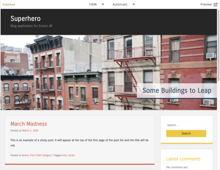
Preview panel
A preview of the selected content appears inside a panel to the right of the Content Tree. The preview is dynamic, so clicking a link will navigate you to the target page, both inside the preview panel and the Content Tree.
Toolbar of the preview panel contains the following:
-
Current status of the selected content item (f.ex.
New,Published,Unpublished,Modified). For items that have been published and then modified there will be an icon ( ) to compare current version with the published version.
-
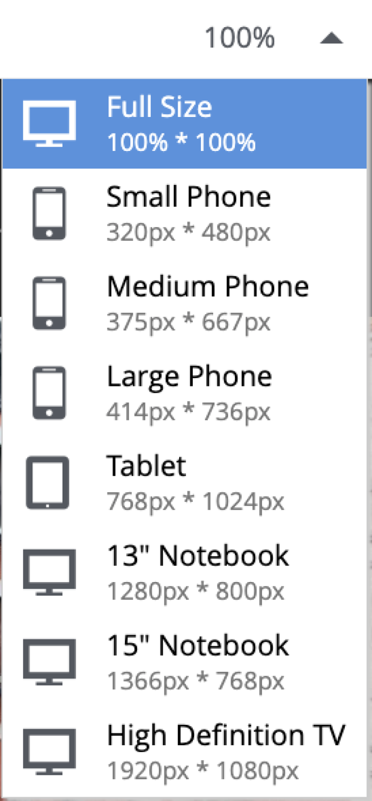
Emulator dropdown to emulate screen resolutions of various device types (monitor, tablet, mobile) for the preview.
-
Current preview mode. The default mode is "Automatic" which will automatically find and use the first mode that supports preview of the current content. You can explicitly select a mode from the dropdown list. Select "Media" to preview media content (if supported by browsers), "Enonic rendering" to use Enonic’s Site Engine and "JSON" to display current content in JSON format.
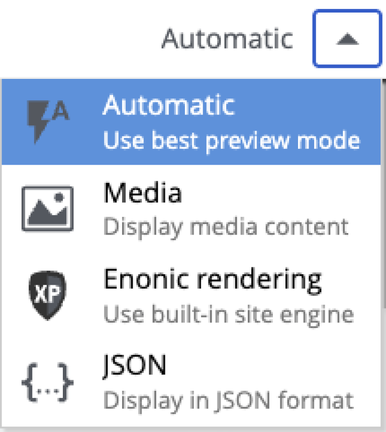
| Even though any content can be displayed in the JSON format, this mode is not used as a fallback in the "Automatic" mode. |
-
 button will open the content preview in a new browser tab. Note that the currently selected preview mode will be used in the new tab.
If currently selected content cannot be rendered by any of the available preview modes, the preview panel will display an error message.
| Only the Draft version of content is visible in the preview panel. |
Context panel
The Context panel is the multi-function column on the right of the Content Navigator (and the Content Editor). It hosts a set of widgets — small tools that act on the currently selected content item. Widgets can be built-in, shipped by Content Studio+, or contributed by any installed application.
The panel is toggled open and closed with the  icon next to the Action-menu button, or (in the Content Editor) with the cog icon on the right of the editor toolbar.
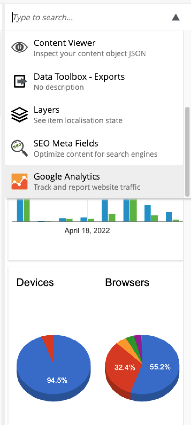
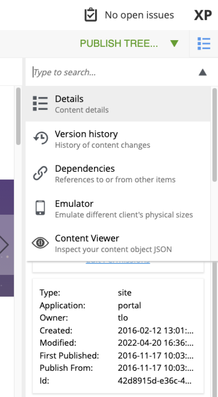
Widget selector
The dropdown at the top of the panel lists the available widgets: the built-ins appear first, followed by widgets from installed applications. A filter field at the top narrows the list by keyword.
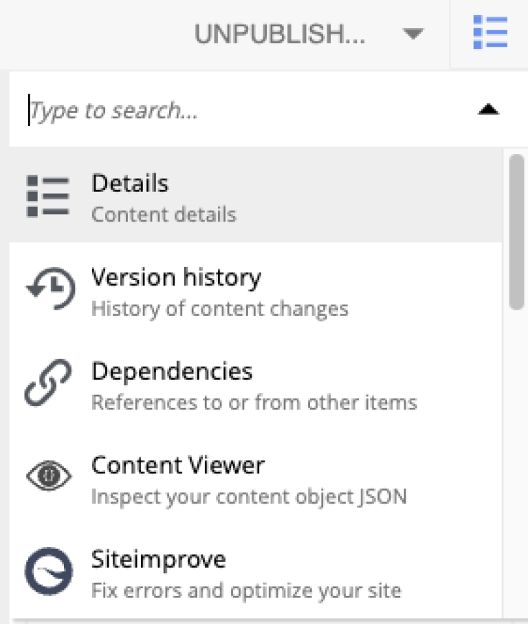
Built-in widgets
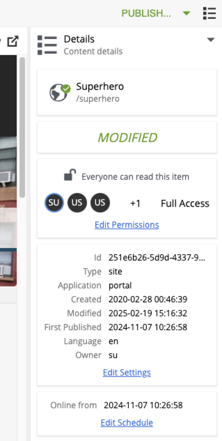
Details
The Details widget shows the basic properties of the selected content item — the core metadata an editor typically needs to know without opening the item.
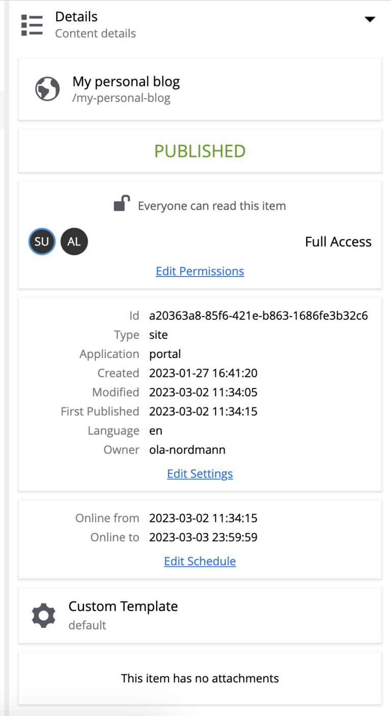
The widget is organised into sections:
- Content
-
Icon, display name, and full content path.
- Status
-
Current content status: New, Modified, Published, Unpublished, or Archived. See Workflow for the state model.
- User access
-
The effective permissions for the current user. The Edit Permissions link opens the permissions dialog.
- Properties
-
Metadata about the content — its type, owner, and created/modified timestamps.
- Schedule
-
The from/to dates the content is scheduled to be online. Only shown for published content that has a schedule configured.
- Page template
-
The page template used to render the content, if any.
- Attachments
-
Downloadable binary attachments on the content item.
Versions, Dependencies, Components
-
The Version history widget lists every version of the selected item and lets you compare or revert. See Versions.
-
The Dependencies widget shows the inbound and outbound references between the item and other content. See Dependencies.
-
The Components widget is the page-building tool that appears in the Content Editor for renderable content. See Page editor.
Content Studio+ widgets
The following widgets are contributed by Content Studio+:
Custom widgets
The Context panel is pluggable: any installed application can contribute a widget that appears in the widget selector. The interface for contributing a widget is contentstudio.contextpanel; see the XP admin widgets reference for the descriptor format and lifecycle.