Context Panel
Contents
This panel is a container for admin extensions (widgets) that can be reached via the  icon in the top right corner. It is used in conjunction with the Page Editor to work with components on the page. The panel contains a widget dropdown that consists of a few built-in widgets shown on top of the list, followed by custom extensions coming from installed applications.
Components
Using the Page widget, you can select a page template or controller, add new components to the page or change configuration of the existing components. This widget consist of two tabs: Insert and Inspect.
Insert tab
This tab has a list of Component types that can be added to the page in a two-step process. The first step is to drag and drop a component placeholder to a region in the visual editor panel. The second step is to select the specific component from a dropdown selector in the placeholder.
For example, to add a part to the page, simply click (and hold) the Part icon ( ) and drag it to a region in the page editor. A red circle appears when the component is dragged over an area where it cannot be dropped. A green checkbox appears when dragged over valid locations and a blue box shows where the component will land.
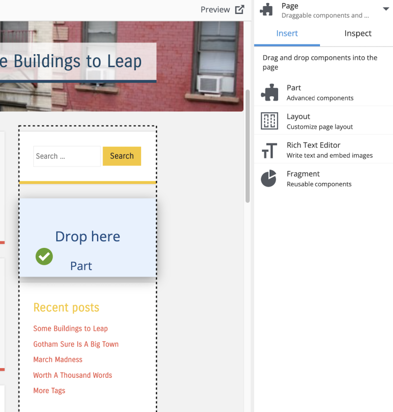
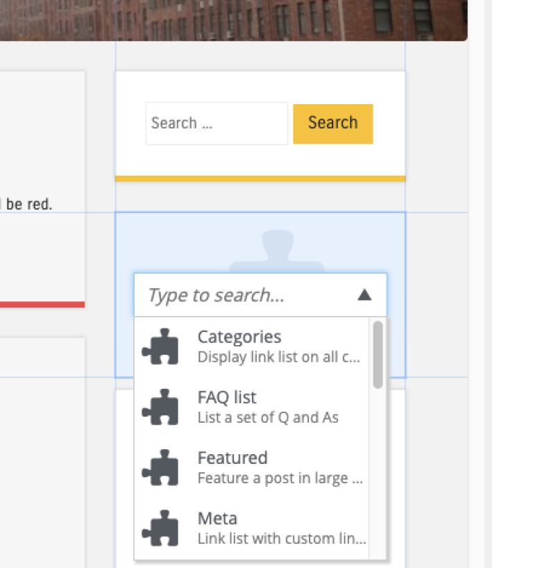
Once the part placeholder is dropped, it will display a dropdown where the necessary part can be selected from the list. When a component placeholder is selected, the "Inspect" panel will also show a dropdown with a list of available part components.
Inspect tab
This is where a selected component can be configured, as long as its configuration form is defined in the application schema.
If a component is changed in the dropdown, the content will be saved automatically. But to apply changes made in the configuration form, the "Apply" button at the bottom of the panel must be clicked.
Some components won’t have any configuration settings. The page will not update as configuration values change until the content is saved or when changes are applied with the button at the bottom of the panel.
The "Inspect" tab is also used for changing the default page template or choosing a page controller to render content that does not have a supporting page template. Read more about this in Page Templates.
Details
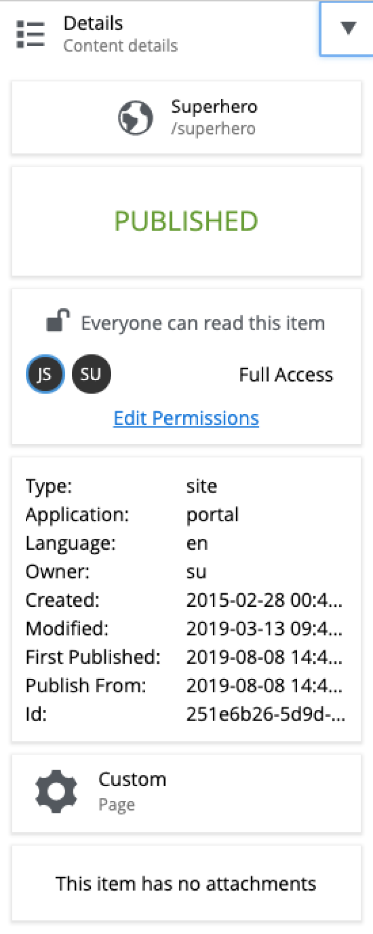
The details widget will show some basic information about the selected component, including location, status, permissions, basic meta-data, component type and attachments.
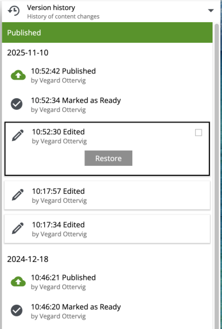
Version History
This widget displays all changes of the selected content and makes it possible to compare different versions and roll back the changes.
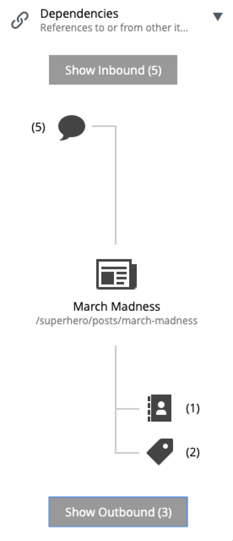
Dependencies
This widget displays aggregated (by type) content items that are referencing the current content (inbound) and content that the current content is referencing (outbound). The two buttons at the top and at the bottom will open the two corresponding lists of references.