Content Form
Contents
This panel appears on the left side of the page after content is created or while being edited. It is here the form appears in which content data is entered. The structure and fields in the form are determined by the content type which is defined in the application code. The content editor panel can be collapsed to give the page editor more room by clicking the arrow icon on the top right of the panel.
Header
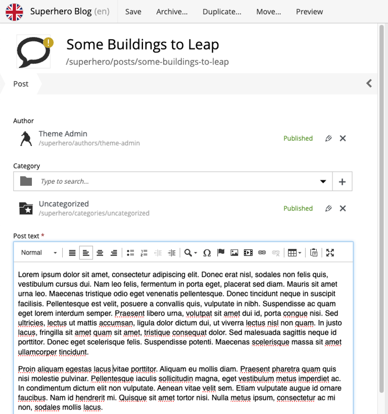
The top of the content form has the content type icon, the Display Name, and the content path name. The default icon can be replaced with a thumbnail image by clicking on it and uploading an image file. When the Display Name is being changed, the path name will change accordingly, to a URL-friendly version. It is also possible for the Display Name to be generated dynamically using values from other form fields by using a Display Name expression.
| Value of the Path field must be unique and will be validated against existing content every time the field is changed. |
| For a new content, Path will be auto-generated as you type into the Display Name field. International letters will be automatically transliterated into their english equivalents. It’s possible to turn off this behaviour in the Content Studio’s config file. |
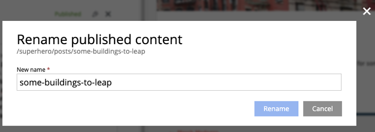
After a content has been published, the Path field gets locked and user must click the path to rename content in the dedicated modal dialog. These precautions aim to prevent accidental breaking of external hard-coded links.
Form
Underneath the header is the toolbar with clickable navigation steps that correspond to different sections of the content form. The first one is always the content type name followed by optional X-data steps (if any). Clicking on an item in the toolbar will scroll the content form down to the corresponding section.
Clicking the "<" icon in the menu toolbar will collapse the Content Form and automatically undock the Page Components tree.
| If you collapse the tree, your browser will remember this selection and won’t reopen it the next time you collapse the form. |
Page Components tree
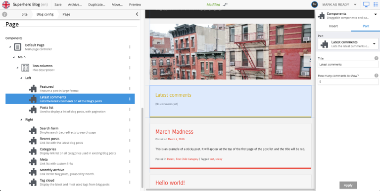
When content has a controller the toolbar menu will have a step called "Page". This form step contains a hierarchical tree representation of all the components and regions on the page, including the page itself. This tree makes it very easy to manage content structure without having to use the Page Editor.
Selecting a component in the tree will highlight the component in the Page editor and display its configuration in the Components widget. The triple dot icon on the right of each component will open a context menu. This menu is the same as the one that would open for the same component in the Page editor.
Components can be rearranged directly in the tree with drag’n’drop function.
In the image below, a part called Latest comments is selected in the Page Components view and highlighted with a blue border/mask in the Page Editor. The selected part’s configuration form is displayed in the Components widget on the right.
| For fragments and page templates the Page Components tree will be inside the first form step. |