Layouts
Contents
In this chapter you will add a two-column layout, which lets editors place components side by side.
Layouts are essentially parts with an extra trick up their sleeve: regions. This means that layouts may host other components, and build rich page structures.
Task: Add a layout to Enonic
Adding layouts is more or less identical to adding pages and parts.
-
Check the layout descriptor - Verify that the Enonic app has the
2-columnlayout descriptor at:src/main/resources/cms/layouts/2-column/2-column.yamlkind: "Layout" title: "2 columns" description: "Provides left and right regions" form: [ ] regions: - "left" - "right"Like a page, layouts may declare named regions. -
Redeploy the Enonic app - This is only needed if you had to change it, and happens automatically if you started
enonic dev.
Task: Add layout rendering to the front-end
Move over to the Next.js app, and add the component that renders the layout.
-
Add the front-end layout component:
src/components/layouts/TwoColumnLayout.tsximport type {LayoutProps} from '@enonic/nextjs-adapter'; import React from 'react' import {RegionView} from '@enonic/nextjs-adapter/views/Region'; import styles from './TwoColumnLayout.module.css'; const TwoColumnLayout = (props: LayoutProps) => { const regions = props.layout.regions; const {common, meta} = props; return ( <> <div className={styles.row}> <RegionView name="left" components={regions['left']?.components} common={common} meta={meta}/> <RegionView name="right" components={regions['right']?.components} common={common} meta={meta}/> </div> </> ); }; export default TwoColumnLayout;And its CSS module:
src/components/layouts/TwoColumnLayout.module.css.row { display: flex; gap: 10px; margin-bottom: 10px; flex-wrap: wrap; } .row :global(div) { flex: 1; min-width: 200px; } .row :global(.xp-page-editor-region-placeholder) { margin-bottom: 0; }This is an example of using CSS modules. For more details visit the Next.js style documentation. -
Register the component - Add these new lines to the
_mappings.tsfile:src/components/_mappings.tsimport TwoColumnLayout from './layouts/TwoColumnLayout'; // Layout mappings ComponentRegistry.addLayout(`${APP_NAME}:2-column`, { view: TwoColumnLayout });This specific layout does not need any additional data, hence no query or processor. -
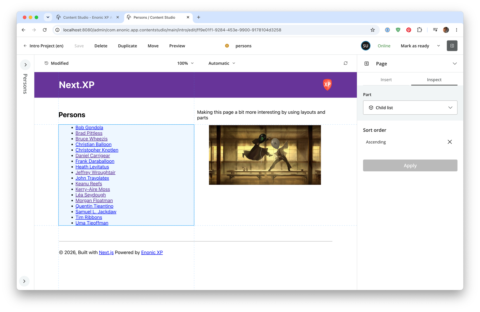
Verify the result - In Content Studio, add the layout to a page, and then add components inside the layout.
By combining layout, part and text components, the potential of the page editor starts to show:
Summary
You’ve added a 2-column layout with left and right regions, and used it to place components side by side on a page.
Next, you’ll create page templates, which reuse a page definition across multiple content items.