Macros - Custom rich text components
Contents
In this chapter you’ll render macros, which are custom components within rich text.
Intro
Occasionally, you may require rich components, even within your rich text. This is enabled via a component type called macros. Macros follow the same pattern as you have seen for other components.
FactBox macro
In your Enonic project, a FactBox macro schema is pre-defined. It is located in src/main/resources/cms/macros/factbox/factbox.yaml. If you take a closer look at the Léa Seydough bio, you can see how the factbox macro is used.
Task: Create the FactBox component
Create a React component that renders the factbox macro.
-
Create the FactBox component - This React component is automatically invoked by the
RichTextViewused in the previous chapter, should it encounter a corresponding macro in the text.src/components/macros/FactBox.tsximport type {MacroProps} from '@enonic/nextjs-adapter'; import React from 'react' import styles from './FactBox.module.css'; const FactBox = ({name, children, config, meta}: MacroProps) => { // macro is used inside a <p> tag so we can't use any dom tags const header = typeof config.header === 'string' && config.header.length ? config.header : 'Fact Box'; return <> <ins className={styles.factbox}> <i className={styles.icon}>💬</i> <strong className={styles.header}> {header}</strong> {children} </ins> </> }; export default FactBox;Style it by adding a CSS module as well:
src/components/macros/FactBox.module.css.factbox { background-color: rgb(235, 249, 249); display: block; text-decoration: none; -webkit-border-radius: 2px; -moz-border-radius: 2px; border-radius: 2px; clear: both; -webkit-box-shadow: 0 2px 3px rgba(0, 0, 0, .3); -moz-box-shadow: 0 2px 3px rgba(0, 0, 0, .3); box-shadow: 0 2px 3px rgba(0, 0, 0, .3); min-height: 24px; line-height: 24px; font-family: sans-serif; font-size: 14px; color: #333; padding: 10px 20px 10px 44px; width: 75%; margin: 20px auto; position: relative; } .factbox .header { font-size: 14px; font-weight: bold; line-height: 24px; margin: 0; } .factbox .icon { position: absolute; font-size: 24px; top: 10px; left: 10px; font-style: normal; } .factbox .body ul { padding-left: 0; } .factbox .body ul li { margin: 5px 0; } @media screen and (max-width: 720px) { .factbox { width: 90%; } } -
Register the factbox macro, like all other components:
src/components/_mappings.ts... import FactBox from './macros/FactBox'; ... ComponentRegistry.addMacro(`${APP_NAME}:factbox`, { view: FactBox, configQuery: '{ header }' });Macros do not support the regular queries, but you may use configQuery. This specifically operates on the form values for the component, and the result will automatically be available in the React component’sconfigprop.You do not need to ask for the macro body, as it is implicitly passed to the macro component. Macros must be registered before the adapter prepares the outgoing query. Register the macro in _mappings.tsso it is available when requests are handled. -
Verify the rendering - The page for Lea Seydough now shows the
FactBoxmacro: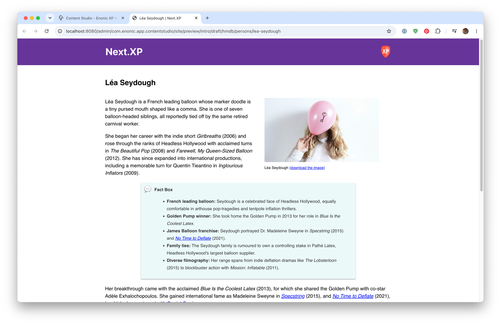
Summary
You’ve created a FactBox component and registered it as a macro, so RichTextView now renders fact boxes inside rich text.
Next, you’ll enable editors to compose landing pages.