Layouts
Contents
Layouts are essentially parts with regions, providing another layer of flexibility for page composition.
Task: Add layout rendering
Adding layouts is more or less identical to pages and parts. Unsurprisingly, HMDB already contains sample pages that uses layouts, specifically a 2-column layout.
Follow the steps below:
-
Add the
2-columnlayout files:/src/main/resources/react4xp/components/layouts/TwoColumn.tsximport type {ComponentProps, LayoutData} from '@enonic/react-components'; import {Region} from '@enonic/react-components'; import React from 'react' import styles from './TwoColumn.module.css'; export const TwoColumnLayout = ({component, meta}: ComponentProps<LayoutData>) => { return <div className={styles.row}> <Region data={component.regions.left.components} meta={meta} name="left"/> <Region data={component.regions.right.components} meta={meta} name="right"/> </div>; };/src/main/resources/react4xp/components/layouts/TwoColumn.module.css.row { display: flex; gap: 10px; margin-bottom: 10px; flex-wrap: wrap; } .row :global(> div) { flex: 1; min-width: 200px; } .row :global(.xp-page-editor-region-placeholder) { margin-bottom: 0; } -
*Register the component:
/src/main/resources/react4xp/componentRegistry.tsimport {TwoColumnLayout} from './components/layouts/TwoColumn'; ... export const componentRegistry = new ComponentRegistry(); ... componentRegistry.addLayout('com.enonic.app.hmdb:2-column', {View: TwoColumnLayout}); -
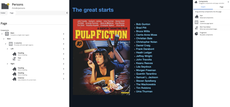
The result: By combining layout, part and text we are starting to see the potential of the page editor:

Like parts, layouts also support processors. Use .addLayout instead of .addPart. |
Optional task: Build a page from scratch
So far you have seen pre-defined pages. You may also try building your own page from scratch - using the components that are now available.
Create a new folder within the site structure, click the preview field and choose Customize. |
Wrapping up, we’ll have a look at page templates.