Custom pages
Contents
By defining a page component, editors may start composing pages using pre-defined components.
Set up page rendering
Content types are required before an editor can create content. Similarly, pages components must be defined before they can create pages.
-
Add the component files:
/src/main/resources/react4xp/components/page/Page.tsximport {Region, ComponentProps, PageData} from '@enonic/react-components'; import React from 'react' export const Page = ({component, meta}: ComponentProps<PageData>) => { return ( <Region data={component.regions.main.components} meta={meta} name="main"/> ); };/src/main/resources/react4xp/components/page/Page.module.css.page { padding-bottom: 0; margin-bottom: 0; display: flow-root; } -
Update the componentRegistry
/src/main/resources/componentRegistry.tsximport {Page} from '/react4xp/components/page/Page'; import {ComponentRegistry} from '@enonic/react-components'; //import {Hello} from './components/hello/Hello'; import {Person} from './components/content/Person'; import {Factbox} from './components/macro/FactBox'; export const componentRegistry = new ComponentRegistry(); //componentRegistry.addContentType('portal:site', {View: Hello}); componentRegistry.addContentType('com.enonic.app.hmdb:person', {View: Person}); componentRegistry.addMacro('factbox', {View: Factbox}); componentRegistry.addPage('com.enonic.app.hmdb:main', {View: Page});Here we also disabled the "Hello" component, as it is no longer needed. -
Disable the HelloProcessor as well:
Your dataFetcher should now look like this:
/src/main/resources/react4xp/dataFetcher.tsimport {DataFetcher} from '/lib/enonic/react4xp'; import {commonProcessor} from '/react4xp/components/common/CommonProcessor'; //import {helloProcessor} from './components/hello/HelloProcessor'; import {personProcessor} from './components/content/PersonProcessor'; import {factboxProcessor} from "./components/macro/FactboxProcessor"; export const dataFetcher = new DataFetcher(); //dataFetcher.addContentType('portal:site', {processor: helloProcessor}); dataFetcher.addCommon({processor: commonProcessor}); dataFetcher.addContentType('com.enonic.app.hmdb:person', {processor: personProcessor}); // @ts-ignore update type in addMacro dataFetcher.addMacro('factbox', {processor: factboxProcessor});
Working with pages
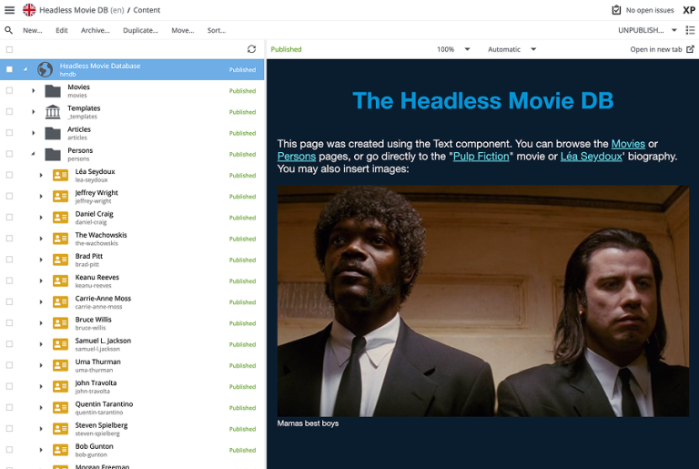
The HMDB dataset already contains sample content with pages. By selecting the front-page in Content Studio, you should immediately see something like this:

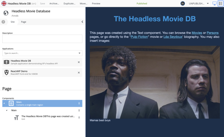
By editing the front page, you will see that a page with a single region main, containing a single Text Component.

The Text Component
Enonic provides a standard Rich text component that can be placed on pages. React4XP implements a default rendering of this special component.
By selecting the component, in the list, or directly on the page you can start editing it.

Custom components
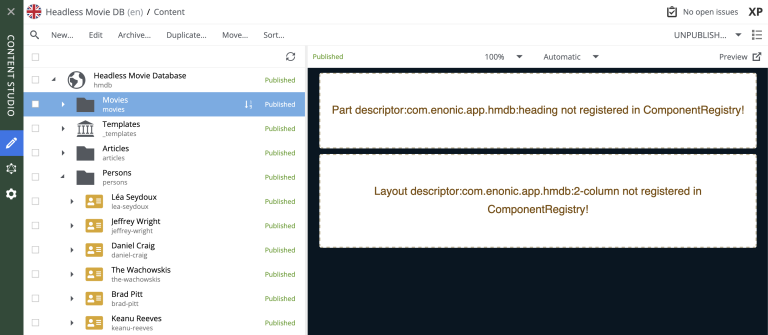
Pages also support custom components. Try selecting the Movies page, and you will see that some components are not rendering properly. Content Studio has a built-in fallback handling for these, so you can interact with them, even if they are not yet rendering.

We’ll start dealing with this in the parts chapter.