Page Editor
Contents
The Page Editor is the visual workspace for assembling and configuring pages in Content Studio.
Overview
The Page Editor consists of three main parts:
-
The Page form contains the component tree and the structured representation of the page.
-
The Preview panel may also support visual and interactive editing of the page content, depending on the current setup and front-end implementation.
-
The Page context panel, referred to below as the context panel, allows editors to configure individual page components.
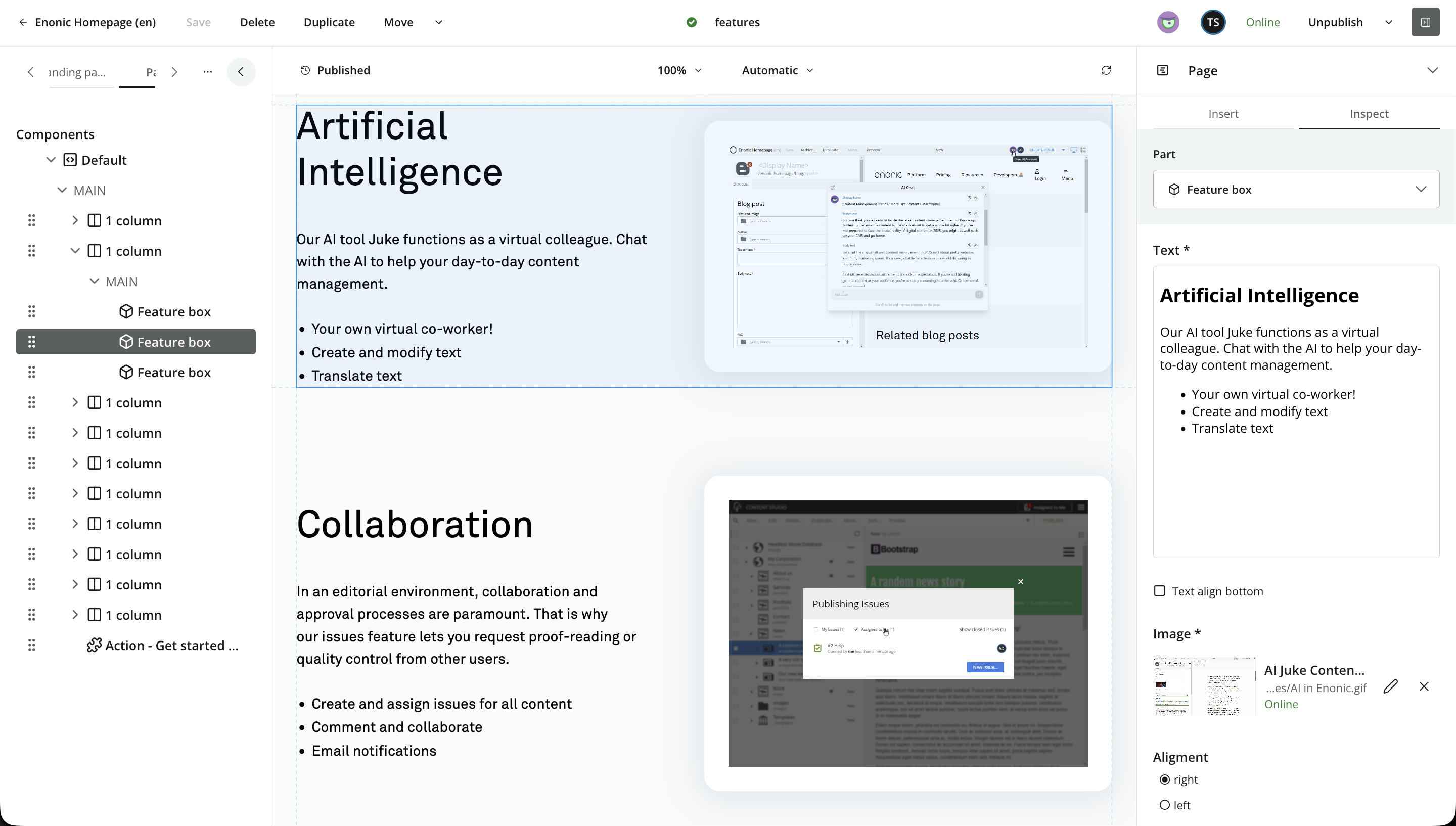
A page consists of a component tree, with the Page component at the root. The Page component may define regions, allowing other components to be nested inside. Layout components also support regions for building more complex structures. Part components are leaf components because they do not define regions.
Page, Layout, and Part components can expose configuration forms, similar to mixins and content types.
Pages and content
Like a mixin, a page is an optional structure that can be added to a content item without changing its content type. A mixin adds predefined fields to the Content Form, while a page adds a component tree that editors can assemble and configure.
When to use pages
Pages are ideal for building content structures that do not fit naturally into the schema of a content type. Examples include landing pages and rich, structured documents.
Pages can also be combined with content types and mixins when you want a structured content core and the freedom to adjust its composition.
Page templates can provide a consistent starting structure for content such as products or articles. Editors normally select a content type rather than a page template when creating content; Content Studio resolves a compatible template behind the scenes.
Main concepts
The following concepts define pages and their composition:
- Page
-
An optional component tree for editors to assemble and configure.
- Component
-
Building blocks supplied by an application. Components can define form fields. Page and Layout components also provide regions.
- Fragment
-
A reusable component stored as a separate content item. Changes to the Fragment affect every page that references it. See Fragment.
- Page template
-
A content item containing a starting page structure for compatible content types. See Page template.
Front-end and rendering
Content Studio manages the page component structure and its content. A front end can retrieve this structure through APIs and determine how to present it. Visual editing and preview depend on the available front-end integration. The following sections explain the editorial controls. For the underlying page model and front-end integration, see the Enonic CMS pages reference.
Availability and setup
The Page Editor is only available when applications assigned to the enclosing site provide page components. Content Studio simply cannot create a page unless at least one page component exists.
Page templates are optional. They are created and managed like other content inside the site’s automatically provisioned Templates folder. When a compatible template exists, Content Studio resolves it from the content type and uses its component structure automatically.
Page settings
When the content does not yet have its own page setup but a matching page template exists, the page preview is marked Locked. Click the preview to open a context menu, then select Page settings.
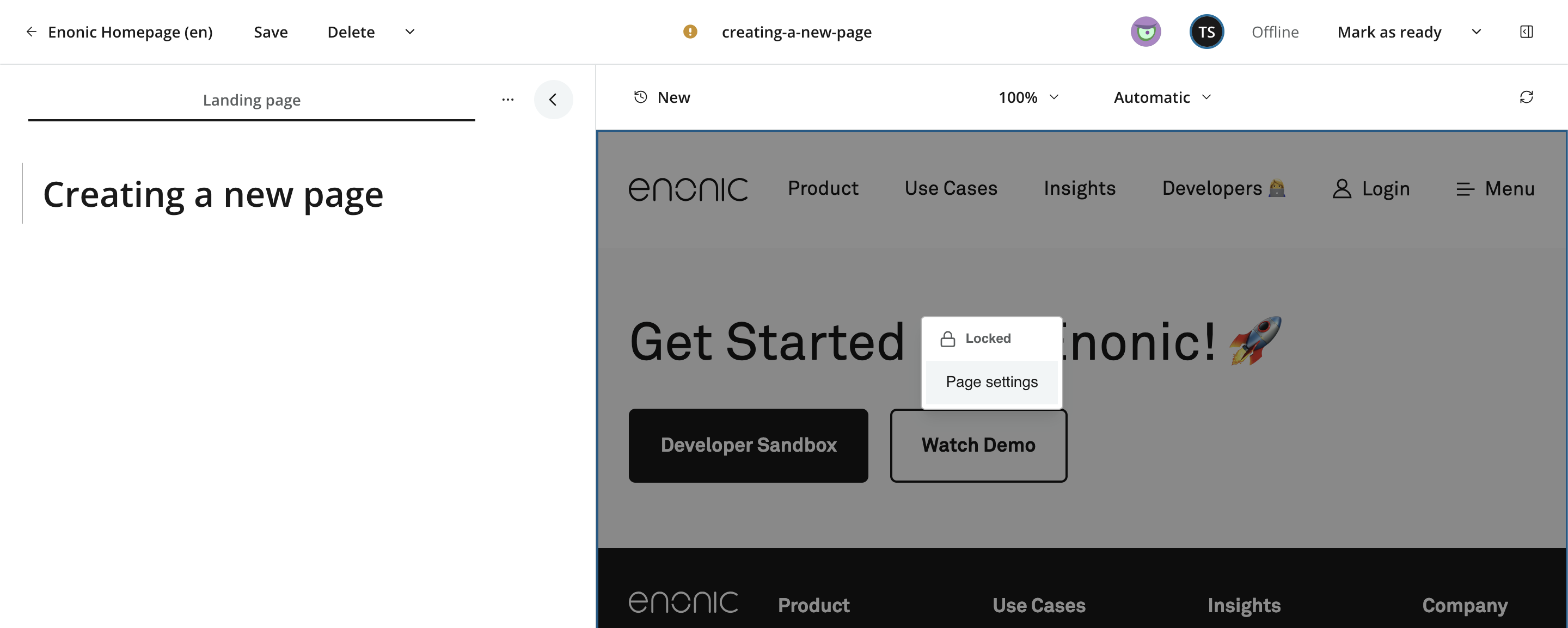
This opens Page settings in the context panel’s Inspect tab. The same settings are available later by selecting the Page root in the Page Components tree and choosing Inspect.
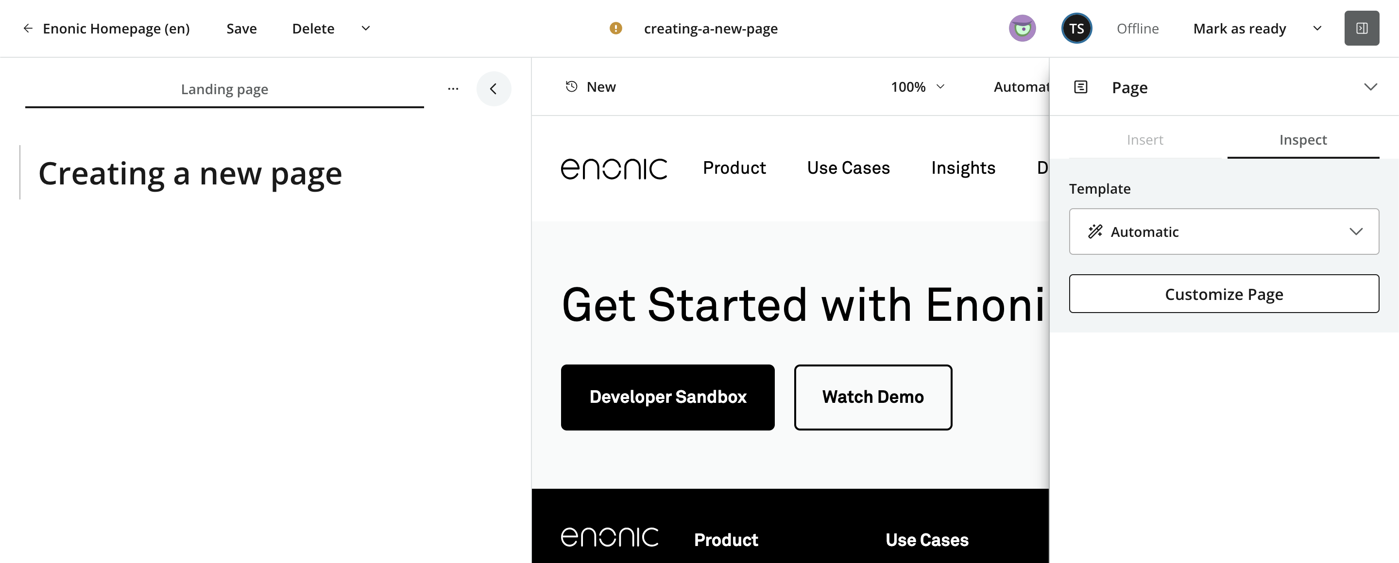
| You may also access Page settings by opening the context panel and selecting Page from the panel list. |
Customizing a template-based page
A page that uses a template remains linked to it and reflects later changes to the template. To create an editable, item-specific copy of the page structure:
-
Open Page settings.
-
Click Customize.
-
Confirm the operation.
Content Studio copies the template’s component structure and configuration into the content item. The page becomes editable and the Insert tab is activated.
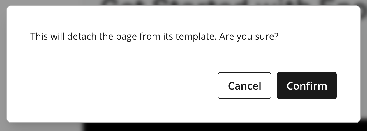
After customization, the page is no longer linked to the original template, and later template changes do not affect it.
Pinning a page template
Several page templates may be compatible with your content type.
In some cases, you may want to pin a specific template to your content rather than build a custom page. For example, you might choose a different page structure for an article or product.
Follow these steps to pin a template to your content:
-
Open Page settings.
-
Select the desired template from the selector.
-
Content Studio automatically saves and applies the new setting.
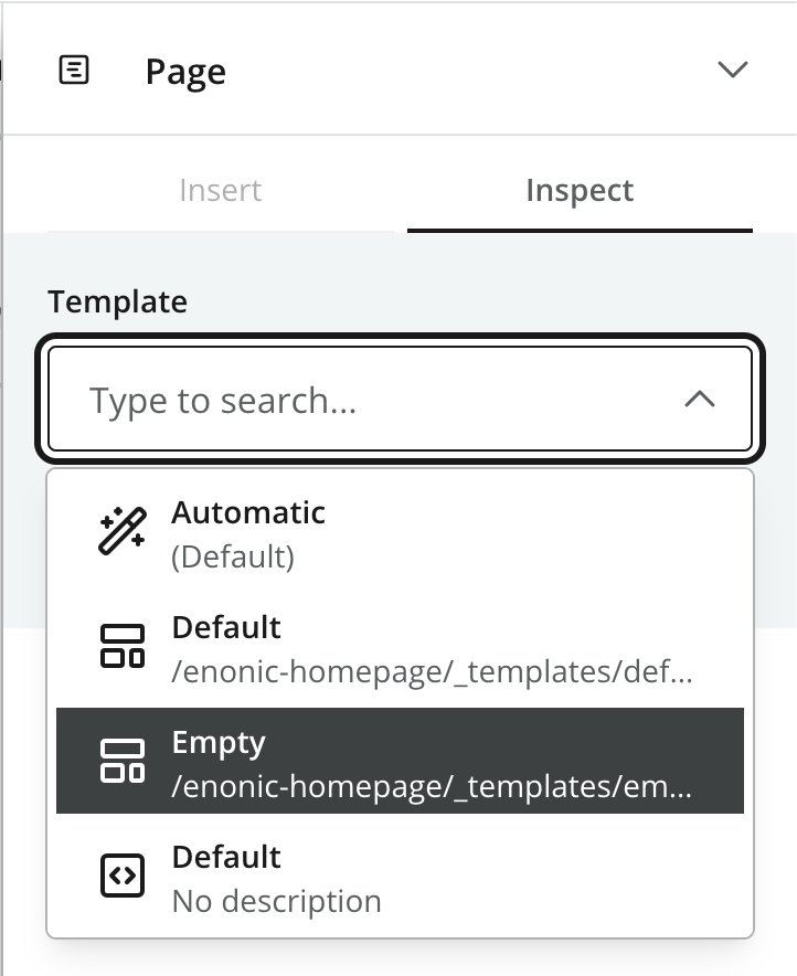
The page remains linked to the selected template until it is customized.
| You may also customize a pinned template by clicking Customize, or return to Automatic template mode. |
Building a page from scratch
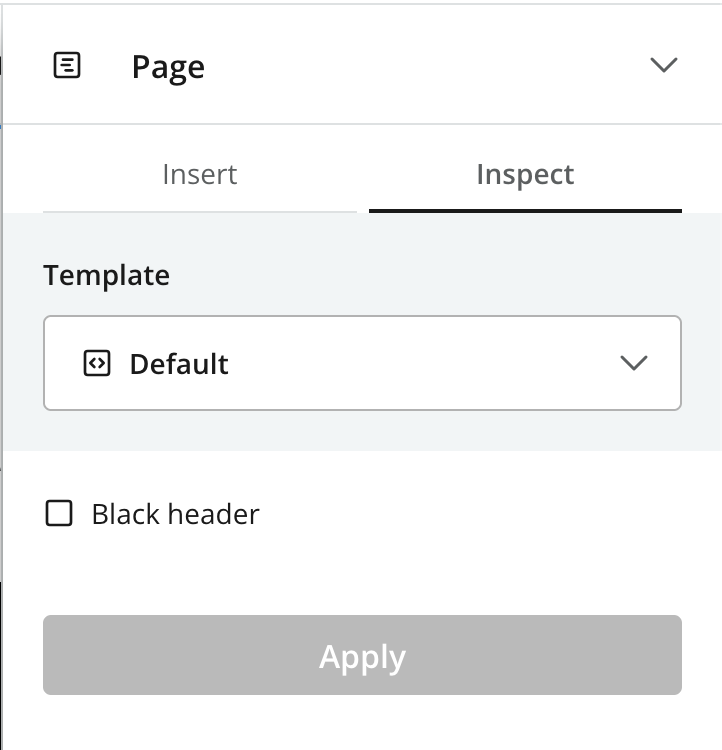
You may also create a page from scratch by selecting a root component directly in Page settings.
| Only components of type Page are listed here. Most setups provide only a single Page component. |
Page context panel
While the Page Editor is active, the context panel provides an Insert tab for adding components and an Inspect tab for configuring the selected page item. See Context panel for its general behavior.
Insert tab
The Insert tab is available when the page has an editable, item-specific setup. It lists the component types that can be added to the current page. Use these items with the visual drag-and-drop workflow described under Working in the page preview.
You can also insert a component after a selected component or into a region from the component context menu. Layout insertion is unavailable inside another layout.
Inspect tab
The Inspect tab follows the current selection. Its title identifies the selected item, such as Page, Part, Layout, or Fragment.
Selecting the Page root opens Page settings. Selecting another component opens its configuration and, where applicable, a selector for its Part, Layout, or Fragment. The fields are supplied by the component’s application and therefore vary between components.
Use Apply when it is shown to save configuration changes to the draft and refresh the preview. Applying changes does not publish the content.
Page structure
The Page Editor works with a hierarchy of page items:
- Page
-
The root of the structure. It identifies the Page component or template and holds page-level configuration.
- Region
-
A named insertion area defined by a Page component or Layout. Regions determine where components can be placed.
- Component
-
A part, layout, fragment, or legacy Text component placed in a region.
Layouts can introduce additional regions, but a Layout cannot be placed inside another Layout. The Page component and Layout definitions determine which regions exist; editors arrange components within them.
Using the Components tree
The Page tab in the Content Form contains a tree of the Page root, its regions, and all components. Selecting an item in the tree selects the same item in the page preview, when available, and opens its Inspect view.
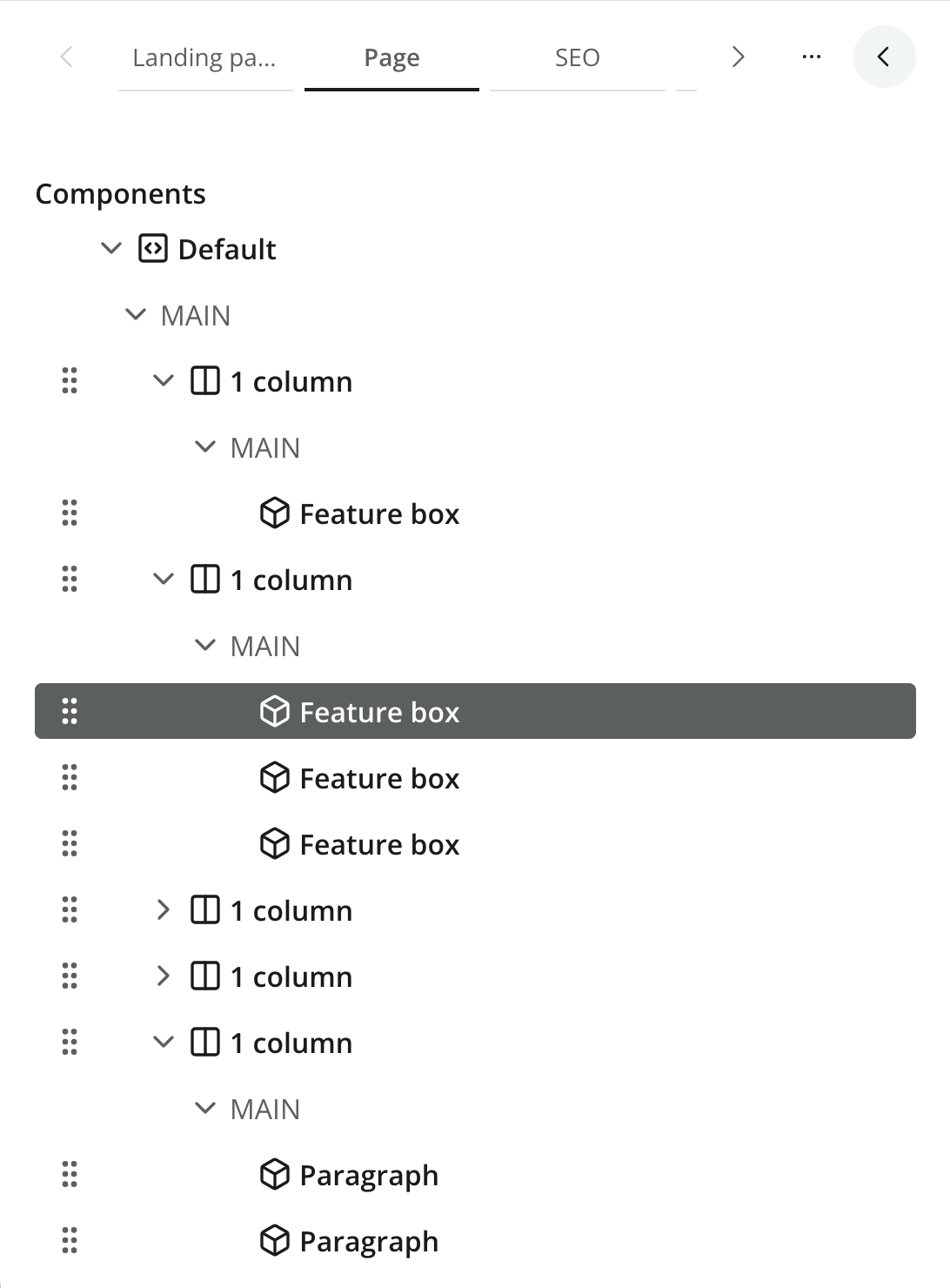
The tree is useful when visual editing is unavailable and for navigating nested structures or empty components. Drag components to reorder them or move them between compatible regions, or open an item’s context menu to use its available actions.
Fullscreen mode
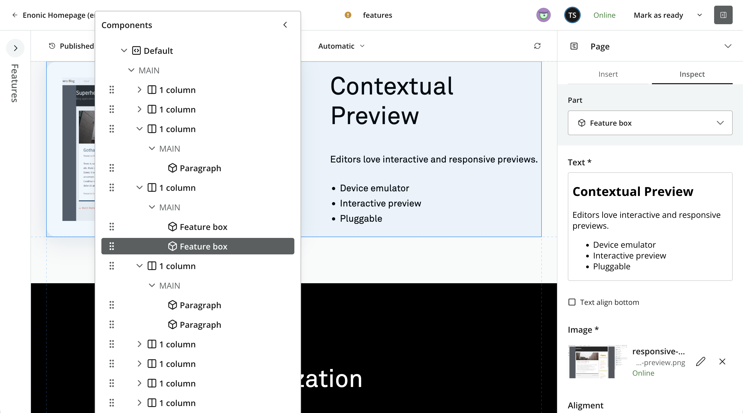
When the Content Form is collapsed, the Page Components tree becomes a floating panel above the visual editor, regardless of whether the preview is interactive. Collapse the floating panel to dock it as an icon in the vertical toolbar. Click the icon to reopen it.
Visual editing
When visual editing is enabled, you may click directly on the page to select an element. The Page Editor highlights the element, selects it in the Page Components tree, and opens its configuration in the Inspect tab.
As in the component tree, you may use the context menu to perform actions such as inserting or deleting components.
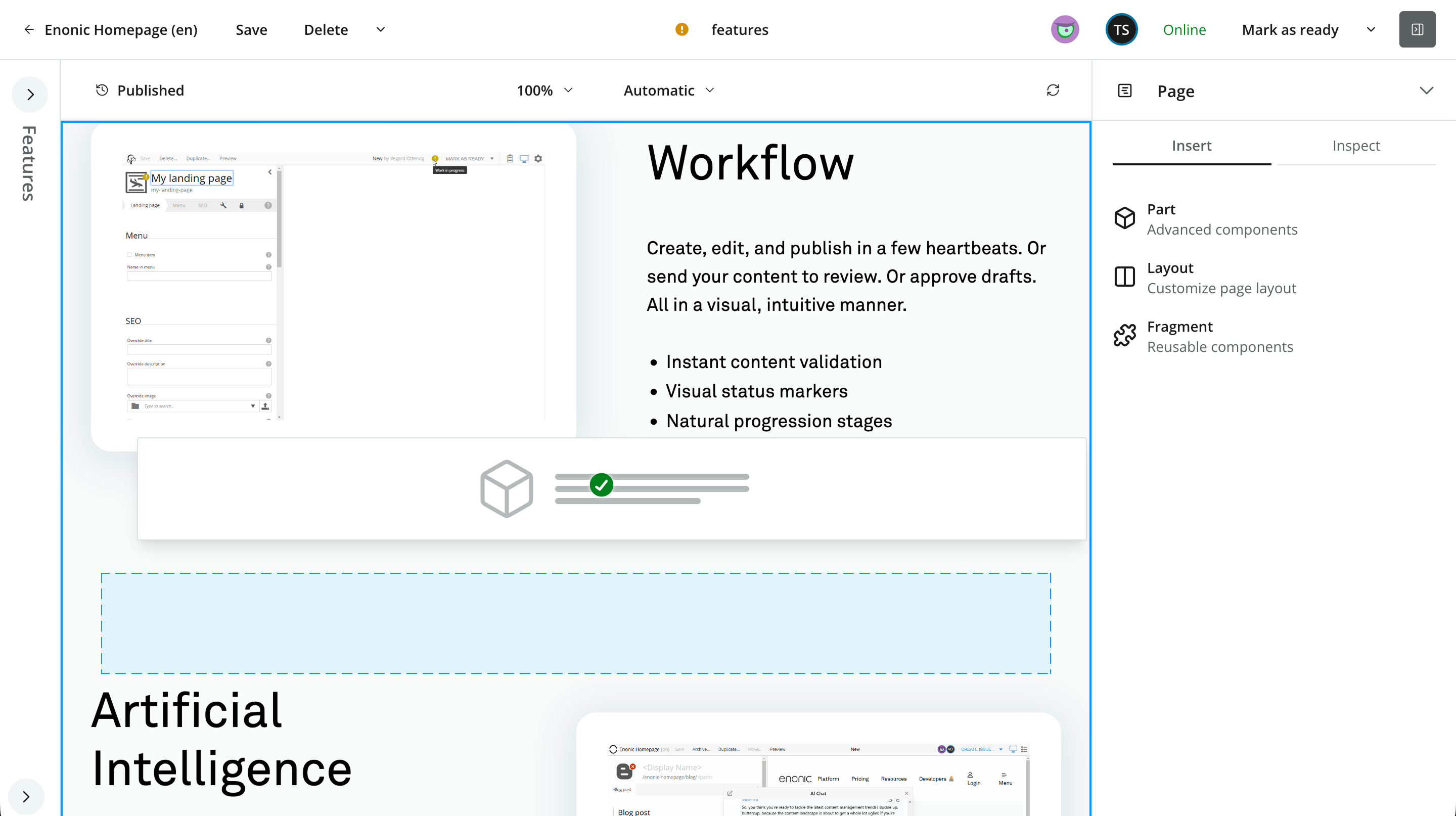
To add a component, drag a component type from the Insert tab to a region in the preview. The Page Editor indicates whether the current position is a valid drop location. After dropping a Part, Layout, or Fragment placeholder, the component is automatically selected, and you may configure it from the context panel.
Drag an existing component to another valid position to reorder it or move it between compatible regions. Some components occupy the same visual area as a parent Layout or are difficult to select directly. Use Select parent from the context menu, or select the exact item in the Page Components tree.
Empty regions are shown as drop zones:

Empty components are shown as placeholders with icons that identify their component type:

Component actions
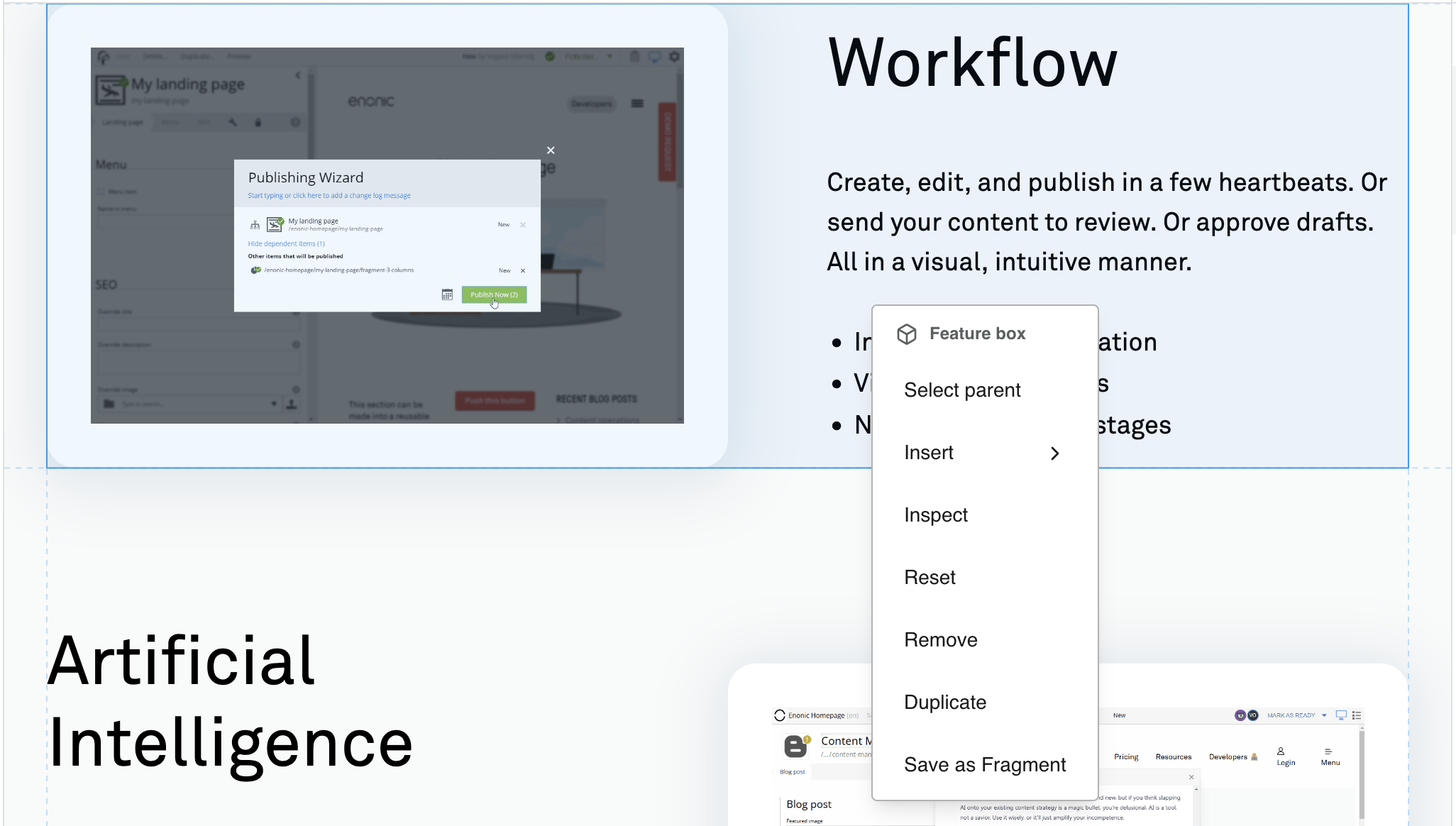
Right-click a page item in either the visual editor or the component tree to open its context menu. The exact set of actions depends on the item type, page state, and your permissions.
Component and region actions
- Select parent
-
Select the region, layout, or Page above the current item.
- Insert
-
Add a Part, Layout, Fragment, or enabled Text component after the current component or inside the selected region.
- Inspect
-
Open the selected item’s settings in the context panel.
- Reset
-
Clear the selected component, or remove all components from the selected region. An empty component remains in place so that it can be configured again.
- Remove
-
Delete the component from the page structure.
- Duplicate
-
Create a copy immediately after the selected component.
Fragment actions
- Save as fragment
-
Replace the selected component with a reusable Fragment content item.
- Detach from fragment
-
Replace a Fragment reference with an independent copy of its component on the current page.
- Edit fragment
-
Open the referenced Fragment content item in a new editor tab.
Page root actions
- Inspect
-
Open Page settings.
- Reset
-
Remove the item-specific page setup and return to automatic page resolution after confirmation.
- Save as Template
-
Create a Page template from the current item-specific page. The new template uses the current Page component, configuration, regions, and nested components, and supports the current content type.
| Save as Template is not available for Fragments, Page templates, locked pages, or users without permission to create content. |
Component types
Content Studio 6 offers Part, Layout, and Fragment components for insertion, subject to the current page context. The legacy Text component can also be enabled by an administrator.
Part
A Part is a configurable component supplied by an application. Parts can represent page elements such as article lists, forms, navigation, or promotional blocks.
The same Part can be used several times on a page, and each instance has its own configuration.
Applications can limit where a Part is available by content type or other rules. See the component filtering reference for the application-side configuration.
Layout
A Layout is a configurable container that introduces one or more regions. Layouts are commonly used for columns or other grouped arrangements, and their configuration can control presentation such as relative column widths.
Layouts cannot be nested inside other layouts.
Fragment
A Fragment references a component stored as a separate content item. The same Fragment can be used on multiple pages, and editing it updates every page that references it.
Fragments can be created from existing components, inserted into pages, edited, or detached through the component actions.
See Fragment for the content-side behavior and lifecycle.
Text
The Text component places a rich-text block directly in a page region. It supports formatting, links, images, media, and macros through the Rich Text Editor.
| The Text component has been deprecated in Content Studio 6 and is not available for insertion by default. Existing components remain editable. An administrator can temporarily re-enable insertion from the Content Studio configuration. |
Saving and validation
The selected Page component, component structure, and component configuration are part of the content item’s draft. Content Studio automatically saves page operations such as selecting a Page component or template and arranging components. Configuration changes are saved when you click Apply. None of these operations publish the content.
Page configuration errors are marked in the Page tab and component tree. Select the affected component to find the invalid field in its Inspect view. An invalid draft can be saved but cannot be marked ready or published until its blocking errors are resolved.
See Saving and validation for the Editor-level behavior and Validation for how errors are represented in the form.