Content Editor
Contents
The Content Editor is the main interface for creating and editing content items in Content Studio.
Overview
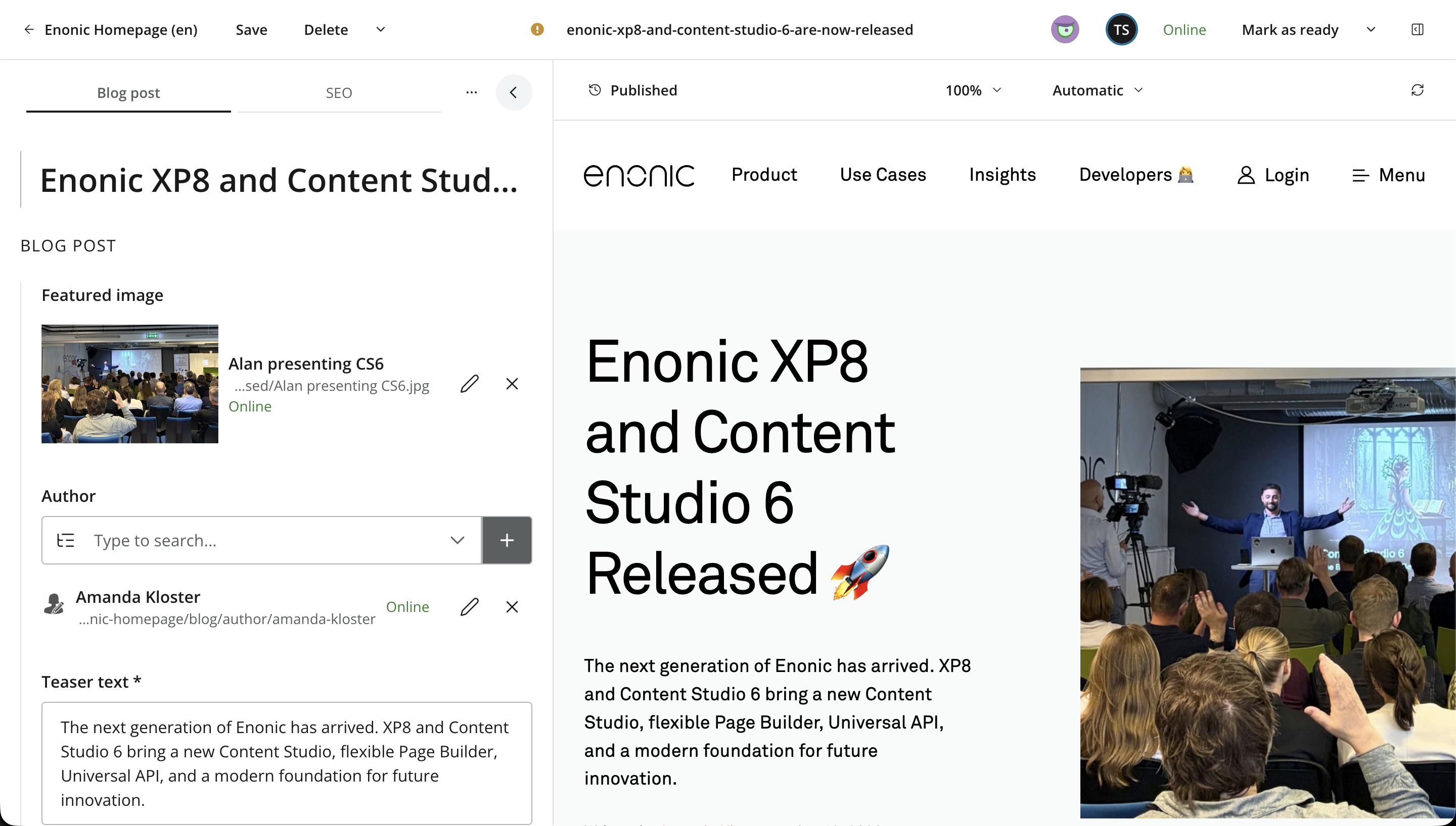
The Content Editor combines the content form, a preview or page-building surface, and the Context panel in a workspace topped by a shared toolbar.
Opening the editor
Creating or editing an item opens the Content Editor in a dedicated browser tab. Multiple content items, including items from different projects or layers, can therefore remain open at the same time.
If you navigate away from or close an editor with unsaved changes, Content Studio asks for confirmation before discarding them.
Why browser-native tabs?
Content Studio deliberately uses browser-native tabs instead of maintaining an internal set of editor tabs. This provides several practical benefits:
-
More workspace for editing, especially on smaller screens.
-
Multiple content items can remain open across different projects and layers without losing context.
-
Content opens in the same editing interface whether editing starts from the Navigator, Archive, a search result, or another reference to the item.
-
Native browser features such as tab grouping, keyboard shortcuts, history, and reopening closed tabs remain available.
-
Each editor has a direct URL that can be bookmarked or shared with another user who has access.
-
Editor workspaces remain separate instead of accumulating inside one Content Studio window, avoiding the responsiveness and resource overhead of an internal tab system.
Workspace layout
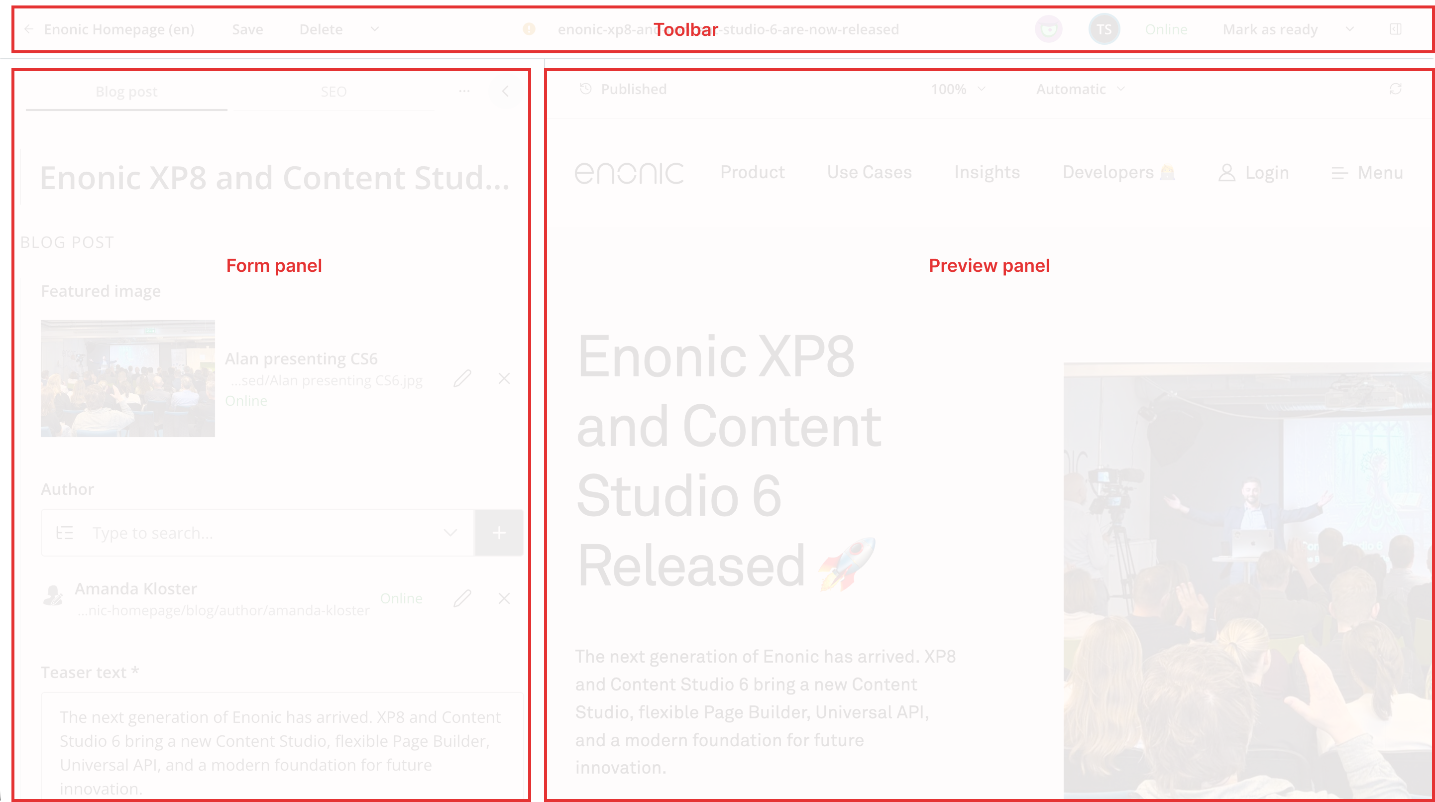
The workspace can contain up to four panels:
- Content Form
-
The Content Form appears on the left and contains the fields defined by the content type. Use it to edit the content’s display name, path, data, and other configuration.
- Preview or Page Editor
-
The central panel shows either the Preview or the Page Editor. The Page Editor manages the component structure and configuration data of content that has a page. Visual and drag-and-drop editing are available when supported by the front-end integration.
- Context panel
-
The Context panel appears on the right and provides details, version history, dependencies, permissions, and other panels relevant to the current item. Available panels depend on the content, installed applications, and the user’s permissions.
Panel visibility adapts to the available screen width. The Content Form and Context panel can also be collapsed manually to provide more space for the preview or Page editor.
Toolbar
The toolbar provides navigation, content actions, status information, workflow actions, and panel controls. The available and enabled controls depend on the content’s state, the current project, installed features, and the user’s permissions.

- Project navigation
-
The project name and language identify the active content project. Click the project name to return this browser tab to the Navigator for that project.
- Content actions
-
Common content actions appear on the left. Save stores changes in the draft branch. Other actions can include Delete, Duplicate, Move, Preview, and layer-specific actions such as Localize or Reset. Actions that do not fit are placed in the adjacent menu.
- Content status and name
-
The center shows the content’s validation or workflow state and path name. For inherited content, it also shows the layer indicator. Click the name to open the rename dialog when renaming is permitted.
- Juke AI
-
When the Juke AI Content Operator is installed, the Juke icon opens or closes the AI assistant. See Juke AI Content Operator.
- Collaborators
-
Avatars identify users who currently have the same content item open. The current user is highlighted, and hovering over an avatar displays the user’s name. When space is limited, additional collaborators are represented by a count.
- Publishing and workflow
-
The publishing badge shows whether the content is online, offline, scheduled, or expired. The adjacent primary action changes with the item’s workflow state and the user’s permissions—for example, Mark as ready, Publish, Request publishing, or Open request. Open its menu for other available workflow and issue actions. See Content life cycle and workflow.
- Context panel
-
Use the rightmost toggle to show or hide the Context panel.
Saving and validation
Use Save to store changes in the draft branch without publishing them.
Content is validated continuously while it is edited. Validation errors are shown in the form and represented by the state icon in the toolbar. Invalid content can be saved, but it cannot be marked ready or published until the blocking errors are resolved. See Invalid content.
Collaboration
The toolbar displays the avatars of users who currently have the same content item open in the same project. This presence information helps editors identify potential simultaneous work on an item.
Collaboration indicators do not replace normal saving and workflow.
Responsive layout
On narrow screens, the toolbar moves actions into compact menus and replaces the visible content name with a path icon. The Context panel is hidden by default, and the available workspace panels use the remaining width.
Collapse the Content Form when more room is needed for the Preview or Page editor. For page content, collapsing the form also changes how the Components panel is presented.