Accessibility
Contents
Accessibility is a firm product requirement in Content Studio, not an add-on.
| This page covers the accessibility of the Content Studio application. The accessibility of a published website also depends on its templates, applications, media, and authored content. |
Introduction
Content teams should not have to choose between advanced content management and an inclusive authoring environment. Keyboard operation, screen-reader support, visible focus, responsive layouts, and accessible color contrast are therefore built into the standard interface rather than confined to a separate mode.
Content Studio 6 is built on the Enonic UI design system. Shared controls and interaction patterns make navigation more predictable across the Navigator, Content Editor, dialogs, selectors, and project-management tools.
Standards and evidence
Content Studio is engineered and evaluated against the Web Content Accessibility Guidelines (WCAG) 2.1. It meets nearly all evaluated requirements and is close to full conformance, with only a small number of known exceptions remaining. Accessibility is considered across complete editorial workflows, including finding content, editing forms, selecting related items, resolving validation errors, and publishing.
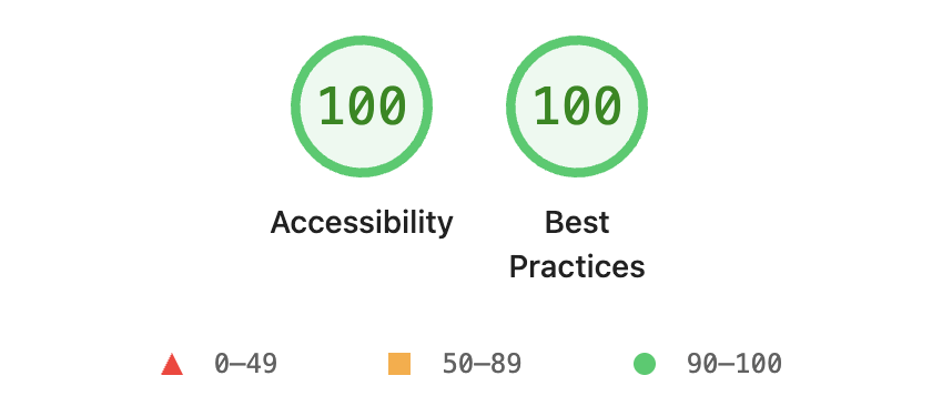
The tested Content Studio 6 interface achieved a perfect 100/100 accessibility score in Lighthouse. This means that it passed every automated accessibility audit contributing to the score, providing a strong, repeatable benchmark for accessible names, element roles, color contrast, and other machine-testable qualities.
Enonic’s detailed accessibility assessment complements this automated benchmark with evaluation of real interaction patterns: keyboard navigation, focus management, screen-reader semantics, validation, dialogs, and responsive layouts. Together, automated and manual evaluation provide stronger evidence than either method alone and help prevent regressions as Content Studio evolves. The Lighthouse accessibility scoring reference describes which automated audits contribute to its score.
Keyboard operation
Content Studio supports keyboard navigation throughout its main work surfaces. Standard interaction patterns include:
-
TabandShift+Tabmove focus between controls. -
Arrow keys move within toolbars, menus, selectors, and content lists.
-
EnterorSpaceactivates the focused control. -
Clearly visible focus indicators show which control will receive the next action.
The Navigator toolbar and content list can be operated from the keyboard. Content Editor and Rich Text Editor actions also have direct shortcuts for frequent operations such as saving, publishing, formatting text, and inserting links.
Press F2 to display the shortcuts available in the current view. See Keyboard shortcuts for the complete reference.
Screen readers
Content Studio’s controls are designed to expose their accessible name, role, and current state to assistive technologies. This is particularly important for controls whose visual presentation is primarily an icon, as well as for dynamic components such as:
-
Action toolbars and dropdown menus
-
Content lists and item selectors
-
Tabs, expandable panels, and context menus
-
Modal dialogs and multi-step wizards
-
Form validation and status messages
Text labels accompany important states and actions so that meaning does not depend on an icon, position, or color alone. Consistent control patterns also reduce the amount of interface-specific behavior a screen-reader user must learn.
Focus and validation
Keyboard focus is visually highlighted as it moves through interactive controls. Within toolbars and other composite controls, focus can move between individual actions without requiring pointer input.

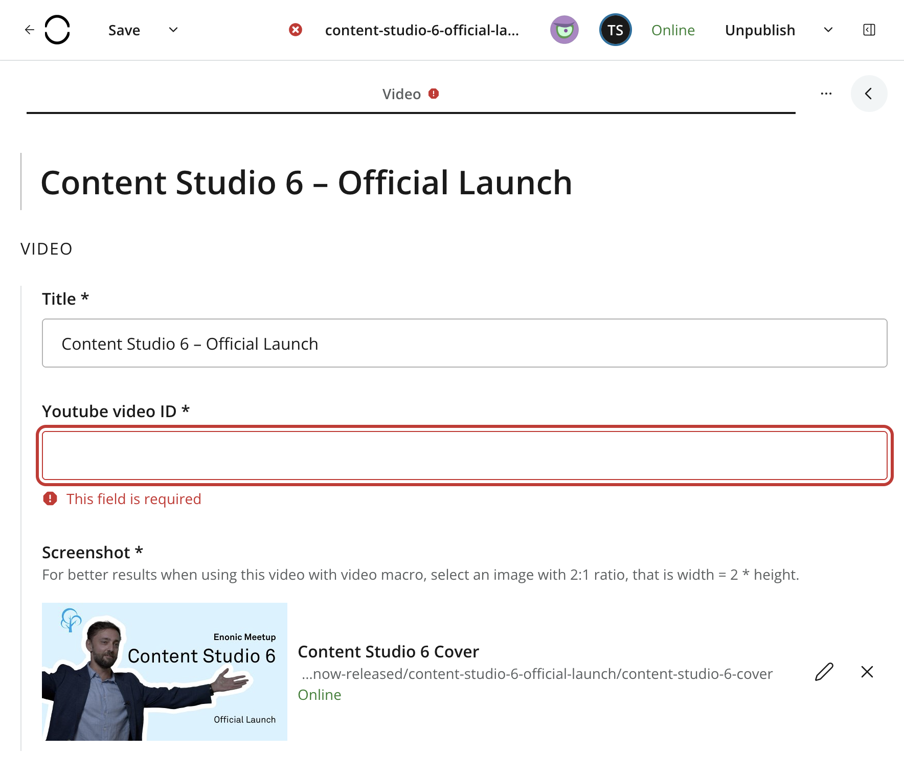
Forms identify invalid fields and surface validation feedback so that errors are not hidden inside collapsed sections or long forms. This is especially useful in the Content Editor, where a content type may contain many inputs and nested field sets.
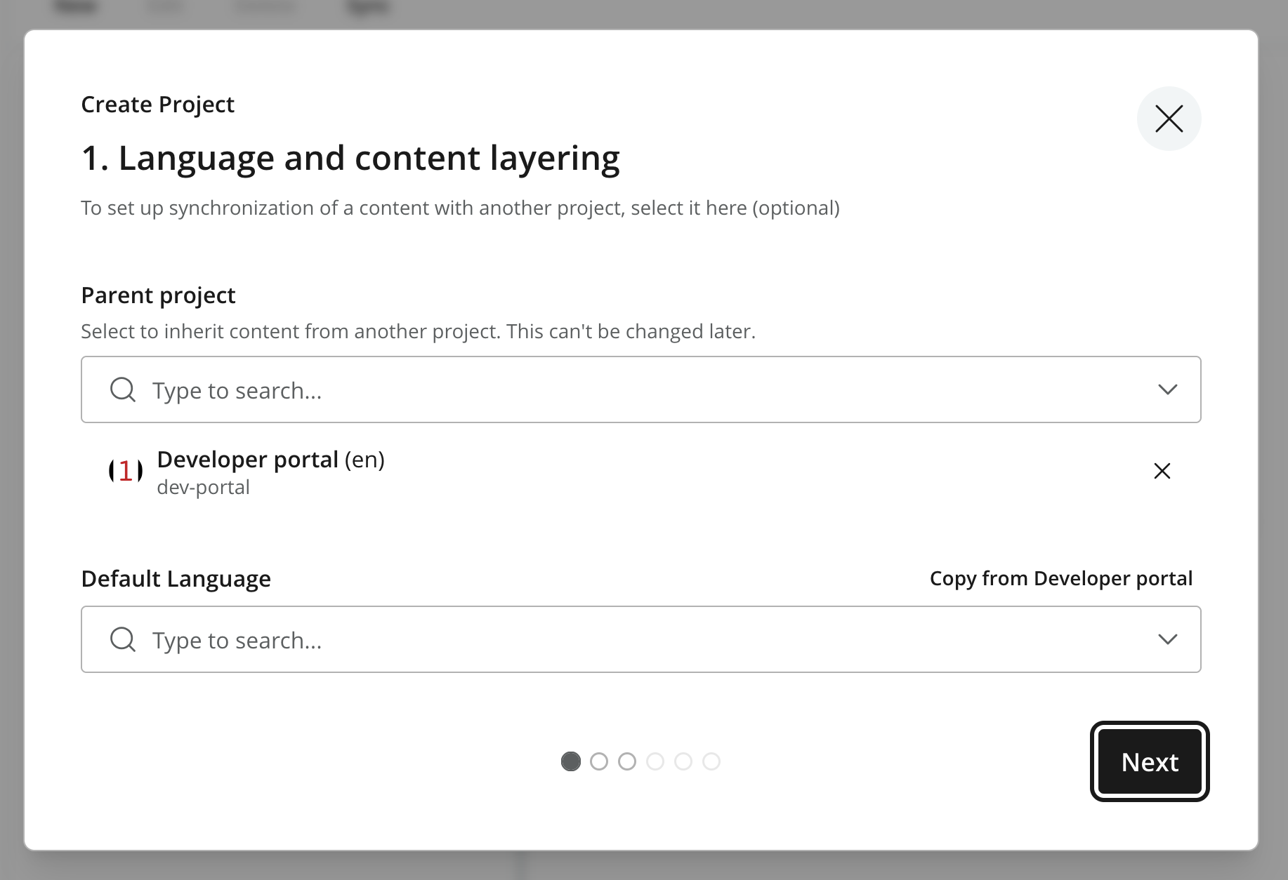
Dialogs and wizards use the same keyboard and focus conventions as the main interface. Primary and secondary actions have text labels, and multi-step flows identify the choices that must be completed before continuing.
Visual presentation
The interface uses a consistent visual hierarchy, accessible color contrast, and clear focus styling. Statuses are communicated with text and icons in addition to color.
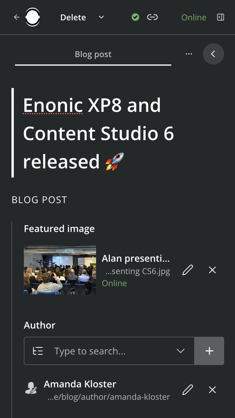
Content Studio’s responsive panels adapt to the available space. This supports different screen sizes and browser zoom levels while keeping the active work surface usable. Dark mode provides an alternative presentation for users who prefer a darker interface or work in low-light environments.
Authoring accessible content
Content Studio also provides tools that help editors improve the accessibility of the content they publish:
-
The Insert Image dialog supports alternative text and lets editors mark decorative images appropriately.
-
Rich text supports semantic heading levels, links, lists, tables, and other structured elements.
-
Image captions can provide visible context in addition to alternative text.
-
Field-level validation can require accessibility-related metadata when the content type is configured accordingly.
These tools support accessible authoring, but cannot guarantee that the finished website is accessible. Site developers remain responsible for accessible templates and application output, while content managers remain responsible for meaningful text alternatives, headings, links, and media.
Reporting accessibility problems
Accessibility problems should be reported with enough context to reproduce them:
-
Content Studio and Enonic XP versions
-
Browser and operating-system versions
-
Assistive technology and version, when applicable
-
The view, content type, and sequence of actions involved
-
The expected and observed keyboard or screen-reader behavior
Screenshots are useful for visual issues, while a short screen recording or screen-reader transcript may better explain focus order, announcements, or other interaction problems.