Navigator
Contents
The Navigator is the default menu item in Content Studio — what you see when you open the application. It is built around the current project’s content list and the actions you can perform on it.
The action toolbar runs across the top. Below it, the Content list is the primary panel. The Search panel opens to its left, while the Preview panel and Context panel appear to its right. The layout adapts to the available width, so fewer panels and columns may be visible in a narrow window.
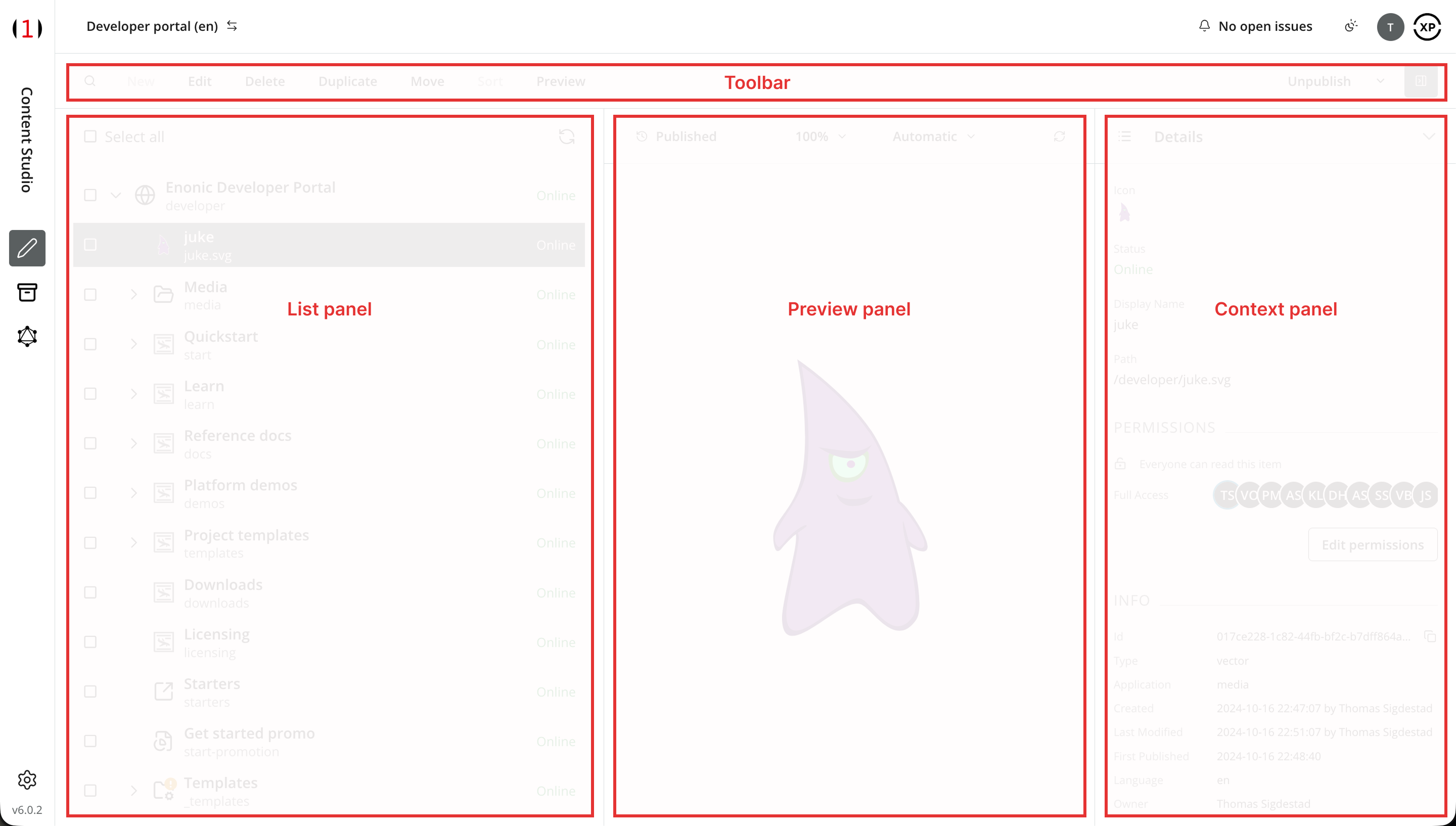
Toolbar

The search button on the left opens the Search panel. Content actions follow it, including New for creating content and Edit for opening selected items in the Content Editor. Buttons are enabled or disabled according to the selection, content state, and your permissions. See Actions for the available actions and their detailed references.
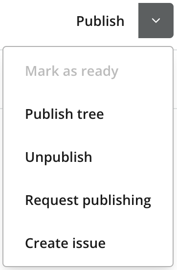
The primary workflow button is on the right. Its main action and menu options change with the selection, the content’s workflow and publish state, and your permissions. For example, it can offer Mark as ready for in-progress content or Request publishing when you cannot publish the content yourself. Open its dropdown for additional workflow and issue actions.
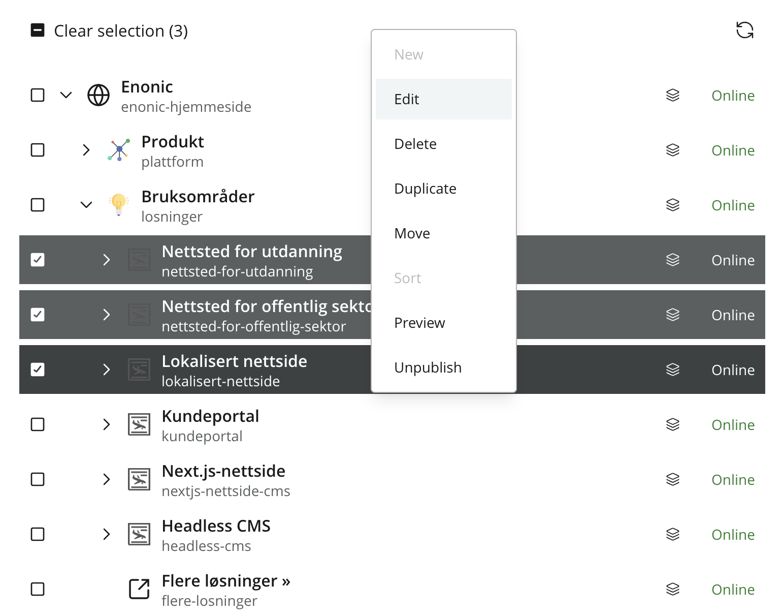
Right-click a content item in the list to open a context menu with applicable actions. For actions on several items, use Bulk selection.
Content list
The main panel displays the content list for the current project.
By default, it shows the items in their native tree structure, with the root content at the top and children nested beneath their parents. Items with children will have an expand icon to the left, which can be clicked to expand or collapse that structure.
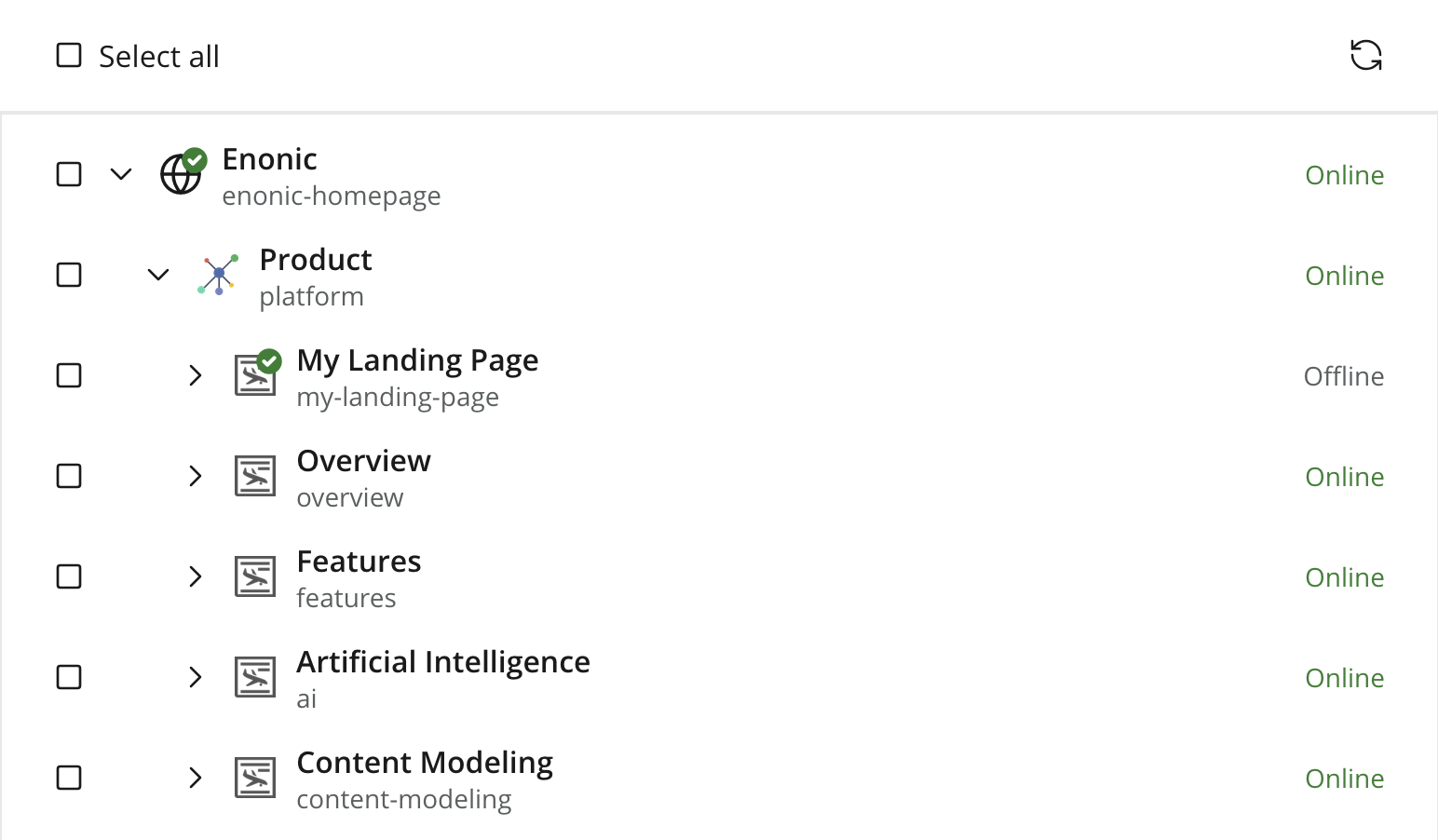
The content list has its own toolbar with an icon to refresh the list and a checkbox to select or deselect all displayed items.
Double-click a content item to open it for editing in a new browser tab, or right-click a content item to open its context menu.
Columns
The content list contains two main columns. Columns may be hidden as the panel narrows:
-
Column 1 contains the content type icon, display name, and path. An expand icon appears when the content has children. Additionally, a workflow state icon may appear on top of the content icon, indicating invalid, in progress or ready.
-
Column 2 shows the publish state as text: Online, Offline, Scheduled, or Expired, telling you whether the content is currently published, unpublished or not.
| If you are working in a layer, a third column will appear, showing the content’s layering status. It will indicate if it is an original item, inherited from the parent project, or inherited and localized. See layering for details. |
Bulk selection
Use the checkboxes to select one or multiple items. Applicable toolbar and context-menu actions then operate on the complete selection; actions that require a single item are disabled.
Search
Open the search panel with the 🔍 (magnifying glass) button on the toolbars left hand side to open the search panel.
Use the Free-text search to find content by content, content ID, or path.
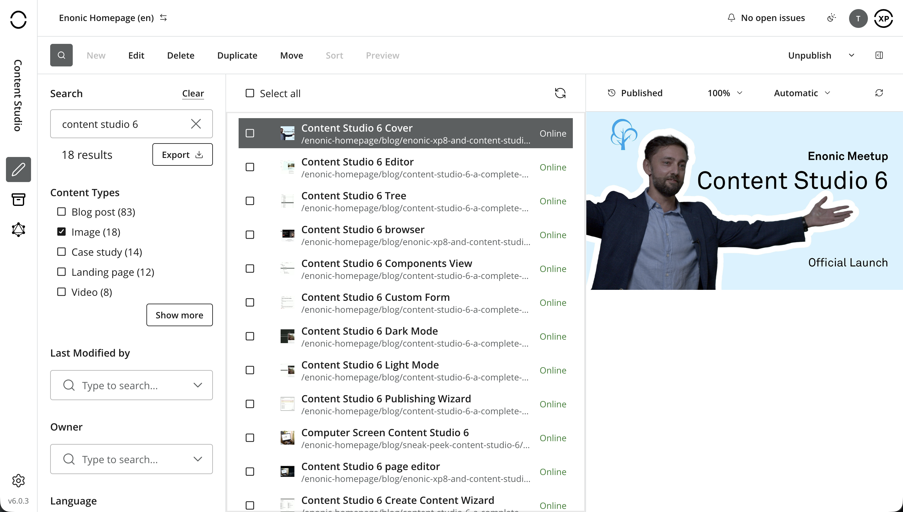
The hit count appears below the search field. Click Clear to reset all search terms and filters.
Results update in the content list as search terms and filters change. Children of matching content items are also included, but remain hidden until their parent is expanded.
Filtering
In addition to free text, the search panel provides the following faceting filters, to help you drill down to the content you want:
-
Content type
-
Last modification date
-
Last modified by
-
Owner
-
Language
Each content type with at least one match appears in the Content type filter, with the number of matches in parentheses. Select one or more content types to limit the results. By default, the five most common matching types are shown; click Show more to display the complete list.
Search report
Use the Export button next to the hit count to download the search result as CSV. The export contains basic metadata such as ID, display name, and path, but not custom fields from the content type.
Preview and Context panels
Selecting a single content item updates both right-hand panels:
-
The Preview panel shows the selected item’s draft rendition. Its toolbar displays status and offers preview modes and device-size emulation. If the item cannot be rendered, the preview is unavailable or replaced by a placeholder.
-
The Context panel provides details, dependencies, and version history for the selected item. Installed applications may contribute additional panels through extensions.
Both panels are also used in the Editor. Their dedicated pages describe all controls and available modes.