Rich Text Editor
Contents
The Rich Text Editor is used to create structured text with headings, inline formatting, lists, links, images, tables, and embedded functionality.
Overview
The editor is provided by the HtmlArea form item and is used when editors need formatted content beyond what is possible with plain text, such as articles and blog posts. HtmlArea fields can be added to schemas for content types, mixins, and page components.
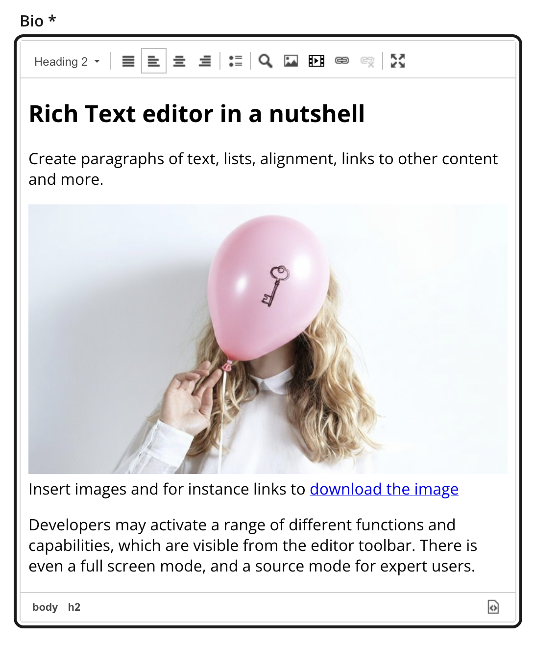
The toolbar may vary between editor instances. Developers may limit the available headings, remove default tools, or enable additional tools. Controls are also disabled when they do not apply to the current selection or when the content is read-only. The toolbar is visible only when the editor has focus.
For details about the raw and processed HTML formats used by front ends, see the CMS rich-text reference.
Toolbar
The toolbar groups controls by purpose:
- Block formats
-
Apply a paragraph, heading, or other enabled block format.
- Alignment
-
Align the current block to the left, center, or right, or justify it.
- Lists and indentation
-
Create numbered or bulleted lists and change their nesting level.
- Find and insert
-
Find text and insert special characters, anchors, images, macros, or links.
- Tables
-
Insert a table and access table-specific actions.
- Paste mode
-
Choose whether pasted content keeps compatible formatting or is inserted as plain text.
- Application-enabled tools
-
Additional controls, including inline formats such as bold, italic, and underline, appear when included in the HtmlArea configuration.
- Content Studio controls
-
Source editing and fullscreen mode appear when available. These controls are provided by Content Studio rather than configured as HtmlArea tools.
The default HtmlArea toolbar includes block formats, alignment, lists and indentation, find and insert controls, tables, and paste mode. Applications can remove default tools or include other available tools.
Depending on the field, you may also see controls for block quotes, text and background colors, horizontal rules, language, copying or removing formatting, and undo or redo. See the HtmlArea form-item reference for the complete list of configurable tools.
Hover over a toolbar button to see its name. Tools that do not fit the available width wrap onto another toolbar row.
Formatting text
Block formats
The format menu applies semantic structure to the block containing the cursor. Common choices include normal text, headings, a generic block, preformatted text, and code. The available heading levels and block formats can vary by field.
Use heading levels to describe the document hierarchy rather than to achieve a particular visual size. The front end determines how each semantic element is presented to readers.
Inline formatting
Applications can enable inline formats such as bold, italic, underline, strikethrough, superscript, and subscript. Enabled formats can be combined within the same block.
Select text before applying an inline format, or enable the format before typing. Apply the same active format again to remove it.
Alignment
Alignment controls apply to the block containing the cursor or to all selected blocks. The available choices are left, center, right, and justified alignment.
Lists and indentation
Use the numbered-list or bulleted-list control to turn the current block into a list. Pressing Enter creates another list item; pressing Enter on an empty list item ends the list. Use a soft line break when you need a new line without creating another item.
The indent and outdent controls change the nesting level of a list item. Outside a list, they adjust the indentation of the selected block when the field permits it.
Right-click a list to open its properties. Depending on the list type, you can change the marker style or the starting number.
Language behavior
The editor follows the content language. Text is presented right-to-left when the selected language uses a right-to-left writing system; no manual direction setting is required.
Content Studio enables spell checking via the browser’s built-in spell checker. It must be enabled in the browser, and the content language must be available among the browser’s spell-checking languages.
Finding and replacing text
The find control opens a search popup without leaving the editor. Enter a term and use the previous and next controls to move between matches. The result counter identifies the current match and the total number found.
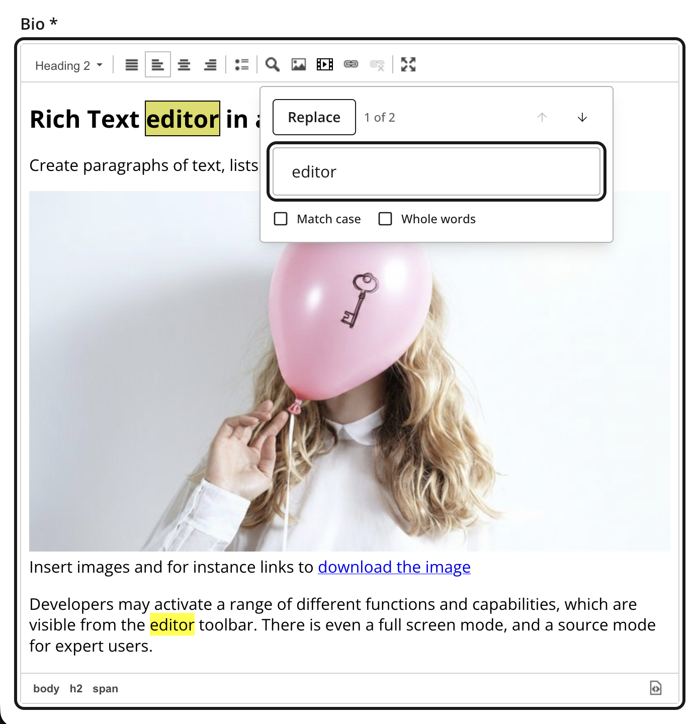
Search can be restricted to matching case or whole words. Switch the popup to replace mode to replace the current match or every match. The popup retains focus inside the Rich Text Editor so editing can continue when it is closed.
Links and anchors
Select existing text before opening the link dialog, or enter the link text in the dialog. An optional tooltip can provide additional information about the destination. The available link types are organized into tabs.
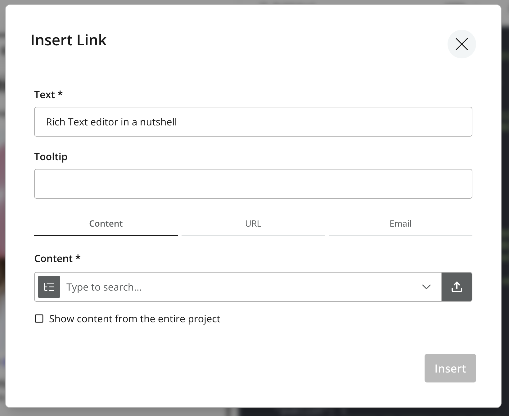
- Content
-
Select another content item. Internal links use a content reference, so they continue to target the same item if it is moved or renamed. Depending on the selected item, you can open it in a new tab, add a fragment or query parameters, or choose how a media item should open.
- URL
-
Enter an HTTPS, HTTP, FTP, telephone, or relative URL and choose whether it opens in a new tab.
-
Enter an email address and, optionally, a subject.
- Anchor
-
Link to an anchor in the same rich-text field. The Anchor tab is visible only when anchors already exist in the document.
To edit an existing link, double-click it, or select the link and use the link control in the toolbar. Use the unlink control to remove the link while keeping its text.
Anchors
Anchors are created using a dedicated anchor control in the toolbar.
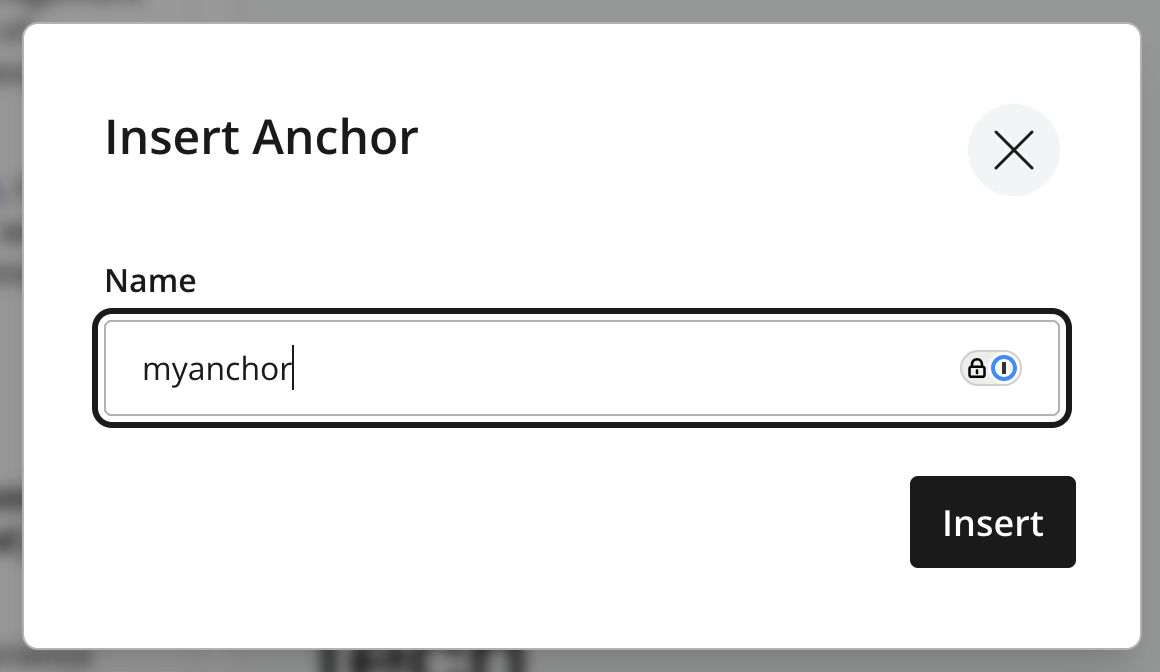
To create an anchor, place the cursor at the destination and use the anchor control. Anchor names cannot contain spaces and must be unique within the rich-text value. The anchor then becomes available in the link dialog.
Internal vs external links
Internal links are stored as references to other content items, while external links are stored as literal URLs.
For details about how internal and media links are stored and resolved by a front end, see the CMS rich-text links reference.
Images
Use the image control to insert an existing image content item or upload a new image. Open an image already in the editor to change its configuration.
Inserting an image
After selecting an image, the dialog provides controls for alignment, style, and width. Left- or right-aligned images allow surrounding text to wrap around them. Centered and full-width placement keep the image on its own line.
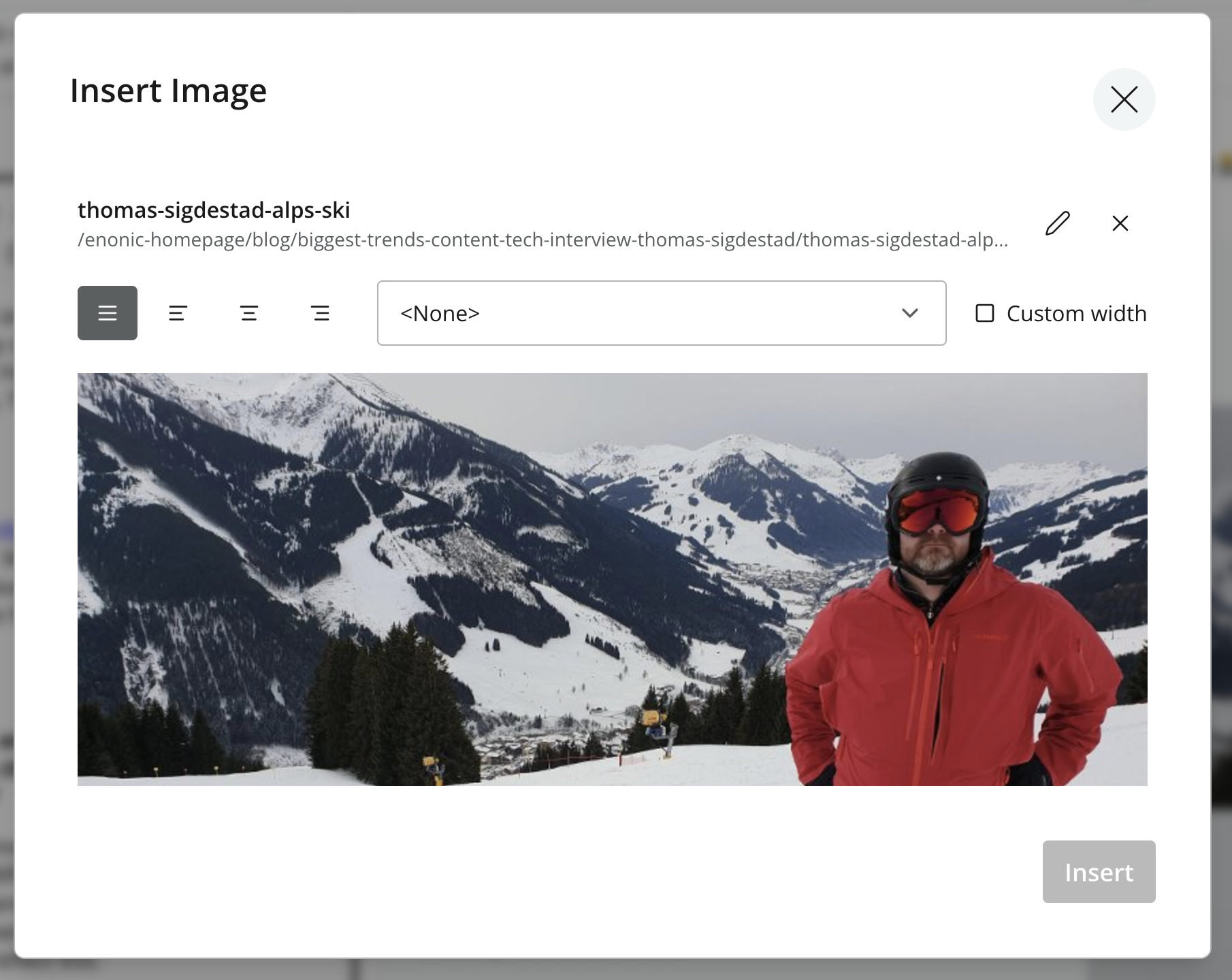
| In general, avoid using Custom width. The editor may declare a relative width, but the front end can override it through its layout and styling rules. |
Caption and accessibility
Editors may optionally provide an image caption, which will be displayed with the image.
Content Studio requires an accessibility setting for each image:
- Decorative image
-
Use when the image adds no information that is not already provided by the surrounding text. Assistive technologies can then ignore it.
- Alternative text
-
Use when the image conveys meaning. Supply alternative text that communicates the image’s purpose or essential information.
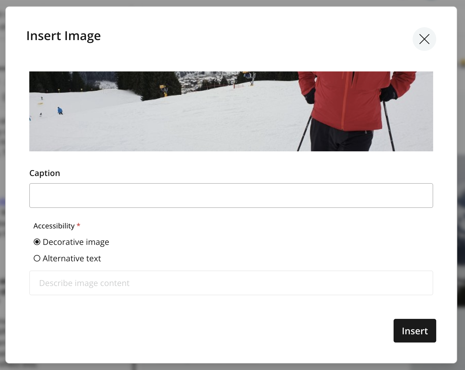
| If alternative text already exists on the image content, it is automatically prefilled in the accessibility settings. |
Image styles
Image styles are supplied by applications and can control server-side cropping or filters as well as the presentation in the editor. Styles available from the applications associated with the current content are combined in the image dialog.
The built-in Original (no image processing) style serves the original image without server-side processing or resizing. Selecting it can disable controls that depend on image processing, such as custom width.
Developers can define custom image styles as described in the CMS image-style reference.
Presentation
Developers control the final image rendering in the presentation layer. The result, normally visible in the preview, may therefore differ from the configuration shown in the editor.
For the stored image reference and front-end processing model, see the CMS rich-text image reference.
Macros
Macros provide functionality for embedding application-defined content or elements into rich text. Open the macro dialog, select an available macro, and complete its configuration form. The Preview tab shows the macro’s rendered result when a preview is available.
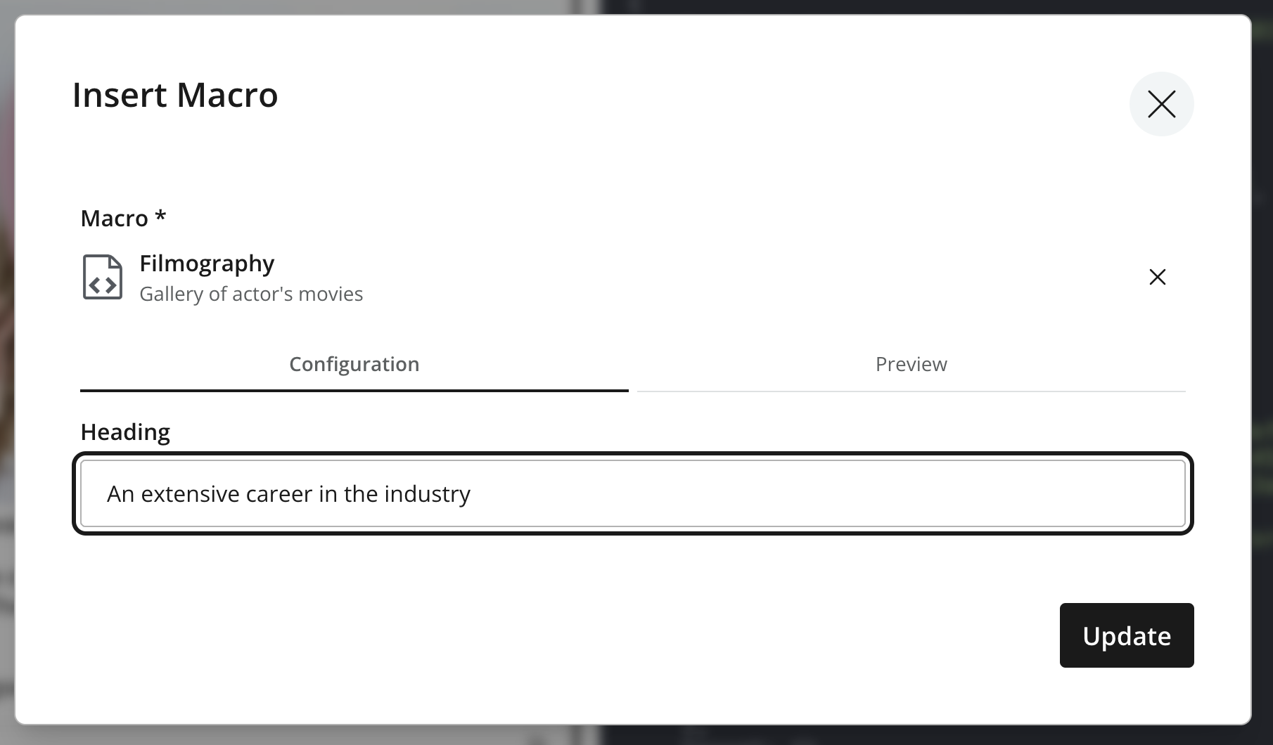
Once the macro is inserted into the rich text, it will appear as a placeholder that can be interacted with like any other content element.
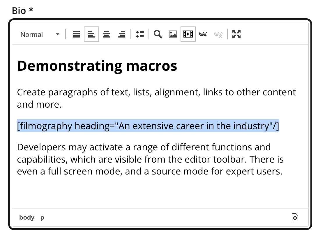
To edit an existing macro, double-click it to reopen the macro dialog.
Built-in macros
Content Studio includes two built-in macros:
- Embed iframe
-
Allows the editor to embed iframe content within the rich text.
- Disable macros
-
Prevents macro instructions from being evaluated within the rich text, typically used if you want to include raw macro syntax without it being processed.
See the CMS macro reference for the available built-in macros, application configuration, and rendering model.
Tables
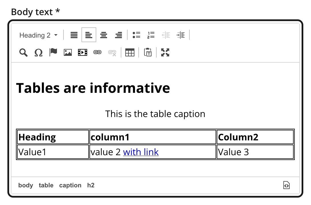
The Rich Text Editor provides controls for inserting, editing, and configuring tables.
Inserting a table
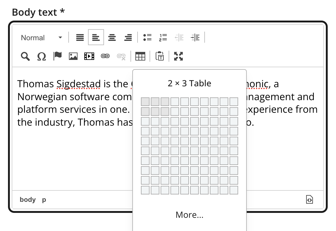
Use the table control to select a table size from the grid, or choose More to open a dialog where you can specify the number of rows and columns, headers, and a caption.
Editing table content
When the cursor is inside an existing table, use the table menu or context menu to add and remove rows or columns, configure headers, edit table properties, or remove the table. The actions available depend on the current cell and selection.
Context menu
Using the context menu, you may perform a range of actions on the table, such as adding or removing rows and columns, accessing the table properties or cell properties, and other table-related operations.
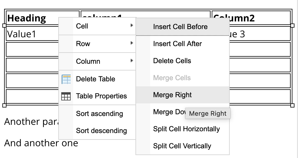
Table properties
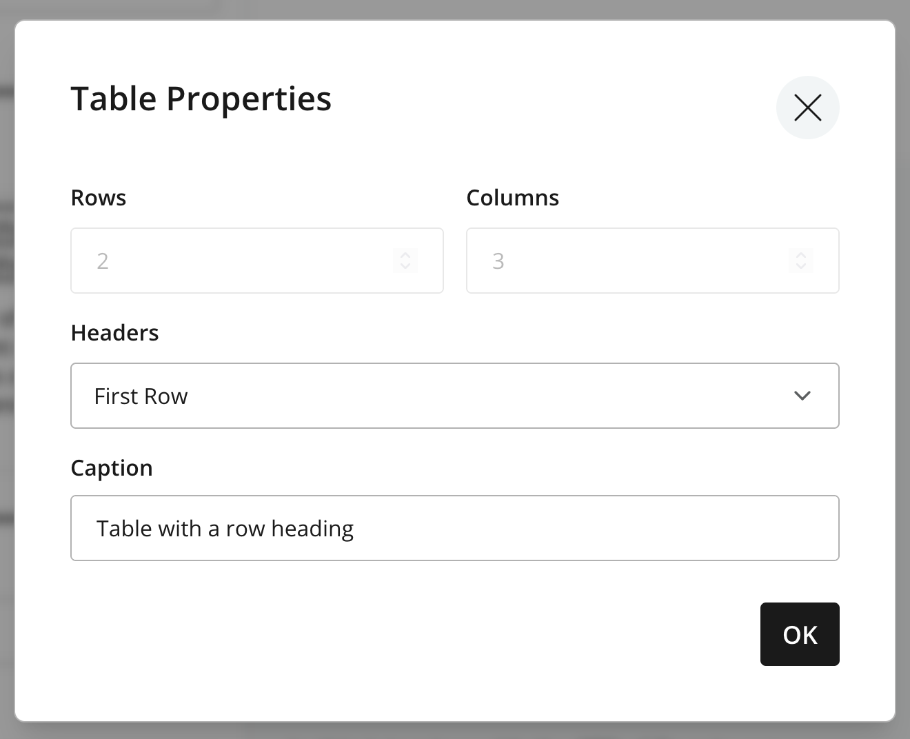
Open Table Properties from the context menu to configure the table’s dimensions, headers, and caption. The dimensions of an existing table cannot be changed from this dialog; use the context-menu actions to add or remove rows and columns.
Special characters
The special-character control opens a character map. Select a character to insert it at the cursor position. This is useful for symbols that are difficult to enter with the current keyboard layout.
Pasting, source, and fullscreen
Paste mode
Formatted paste is the default. It retains compatible structure and formatting from sources such as word processors while removing unsupported markup. Switch to plain-text paste when only the text should be inserted.
The paste-mode selection applies to subsequent paste operations. It does not change content already in the editor.
Source editing
Users with the Content Expert role or the Editor or Owner project role can open the source dialog and edit the underlying HTML. This is useful for inspecting structure or making a precise correction that the visual controls do not support.
| Source editing can introduce invalid or unsupported markup. Use only well-formed HTML supported by the field’s configuration. |
Fullscreen mode
Fullscreen mode expands the Rich Text Editor into a dialog with more room for long content. The same content and configured toolbar remain available, including dialogs for links, images, macros, and other elements. Closing fullscreen mode returns to the original field without creating a separate value.
Keyboard shortcuts
The Rich Text Editor supports shortcuts for frequent formatting, insertion, navigation, and editing actions. Shortcut availability follows the tools and heading levels enabled for the field.
See the centralized Rich Text Editor keyboard shortcuts table for the complete list.