Form items
Contents
The content types we’ve created previously in this guide have only used a few basic form items: TextLine, TextArea and Date.
However, Content Studio has a lot more up its sleeve than that! Form items are the building blocks of forms. They dictate what kind of data the user can or must add to any piece of content, and how it is edited.
This chapter introduces more kinds of form items and explains how you can configure them to your liking.
If you’re used to working with HTML, be aware that XP’s form items are not the same as HTML input elements. |
| The tasks and examples in this chapter are based on work done in previous chapters (starting with the setup chapter). If you want to follow along with the examples, make sure you’re all caught up. |
Common settings
All form items share a number of settings that affect how they act. These settings are:
-
type(required) -
Which kind of form item this is, such as
TextLineorImageSelector. -
name(required) -
The property name the value is stored under.
-
label(required) -
What the form item should be labeled as in the content form.
-
occurrences(optional) -
Specifies the minimum and maximum instances of this field. Defaults to "one optional".
-
default(optional) -
Gives a default value to the form item.
-
helpText(optional) -
Lets you specify a description of the field to show to the user.
Because the form items are so different from each other, they also support type-specific settings. These are placed directly on the form item, next to the shared ones. That is how we use regex validation for TextLine inputs, configure formatting options for HtmlAreas, and dictate what numeric values a Long or a Double accepts.
Use camelCase for names, such as otherNames. Names are used as they are for field names in the GraphQL API, where camelCase is the convention and matches built-in fields such as displayName. One caveat: property paths are lowercased in the index, so never give two form items on the same level names that differ only by case. |
|
When to use it
Names are part of your API, so choose them to last. Renaming a form item does not rename the data already stored under the old name: existing items keep their values under a property the form no longer shows, and every query that selected the old field breaks. Labels, on the other hand, can change whenever you like. |
All of the shared settings (label, occurrences, etc.), and the list of available form items are described in the form items documentation. |
To show how the settings work, let’s examine some TextLine inputs with different configurations.
form:
  - type: "TextLine"
    name: "textlineRequired"
    label: "Required input with default" (1)
    helpText: "This text should provide additional information to the user." (2)
    occurrences: (3)
      min: 1
      max: 1
    default: "This is a required input with a default value." (4)
  - type: "TextLine"
    name: "textlineOptional"
    label: "Optional input"
    occurrences: (5)
      min: 0
      max: 1
  - type: "TextLine"
    name: "textlineList"
    label: "Input list"
    helpText: "This input can have as many values as you want."
    occurrences: (6)
      min: 0
max: 0| 1 | The label is shown above the input and provides context to the user. |
| 2 | The help text can provide extra context and information to the user. It’s hidden by default, but can be shown by activating the help text button. |
| 3 | This instance of occurrences specifies that this is a required input. It must have at least one and at most one value. |
| 4 | The default value gets added to the input by default. The user can manually override this. |
| 5 | When you specify min: 0 and max: 1, that makes the input optional. This is the default. |
| 6 | When you set max: 0, the user can add as many values as they want to. |
This set of inputs would be rendered as in the following picture. As specified in the above configuration:
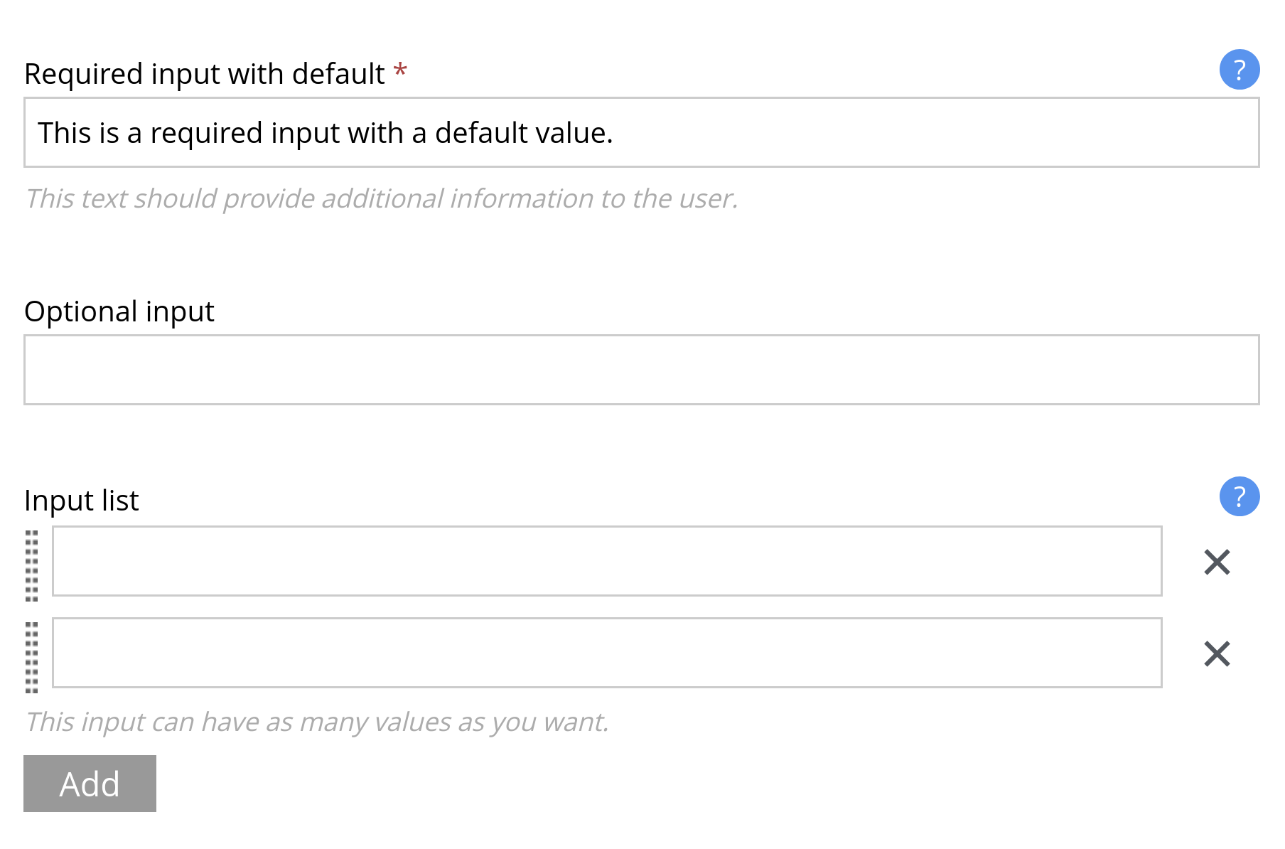
Note that: - The required input field has a red asterisk to signify that it must be filled out. - The required input field already has a value provided via the default setting. - The help texts for the required input field and for the input list are both visible - The input list has controls to add more inputs and remove existing inputs
The occurrences setting
The occurrences setting decides how XP treats the value. Use occurrences to indicate whether a form item is expected to be a list or a single element and whether it is required or not.
The setting has two required keys, min and max. Use these to control the number of instances the user can create.
min specifies that the user must fill out at least this many instances of the field. Usually it is set to 0 or 1. A zero indicates that the field is optional and that the user does not need to fill it out. A one means the field is required.
max tells XP how many instances the field can have at most. 0 is a special value here, indicating that the user can have as many as they want (in other words: there is no maximum).
A couple of common configuration tricks:
Optional
If you don’t add an occurrences setting, XP uses the default, which is min: 0, max: 1.
That means that the field is optional and can have at most one entry.
Required
To make the field required, set both min and max to 1.
That means that the field is required, and can have at most one entry.
By keeping min at 1 and changing max to a number n above 1, you’ll be able to keep the field required, but make it able to have at most n entries.
Unlimited
By setting max to 0, you allow the field to have an unlimited amount of entries.
If max is greater than 0, make sure that min is less than or equal to max. Otherwise, the field will never be considered valid according to XP. |
|
When to use it
Make a field required only when your front-end cannot render the item without it. A required field blocks editors from saving work in progress, and an invalid item cannot be published. Most fields are better optional, with the front-end handling an empty value. |
Common form items
Apart from the form items we’ve already gotten familiar with, XP also has form items created for other kinds of data. You can always find the full list over at the form items reference docs, grouped by the kind of value they produce, but some useful and common ones are:
- ComboBox
-
A dropdown menu containing predefined options for the user to select from. Allows selection of one or more options.
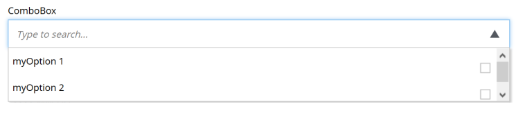 Figure 2. The ComboBox form item
 - Date, DateTime and Instant
-
Provide an interactive date picker (with a time component for DateTime and Instant) to save dates and times. The reference explains which of the two to pick for a date with a time.
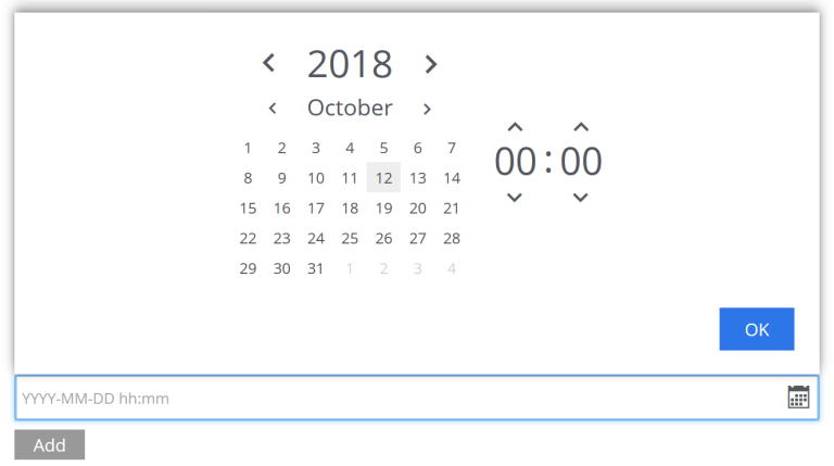 Figure 3. The DateTime form item
 - GeoPoint
-
Stores GPS coordinates.
 Figure 4. The GeoPoint form item
 - HtmlArea
-
Provides a rich text, multi-line input. We’ll discuss this in detail in the rich-text chapter.
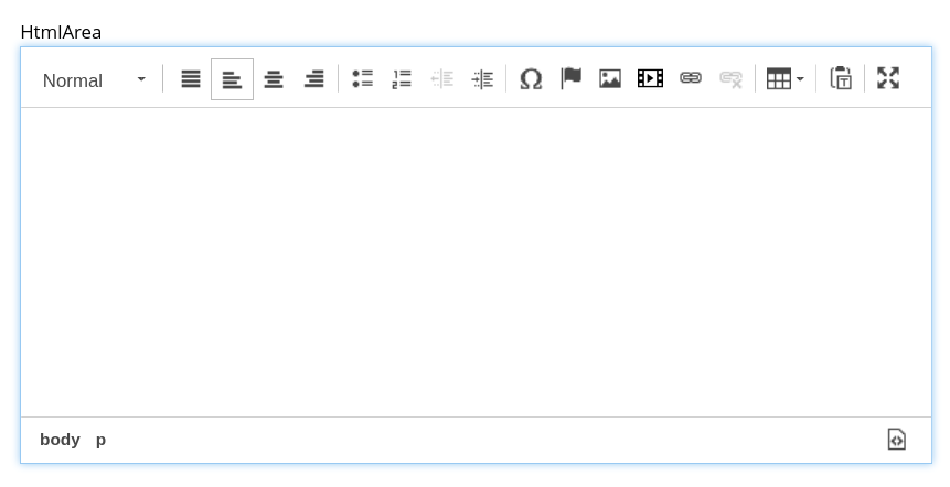 Figure 5. The HtmlArea form item
Additionally, XP has form items that group other form items, called sets, which get a chapter of their own. First, let’s look at the form items that reference other content.
ImageSelector
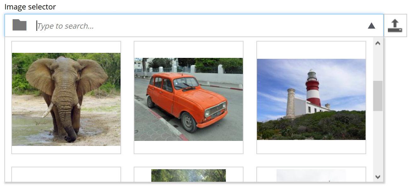
Images are a key part of many web experiences: they add color, break up the content, and give the reader something to rest their eyes on.
XP’s image selector allows you to select an image for a piece of content and also to upload new images.
- type: "ImageSelector"
  name: "myImage"
  label: "My Image"
Read more about the configuration of image selectors in the reference docs.
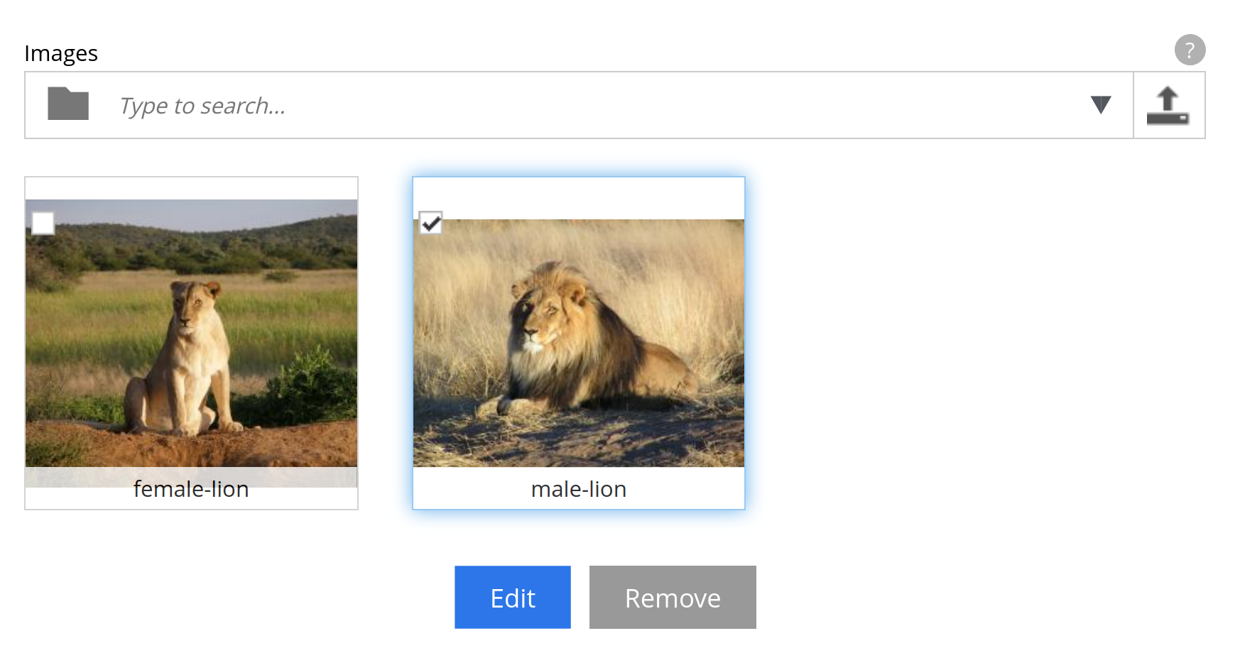
After you’ve added an image (or several), you can highlight it and click the edit button. This will take you to the image editing form. This is the same form as we saw in the previous chapter.
ContentSelector
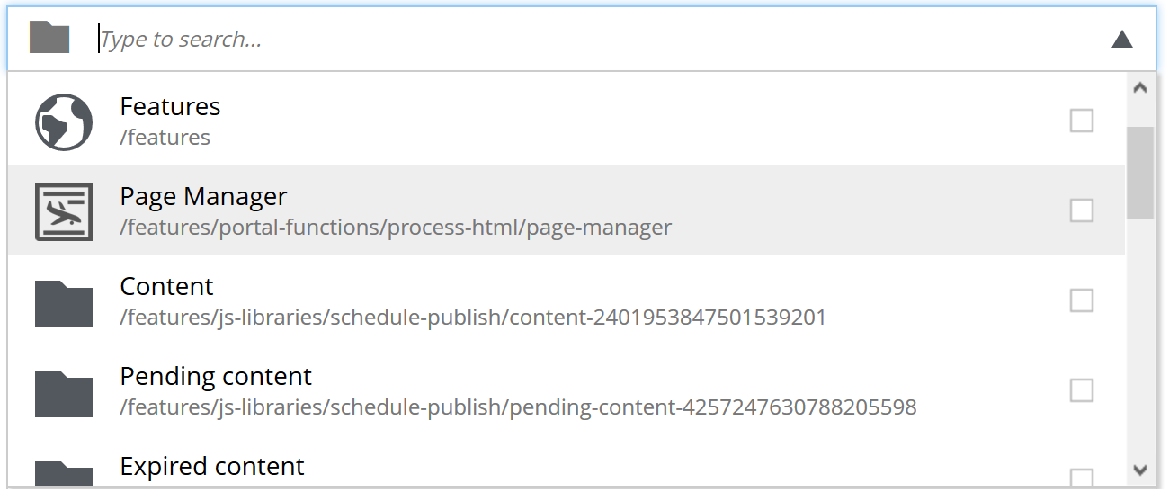
The image selector we just saw is actually a specialized form of the more general ContentSelector.
The ContentSelector allows you to reference other content. Let’s say you have two content types: one of type person and one of type food. If you want to be able to specify which dishes the person likes, you could use a content selector to create a reference from the person to their favored dish.
Because referencing other content types comes with a lot of variability, the ContentSelector has settings to support this. You can choose to allow only certain content types or only content that’s available at a certain path. You can also change whether the selector should show content in a tree-style hierarchy or as a flat list of content.
The full list of ContentSelector settings is available in the reference docs, including a number of examples to explain content inclusion and exclusion. However, a simple configuration could look like this:
- type: "ContentSelector"
  name: "myContentSelector"
  label: "My ContentSelector"
  allowContentType:
- "citation"|
When to use it
Reference another content item when the thing has a life of its own: it is published, moved, reused from several places or edited by someone else. An artist’s favorite animal is an animal that exists regardless of the artist, so it is a reference. When the data only makes sense inside the parent, such as an artist’s filmography entries, embed it instead with the sets you will meet in the next chapter. |
AttachmentUploader
XP also has a rather special form item named AttachmentUploader. Unlike media content, which creates an independent content item for each file you upload, AttachmentUploader lets you store one (or more) files within the specific content item. Under the hood, it uses the same attachment property structure as media when persisting the file.

|
When to use it
Upload a file as media when it is an asset in its own right: an image used on several pages, a brochure linked from many places, anything editors should find, reuse and publish independently. Use an AttachmentUploader when the file belongs to exactly one item and should live and die with it, such as the attachments of an e-mail or the PDF version of a report. Media can be referenced from an ImageSelector or ContentSelector; attachments cannot. |
- type: "AttachmentUploader"
  name: "attachments"
  label: "Attachments"
  occurrences: (1)
    min: 0
max: 0| 1 | min: 0 shows that this is not a required field, while max: 0 shows that we can upload as many attachments as we want. |
attachmentUrl
Remember how we used mediaUrl to get a link to a media item’s file. mediaUrl is only available for media content. For attachments stored on any content item, use the attachments field and its attachmentUrl instead:
{
  guillotine {
    queryDsl(
      query: {
        term: {
          field: "type",
          value: {
            string: "media:image"
          }
        }
      }
    ) {
      displayName
      type
      attachments {
        name
        attachmentUrl {
          path
          queryString
        }
      }
    }
  }
}
And the result should look something like this:
| If you have multiple attachments in your content, they will all be listed. |
{
  "data": {
    "guillotine": {
      "queryDsl": [
        {
          "displayName": "lion",
          "type": "media:image",
          "attachments": [
            {
              "name": "lion.jpg",
              "attachmentUrl": {
                "path": "/media:attachment/my-first-project:draft/f7efd6e4-9eed-45d2-83b6-d088a7bdc685:8652e625afe7bbda595a190a3b8624e322dc9f1a/lion.jpg",
                "queryString": ""
              }
            }
          ]
        }
      ]
    }
  }
}
As with mediaUrl in the previous chapter, put your API base URL in front of path to get a working link - for your sandbox that is http://localhost:8080/api.
Under the hood, attachmentUrl uses the same logic as Enonic’s portal library function attachmentUrlParts, so you can follow the link to better understand the arguments that you pass to this field when creating queries that use it. |
Task: artist and animals
Time for a little recap! We’ll put together everything we’ve learned about content types and form items thus far to create a new data set.
A solution is listed below, but try and see if you can solve it yourself first.
| If you’re wondering how to achieve some of the goals, try consulting the documentation that’s been linked to in this chapter. |
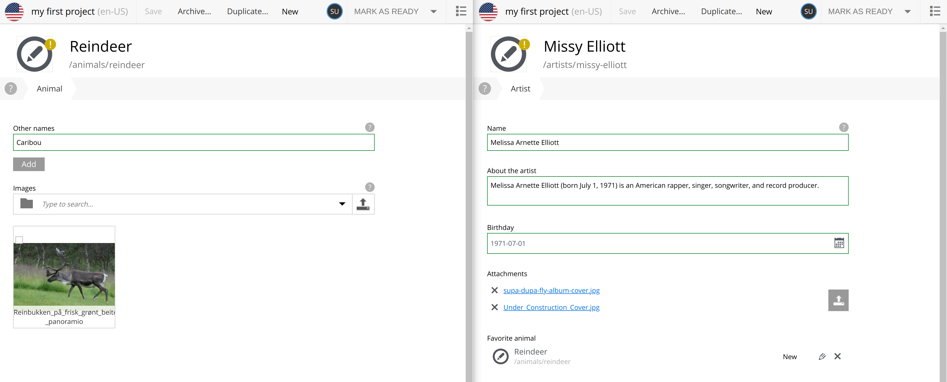
Your task is to create a new content type: Animal and to update the Artist content type with new constraints and fields. By the end of this chapter, you should have content types that look like this in Content Studio:
Animal constraints
-
Make the display name use "Species" as its label. Hint: check out the display name section of the content type documentation and look for something that allows you to do this.
-
An animal can also have alternative names for its species (for instance, the reindeer is also known as caribou). Allow the user to add as many alternative names as they want.
-
An image selector that accepts between 0 and 3 images.
-
Help text where you think it would be helpful.
Artist constraints
-
Add a ContentSelector that allows only content of the "Animal" type and that must be nested under the "animals" folder. Call it
favoriteAnimal.
Querying
-
Create a GraphQL query that’ll fetch all artists and list what their favorite animals are, as well their animals' other names.
Check your work
To verify that everything works, create some animals, create a content link between a artist and an animal and run your query to fetch some new data on this new structure.
| Don’t worry if something did not work, we’ll show the solutions in the next section. |
Task solution
Content types
-
Create the animal content type. In
src/main/resources/cms/content-types/animal/animal.yaml, place the following content:The animal content typekind: "ContentType" title: "Animal" description: "An animal that lives on planet Earth" displayNamePlaceholder: "Species" (1) superType: "base:structured" form: - type: "TextLine" name: "otherNames" label: "Other names" helpText: "Other names for this species." occurrences: min: 0 max: 0 - type: "ImageSelector" name: "images" label: "Images" helpText: "Images of the animal" occurrences: min: 0 max: 31 This setting lets you customize what Content Studio calls the built-in "display name" field. -
Next, update the
Artistcontent type.
kind: "ContentType"
title: "{content-type-1-capitalized}"
description: "Information about an {content-type-1}"
superType: "base:structured"
form:
  - type: "TextLine"
    name: "name"
    label: "Name"
    helpText: "The artist's name (if different from their professional moniker)."
  - type: "TextArea"
    name: "about"
    label: "About the {content-type-1}"
  - type: "Date"
    name: "birthday"
    label: "Birthday"
  - type: "ContentSelector" (1)
    name: "favorite{content-type-2-capitalized}"
    label: "Favorite {content-type-2}"
    allowContentType:
      - "{content-type-2}"
    allowPath:
      - "/{content-type-2}s/*"
+ <1> This ContentSelector uses allowContentType and allowPath to narrow the possible content to only Animals in the animals folder
+ . Create a folder called "animals" next to the "artists" folder, and create some animals in it. Either pick your favorites, or, if you’re not feeling creative, add these (content from Wikipedia): - Wiki article for lion - Wiki article for reindeer
-
Create some links using the ContentSelector from artists to animals to get familiar with linking content.
GraphQL query
Finally, it’s time to introduce the query in GraphQL.
A ContentSelector will store a reference to the target content item. When using the Guillotine API, you may simply follow this reference to access the target content, and access its fields instantly.
{
  guillotine {
    getChildren(key: "/artists") {
      displayName
      ... on com_example_tutorial101_Artist {
        _id
        data {
           favoriteAnimal {
            displayName
            ... on com_example_tutorial101_Animal{
              data {
                otherNames
              }
            }
          }
        }
      }
    }
  }
}
Depending on the links (and animals) you created, your result might look a little something like this:
{
  "data": {
    "guillotine": {
      "getChildren": [
        {
          "displayName": "Cardi B",
          "data": {
            "favoriteAnimal": {
              "displayName": "Lion",
              "data": {
                "otherNames": []
              }
            }
          }
        },
        {
          "displayName": "Missy Elliott",
          "data": {
            "favoriteAnimal": {
              "displayName": "Reindeer",
              "data": {
                "otherNames": [
                  "Caribou"
                ]
              }
            }
          }
        },
        {
          "displayName": "P!nk",
          "data": {
            "favoriteAnimal": {
              "displayName": "Lion",
              "data": {
                "otherNames": []
              }
            }
          }
        }
      ]
    }
  }
}
Summary
You have configured form items with occurrences, defaults and help text, linked content with selectors, and followed a reference through the API.
Next up, sets and form fragments let you group and reuse form items.