Input types
Contents
The content types we’ve created previously in this guide have only used two basic input types: TextLine, TextArea, Date and AttachmentUploader.
However, Content Studio has a lot more up its sleeve than that! Input types dictate what kind of data the user can or must add any piece of content.
This chapter introduces more new types of inputs and explains how you can configure them to your liking.
If you’re used to working with HTML, be aware that XP’s input elements are not the same as HTML input elements. |
| The tasks and examples in this chapter are based on work done in previous chapters (starting with the sandboxes chapter). If you want to follow along with the examples, make sure you’re all caught up. |
General config
All input types share a number of options that affect how they act. These options are:
-
label(required) -
What the input should be labeled as in the content form.
-
occurrences(optional) -
Specifies the minimum and maximum instances of this field. Defaults to "one optional".
-
default(optional) -
Gives a default value to the input.
-
help-text(optional) -
Lets you specify a description of the input field to show to the user.
-
config(optional) -
Input type-specific configuration.
The
configelement is for input-specific configuration. Because the input types are so different to each other, they all support different options. Theconfigelement allows us to use regex validation for TextLine inputs, configure formatting options for HtmlAreas, and to dictate what numeric values a Long or a Double input accepts.
All of the shared configuration options (label, occurrences, etc.), and the list of available input types are described in the input types documentation. |
To show an example of the configuration options work, let’s examine some TextLine inputs with different configurations.
<input type="TextLine" name="textlineRequired">
  <label>Required input with default</label> (1)
  <help-text>This text should provide additional information to the user.</help-text> (2)
  <occurrences minimum="1" maximum="1" /> (3)
  <default>This is a required input with a default value.</default> (4)
</input>

<input type="TextLine" name="textlineOptional">
  <label>Optional input</label>
  <occurrences minimum="0" maximum="1" /> (5)
</input>

<input type="TextLine" name="textlineList">
  <label>Input list</label>
  <help-text>This input can have as many values as you want.</help-text>
  <occurrences minimum="0" maximum="0" /> (6)
</input>| 1 | The label is shown above the input and provides context to the user. |
| 2 | The help-text can provide extra context and information to the user. It’s hidden by default, but can be shown by activating the help text button. |
| 3 | This instance of the occurrences element specifies that this is a required input. It must have at least one and at most one value. |
| 4 | The default value gets added to the input by default. The user can manually override this. |
| 5 | When you specify minimum="0" and maximum="1" on an occurrences element, that makes the input optional. This is the default. |
| 6 | When you set maximum="0" on an occurrences element, the user can add as many values as they want to. |
This set of inputs would be rendered as in the following picture. As specified in the above configuration:
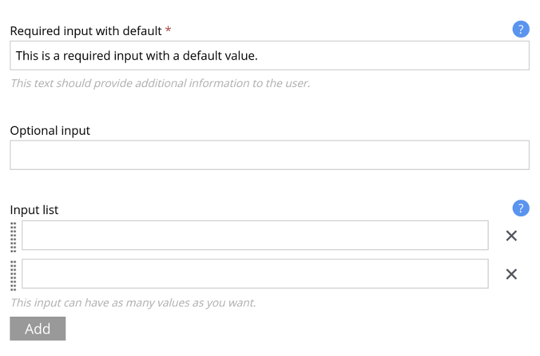
Note that: - The required input field has a red asterisk to signify that it must be filled out. - The required input field already has a value provided via the default configuration option. - The help texts for the required input field and for the input list are both visible - The input list has controls to add more inputs and remove existing inputs
The ocurrences config
The occurrences configuration option decides how XP treats the input value. Use occurrences to indicate whether an input is expected to be a list or a single element and whether the input is required or not.
The occurrences element has two required attributes, minimum and maximum. Use these to control the number of instances the user can create.
The minimum attribute specifies that the user must fill out at least this many instances of the field. Usually it is set to 0 or 1. A zero indicates that the field is optional and that the user does not need to fill it out. A one means the field is required.
The maximum attribute tells XP how many instances the input field can have at most. 0 is a special value here, indicating that the user can have as many as they want (in other words: there is no maximum).
A couple of common configuration tricks:
Optional
If you don’t add an occurrences element, XP uses the default, which is minimum="0", maximum="1".
That means that the input is optional and can have at most one entry.
Required
To make the input required, set both minimum and maximum to 1.
That means that the input is required, and can have at most one entry.
By keeping the minimum at 1 and changing the maximum to a number n above 1, you’ll be able to keep the field required, but make it able to have at most n entries.
Unlimited
By seeting maximum to 0, you allow the input to have an unilimited amount of entries.
If maximum is greater than 0, make sure that minimum is less than or equal to maximum. Otherwise, the input will never be considered valid according to XP. |
Common inputs
Apart from the input types we’ve already gotten familiar with, XP also has input types created for other kinds of data. You can always find the full list over at the input types reference docs, but some useful and common ones are:
- ComboBox
-
A dropdown menu containing predefined options for the user to select from. Allows selection of one or more options.
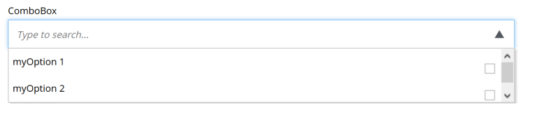 Figure 2. The ComboBox input type
 - Date and DateTime
-
Provides an interactive date picker (with a time component in DateTime’s case) to save date and times.
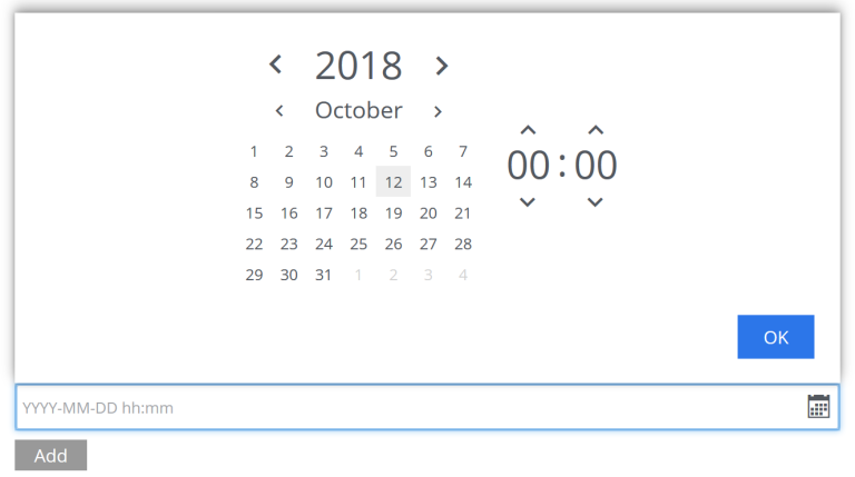 Figure 3. The DateTime input type
 - GeoPoint
-
Stores GPS coordinates.
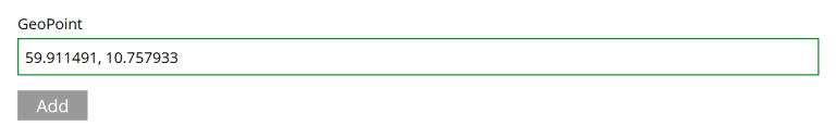 Figure 4. The GeoPoint input type
 - HtmlArea
-
Provides a rich text, multi-line input. We’ll discuss this in detail in the rich-text chapter.
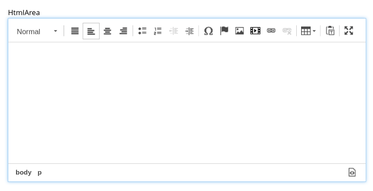 Figure 5. The HtmlArea input type
Additionally, XP has more complex input types, which we’ll look at next.
ImageSelector
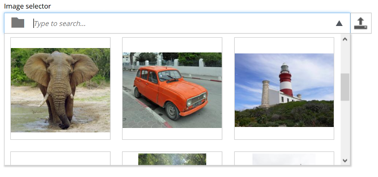
Images are a key part of many web experiences: they add color, break up the content, and gives the reader something to rest their eyes on.
XP’s image selector allows you to select an image for a piece of content and also to upload new images.
<input name="myimage" type="ImageSelector">
  <label>My Image</label>
</input>
Read more about the configuration of image selectors in the reference docs.
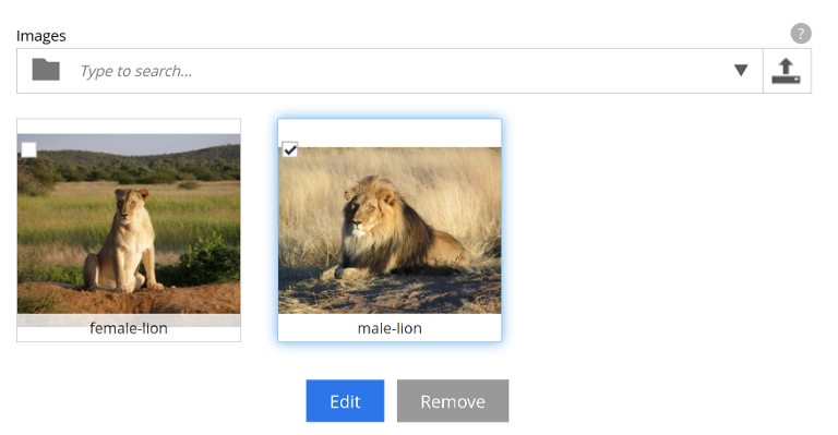
After you’ve added an image (or several), you can highlight it and click the edit button. This will take you to the image editing form. This is the same form as we saw in the previous chapter.
ContentSelector
The image selector we just saw is actually a specialized form of the more complex ContentSelector input type.
The ContentSelector input type allows you to reference other content. Let’s say you have two content types: one of type person and one of type food. If you want to be able to specify which dishes the person likes, you could use a content type to create a reference from the person to their favored dish.
Because referencing other content types comes with a lot of variability, the ContentSelector type has configuration options to support this. You can choose to allow only certain content types or only content that’s available at a certain path. You can also change whether the selector should show content in a tree-style hierarchy or as a flat list of content.
The full list of ContentSelector configuration options is available in the reference docs, including a number of examples to explain content inclusion and exclusion. However, a simple configuration could look like this:
<input name="mycontentselector" type="ContentSelector">
<label>My ContentSelector</label>
<config>
<allowContentType>citation</allowContentType>
</config>
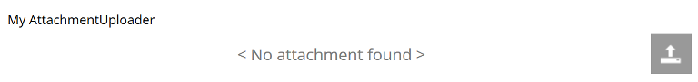
</input>AttachmentUploader
XP also has a rather special input type named AttachmentUploader. Unlike media content, which creates an independent content item for each file you upload, attachmentUploader lets you store one (or more) files within the specific content content item. Under the hood, it uses the same attachment property structure as media when persisting the file.
| Imagine creating a content type for e-mail, you would probably use an AttachmentUploader field to store the file attachments. This is because you really don’t need each file to be independently referenced, published and managed - right. |
<input type="AttachmentUploader" name="attachments">
  <label>Attachments</label>
  <occurrences minimum="0" maximum="0"/> (1)
</input>| 1 | minimum="0" shows that this is not a required field, while maxiumum="0" shows that we can upload as many attachments as we want. |
attachmentUrl
Remember how we used mediaUrl to get a link to the media’s attachment. MediaUrl is only available for "media" content, for other content types using attachmentUrl we have to use a different approach: attachmentUrl to the rescue:
query {
  guillotine {
    get(key: "/developer/media/ready-set-code.png") {
      displayName
      type
      attachments{
        name
        attachmentUrl
      }
    }
  }
}
And the result should look something like this:
| If you have multiple attachments in your content, they will all be listed. |
{
  "data": {
    "guillotine": {
      "get": {
        "displayName": "ready-set-code",
        "type": "media:image",
        "attachments": [
          {
            "name": "ready-set-code.png",
            "attachmentUrl": "/site/preview/dev-portal/draft/_/attachment/inline/f7efd6e4-9eed-45d2-83b6-d088a7bdc685:8652e625afe7bbda595a190a3b8624e322dc9f1a/ready-set-code.png"
          }
        ]
      }
    }
  }
}| Under the hood, the attachment field argument attachmentUrl uses Enonic’s javascript lib portal attachmentUrl function, so you can follow the link to better understand the arguments that you pass to this field when creating queries that uses it. |
Task: artist and animals
Time for a little recap! We’ll put together everything we’ve learned about content types and input types thus far to create a new data set.
A solution is listed below, but try and see if you can solve it yourself first.
| If you’re wondering how to achieve some of the goals, try consulting the documentation that’s been linked to in this chapter. |
Your task is to create a new content type: Animal and to update the Artist content type with new constraints and fields. By the end of this chapter, you should have content types that look like this in Content Studio:
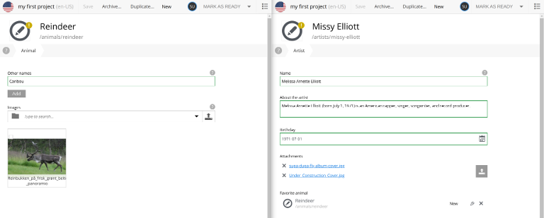
Animal constraints
-
Make the display name use "species" as its label. Hint: check out the content type form definition and look for something that allows you to do this.
-
An animal can also have alternative names for its species (for instance, the reindeer is also known as caribou). Allow the user to add as many alternative names as they want.
-
An image selector that accepts between 0 and 3 images.
-
Help text where you think it would be helpful.
Artist constraints
-
Add a ContentSelector input that allows only content of the "Animal" type and that must be nested under the site’s "animals" folder. Call it
favoriteAnimal.
Querying
-
Create a GraphQL query that’ll fetch all artists and list what their favorite animals are, as well their animals' descriptions.
Check your work
To verify that everything works, create some animals, create a content link between a artist and an animal and run your query to fetch some new data on this new structure.
| Don’t worry if something did not work, we’ll show the solutions on the next section. |
Task solution
Content types
-
Create the animal content type. In
src/main/resources/site/content-types/animal/animal.xml, place the following content:The animal content type<content-type> <display-name>Animal</display-name> <description>An animal that lives on planet Earth</description> <display-name-label>Species</display-name-label> (1) <super-type>base:structured</super-type> <form> <input type="TextLine" name="otherNames"> <label>Other names</label> <help-text>Other names for this species.</help-text> <occurrences minimum="0" maximum="0" /> </input> <input name="images" type="ImageSelector"> <label>Images</label> <help-text>Images of the animal</help-text> <occurrences minimum="0" maximum="3" /> </input> </form> </content-type>1 This field lets you customize what Content Studio calls the "display name" field and what it puts in the placeholder text. -
Next, update the
Artistcontent type.An updated artist<content-type> <display-name>Artist</display-name> <description>Information about an artist</description> <super-type>base:structured</super-type> <form> <input name="name" type="TextLine"> <label>Name</label> <help-text> The artist's name (if different from their professional moniker). </help-text> </input> <input type="TextArea" name="about"> <label>About the artist</label> </input> <input name="favoriteAnimal" type="ContentSelector"> (1) <label>Favorite animal</label> <config> <allowContentType>animal</allowContentType> <allowPath>${site}/animals/</allowPath> </config> </input> </form> </content-type>1 This ContentSelector uses the configsection to narrow the possible types of content to only beAnimal -
Create some animals. Either pick your favorites, or, if you’re not feeling creative, add these (content from Wikipedia), :
-
Create some links using ContentSelector from artists to animals to get familiar with linking content.
GraphQL query
Finally, it’s time to introduce the query in GraphQL.
A ContentSelector input will store a reference to the target content item. When using the Guillotine API, you may simply follow this reference to access the target content, and access it’s fields instantly.
{
  guillotine {
    getChildren(key: "/artists") {
      displayName
      ... on com_example_myapp_Artist {
        _id
        data {
           favoriteAnimal {
            displayName
            ... on com_example_myapp_Animal{
              data {
                otherNames
              }
            }
          }
        }
      }
    }
  }
}
Depending on the links (and animals) you created, your result might look a little something like this:
{
  "data": {
    "guillotine": {
      "getChildren": [
        {
          "displayName": "Cardi B",
          "data": {
            "favoriteAnimal": {
              "displayName": "Lion",
              "data": {
                "otherNames": []
              }
            }
          }
        },
        {
          "displayName": "Missy Elliott",
          "data": {
            "favoriteAnimal": {
              "displayName": "Reindeer",
              "data": {
                "otherNames": [
                  "Caribou"
                ]
              }
            }
          }
        },
        {
          "displayName": "P!nk",
          "data": {
            "favoriteAnimal": {
              "displayName": "Lion",
              "data": {
                "otherNames": []
              }
            }
          }
        }
      ]
    }
  }
}