Widgets
Contents
Introduction
Widgets are visual components that dynamically extend Admin UI. Widgets may or may not be context-dependent (require id of selected content and current branch).
Implementation
Widget is essentially a special, admin-only kind of web application. Like all other XP components, widgets are defined by a controller and a descriptor.
To create a widget, add a new folder in your project structure, i.e. src/main/resources/admin/widgets/<widget-name>. The folder must contain both a descriptor (<widget-name>.xml) and a controller (<widget-name>.js).
Descriptor
Widget descriptor defines a display name, a list of roles required to access the widget and interfaces it implements. The descriptor file must match the widget folder name, i.e. admin/widgets/<widget-name>/<widget-name>.xml.
<widget>
  <display-name i18n="phrases.my-dashboard-widget">My dashboard widget</display-name>
  <description i18n="phrases.my-dashboard-widget-desc">Description of my dashboard widget</description>
  <interfaces>
    <interface>admin.dashboard</interface>
  </interfaces>
  <allow>
    <principal>role:system.admin</principal>
    <principal>role:myapp.myrole</principal>
  </allow>
</widget>
Controller
To drive the widget, we will need a controller. The controller typically renders the widget’s HTML template. Depending on the widget implementation it may also handle any further server requests from the widgets interface.
The controller file must match the widget name, i.e. admin/widgets/<widget-name>/<widget-name>.js:
exports.GET = function (req) {
    return {
        body: '<widget>My dashboard widget</widget>',
        contentType: 'text/html'
    };
};| Depending on the interface a widget is implementing, controller may be initialised with parameters, for instance providing a specific context. |
When the application is deployed, the controller will be accessible from
<server>:<port>/admin/<app-name>/<tool-name>/_/admin:widget/<widget-app-name>/<widget-name> (i.e. localhost:8080/admin/com.enonic.xp.app.main/home/_/admin:widget/com.enonic.xp.app.main/launcher)
Icon
Widgets may also have icons. Simply place an SVG or PNG file into the widget folder, i.e. admin/widgets/<widget-name>/<widget-name>.svg
| Widget icon will not be used for Dashboard widgets, only for Content Studio widgets. |
Widget Types (Interface)
Widget interface is simply a unique identifier (or widget type, if you will) that links the widget to its extension point (i.e. Dashboard or Content Studio’s context panel). One well-known interface is admin.dashboard - Dashboard Widgets that are displayed on the Admin Dashboard screen.
Admin Tools are required to specify the widget interfaces (but not widget themselves) they support in their descriptor file, i.e. admin/tools/<tool-name>/<tool-name>.xml.
For example, if a tool supports Dashboard Widgets, it should have the following in its descriptor:
<tool>
  <!--...-->
  <apis>
    <api>admin:widget</api> (1)
  </apis>
  <interfaces>
     <interface>admin.dashboard</interface> (2)
  </interfaces>
</tool>-
This line mounts the Widget API to the tool, allowing it to use widgets.
-
This line specifies that the tool supports Dashboard Widgets, allowing it to display them in your widget.
There is one exception form this rule - The generic interface. In order to use such widgets Admin Tool just needs to mount the Widget API.
The generic interface widgets should be used sparsely as they may impose security risks. For instance, Launcher widget is generic because all Admin Tools should be able to show the Launcher Menu - but it does not accept any mutation requests or exposes secrets, so it is safe to use. |
| Widget API is not mounted to Admin Tools by default. In order to use any widgets in Admin Tools, you need to add the following to your Admin Tool descriptor: |
<tool>
    <apis>
        <api>admin:widget</api>
    </apis>
</tool>
To enumerate all available widgets by interface, use the Widget API: <server>:<port>/admin/<app-name>/<tool-name>/_/admin:widget?widgetInterface=<interface> (i.e. localhost:8080/admin/com.enonic.xp.app.main/home/_/admin:widget?widgetInterface=admin.dashboard)
| Although browsers do not restrict web pages from accessing URLs on the same domain, there is no safe way to generate working URLs to other APIs from within the widget. Only APIs that are available to the Admin Tool that the widget is used in can be accessed. |
| Content Studio supports other types of widgets that will be embedded inside the Content Studio UI. Read more about Content Studio widgets here |
widgetUrl()
To safely generate a Widget URL, use the widgetUrl() function that is part of the Admin Library.
Dashboard Widgets
XP 7.12.0
Dashboard Widgets will be identified by interface admin.dashboard and displayed on the Admin Dashboard screen.
Following properties are supported in <config> of Dashboard Widget descriptor:
-
width
Used to specify widget width. Supported values are: small (25% of the screen width), medium (50%), large (75%) and full (100%).
medium is a default value for width config, if width is not specified or unsupported value is used. |
-
height
Used to specify widget height. Supported values are: small (25% of the screen height), medium (50%), large (75%) and full (100%).
medium is a default value for height config, if height is not specified or unsupported value is used. |
-
header
Specifies whether widget will automatically have a header with widget title (coming from display-name field in descriptor). Default value (when nothing is specified) is true which means that widget will have a header by default. To hide the header, use <header>false</header>.
-
style
Specifies whether XP will apply default styling to the widget (default). If you want to have full control over widget styling, use <style>custom</style>.
-
order
Specifies desired order of the widget on the Dashboard (with 0 being the top-left position). If order is not specified, the widget will be placed after widgets with specified order.
| Widgets with equal order or no order will be placed based on their size (to fit as many widgets as possible next to each other). |
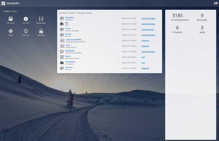
Widgets in the screenshot above are configured in three different ways (from left to right):
<widget xmlns="urn:enonic:xp:model:1.0">
  <display-name>Useful Links</display-name>
  <interfaces>
    <interface>admin.dashboard</interface>
  </interfaces>
  <config>
    <property name="width" value="small"/>
    <property name="style" value="custom"/>
    <property name="order" value="0"/>
  </config>
</widget><widget xmlns="urn:enonic:xp:model:1.0">
<display-name>Content Studio: Recent items</display-name>
<interfaces>
<interface>admin.dashboard</interface>
</interfaces>
<config>
<property name="order" value="1"/>
</config>
</widget><widget xmlns="urn:enonic:xp:model:1.0">
<display-name>Statistics</display-name>
<interfaces>
<interface>admin.dashboard</interface>
</interfaces>
<config>
<property name="width" value="small"/>
<property name="height" value="full"/>
<property name="header" value="false"/>
</config>
</widget>