Option Set
Contents
An option set is a group of options presented either as a multi-select option set (radio button style), or as a single-select option set (dropdown style).
Each option may contain an optional form, which also support nested item-sets and option-sets.
Single select mode
Appearance
In single select mode, an optionset will look similar to an item set, but you will rather have multiple "items" to select from.
When inserting a new optionset, the selected option’s form will automatically be expanded.
The example below what it looks like when multiple option set instances are inserted and expanded. Each option set is visualized as a card.
| Notice that the Horizontal line option does not have a form. |
| Delete, reset or move the option panels using the right hand context menu. |
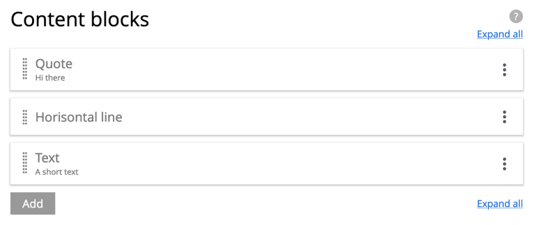
The final example demonstrates the same form as above, with all forms collapsed.
| Easily shuffle the order of the option sets by dragging the cards from the grip zone on the left hand side. |
Usage
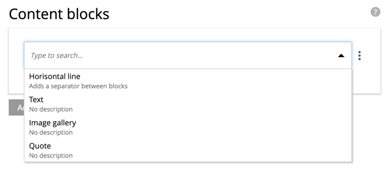
The schema below demonstrates how you may create blocks of structured content using the single-select mode.
hr, text, gallery and quote.
<option-set name="blockOptionSet">
  <label>Content blocks</label>
  <occurrences minimum="0" maximum="0"/>  (1)
  <help-text>Create content with optional blocks</help-text>
  <options minimum="1" maximum="1">   (2)
    <option name="hr">  (3)
      <label>Horisontal line</label>
      <help-text>Adds a separator between blocks</help-text>
    </option>
    <option name="text">
      <label>Text</label>
      <items>
        <input name="text" type="TextArea">
          <label>Text</label>
          <occurrences minimum="1" maximum="1"/>
        </input>
      </items>
    </option>
    <option name="gallery">
      <label>Image gallery</label>
      <items>
        <input name="images" type="ImageSelector">
          <label>Images</label>
          <occurrences minimum="1" maximum="0"/>
          <config/>
        </input>
      </items>
    </option>
    <option name="quote">
      <label>Quote</label>
      <items>
        <input name="quote" type="TextLine">
          <label>Quote</label>
          <occurrences minimum="1" maximum="1"/>
        </input>
        <input name="quotee" type="TextLine">
          <label>Quotee</label>
          <occurrences minimum="1" maximum="1"/>
        </input>
      </items>
    </option>
  </options>
</option-set>| 1 | occurences Set value to maximum=0 for unlimited option-set (block) instances |
| 2 | options/@maximum Refers to selectable options per instance. A value of 1 ⇒ single-select mode. |
| 3 | option (required) Container of options. Each option may be empty or contain items, just like an item set. |
Output
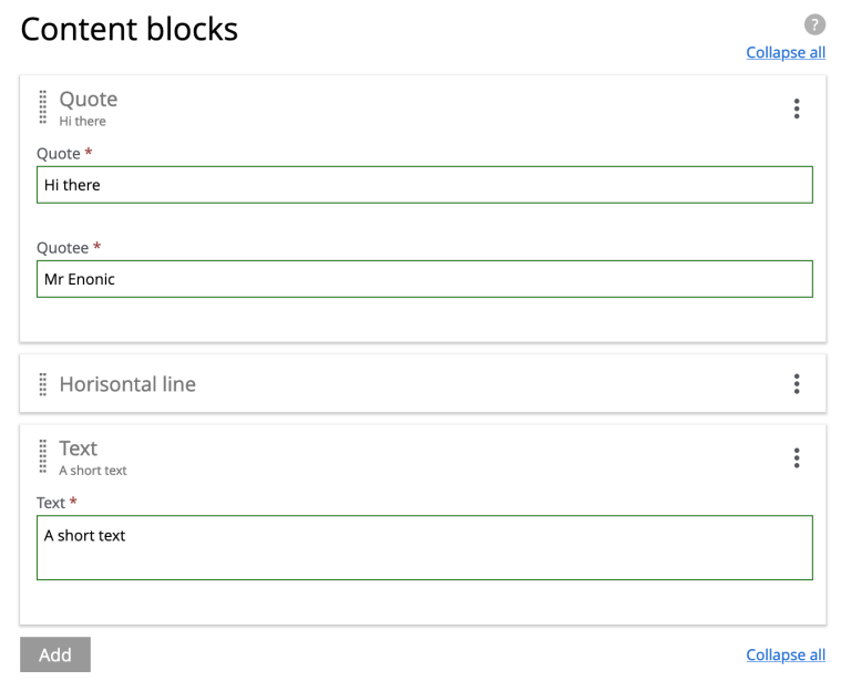
An example output of the above form, where the user has created three instances, using three different options: quote, hr and text.
{
  "blockOptionSet": [
    {
      "quote": {
        "quote": "Hi there",
        "quotee": "Mr Enonic"
      },
      "_selected": "quote"
    },
    {
      "hr": {
      },
      "_selected": "hr"
    },
    {
      "text": {
        "text": "A short text"
      },
      "_selected": "text"
    }
  ]
}
The _selected property can be used when searching for selected options for instance. |
Multi select mode
Appearance
In multi select mode, the user may select zero to many options within a single option set.
Each option’s form (if it exists) will normally only be visible once the option is selected.
| For convenience, a multi-select option set can be configured to have all options expanded by default. |
Below: A multi-select option set where all options are expanded by default. Option 2 and 3 do not have any additional form items:
| For multi-select options sets, it is also possible to pre-select options by default. |
Usage
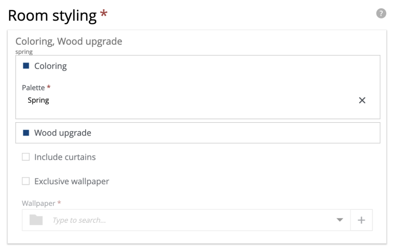
The example below demostrates multi-select mode, with the options Coloring, Wood upgrade, Include curtains and Exclusive wallpaper. Only options 1 and 4 contain form elements. Also, user may maximally select two options.
<option-set name="styling">
  <label>Room styling</label>
  <expanded>true</expanded> (1)
  <occurrences minimum="1" maximum="1"/> (2)
  <help-text>Select up to 2 options</help-text>
  <options minimum="1" maximum="2"> (3) (4)
    <option name="coloring"> (5)
      <label>Coloring</label>
      <help-text>Select a color palette for the room</help-text>
      <default>true</default> (6)
      <items>
      <input name="palette" type="ComboBox">
        <label>Palette</label>
        <occurrences minimum="1" maximum="1"/>
        <config>
          <option value="spring">Spring</option>
          <option value="summer">Summer</option>
          <option value="autumn">Autumn</option>
          <option value="winter">Winter</option>
        </config>
        <default>spring</default>
      </input>
      </items>
    </option>
    <option name="wood">
      <label>Wood upgrade</label>
      <help-text>Wooden floor and doors</help-text>
    </option>
    <option name="curtains">
      <label>Include curtains</label>
      <help-text>Adds curtains to all windows</help-text>
    </option>
    <option name="wallpaper">
      <label>Exclusive wallpaper</label>
      <items>
        <input name="product" type="ContentSelector">
          <label>Wallpaper</label>
          <occurrences minimum="1" maximum="1"/>
          <config/>
        </input>
      </items>
    </option>
  </options>
</option-set>| 1 | expanded Set to true to expand all of the options by default |
| 2 | occurrences Allow zero, one or more instances of the whole option-set. |
| 3 | options/@minimum (required) Minimum number of options that must be selected in this option set. |
| 4 | options/@maximum (required) Maximum number of options to create. > 1 ⇒ multi-select mode. 1 ⇒ single-select mode. |
| 5 | option/@name (required) Must be unique within the option set. |
| 6 | default Set to true to pre-select one of the options. |
Output
The output from the example above may look like this:
{
  "styling": {
    "_selected": [
      "coloring",
      "wood"
    ],
    "coloring": {
      "palette": "spring"
    },
    "wood": {
    }
  }
}
The _selected property contains information about which options were selected. |
