Context panel
Contents
The Context panel is the multi-function column on the right of the Navigator and the Editor. It hosts a set of widgets — small tools that act on the currently selected content item. Widgets can be built-in, shipped by Content Studio+, or contributed by any installed application.
The panel is toggled open and closed with the  icon next to the Action-menu button in the Navigator, or with the cog icon on the right of the editor toolbar in the Editor.
Widget selector
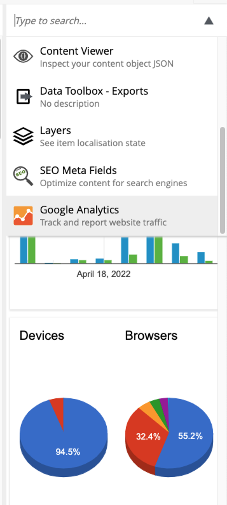
The dropdown at the top of the panel lists the available widgets: the built-ins appear first, followed by widgets from installed applications. A filter field at the top narrows the list by keyword.
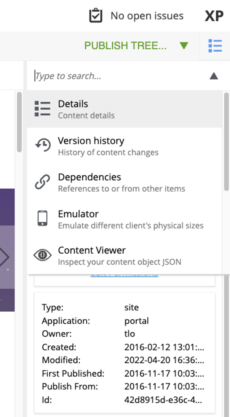
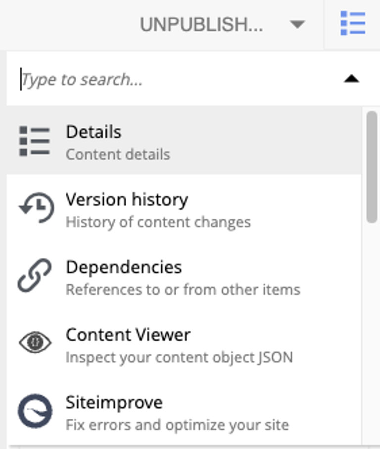
Built-in widgets
-
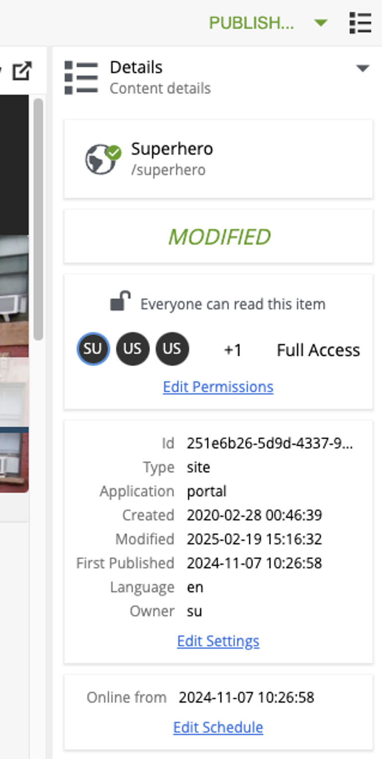
Details — basic properties of the selected content item (display name, path, status, permissions, properties, schedule, attachments).
-
Dependencies — inbound and outbound references between the item and other content.
-
Version history — every version of the selected item; lets you compare or revert.
-
Components — the page-building tool that appears in the Editor for renderable content.
Content Studio+ widgets
The following widgets are contributed by Content Studio+:
Contributing a widget
The Context panel is pluggable: any installed application can contribute a widget that appears in the widget selector.
See the Context panel extension reference for the descriptor format, lifecycle, and implementation details.